looks better and youre legend if u can code snowstormAlso, it's funny how you literally said you came on to provoke the owners & then you were claiming to be a developer. pfft, developer my ass
Oh btw, we are using a reverse proxy? haha how in gods name couldn't you see that ^^
I hopefully made the CMS look slightly better.
Also, under development
We are using cloudflare and reverse proxies.
You are using an out of date browser. It may not display this or other websites correctly.
You should upgrade or use an alternative browser.
You should upgrade or use an alternative browser.
Flash Blib.pw | Unique features | FastFood, Jukeboxes, Groupforums... | Hiring!
- Status
- Not open for further replies.
")
Syr
Member
- Jun 10, 2014
- 68
- 9
- Thread starter
- #24
I agree with you 100%, I am terrible at design. If someone could suggest something I could fix it. However, I focus more on the clientDecent, before you edited the top background it reminded me of those pre made epic-hosts hotels.
Not a fan of them tabs and the faqs look ugly (don't fit the container properly)
But best of luck with this

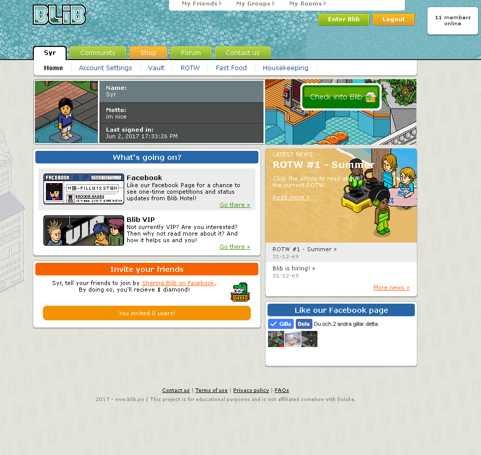
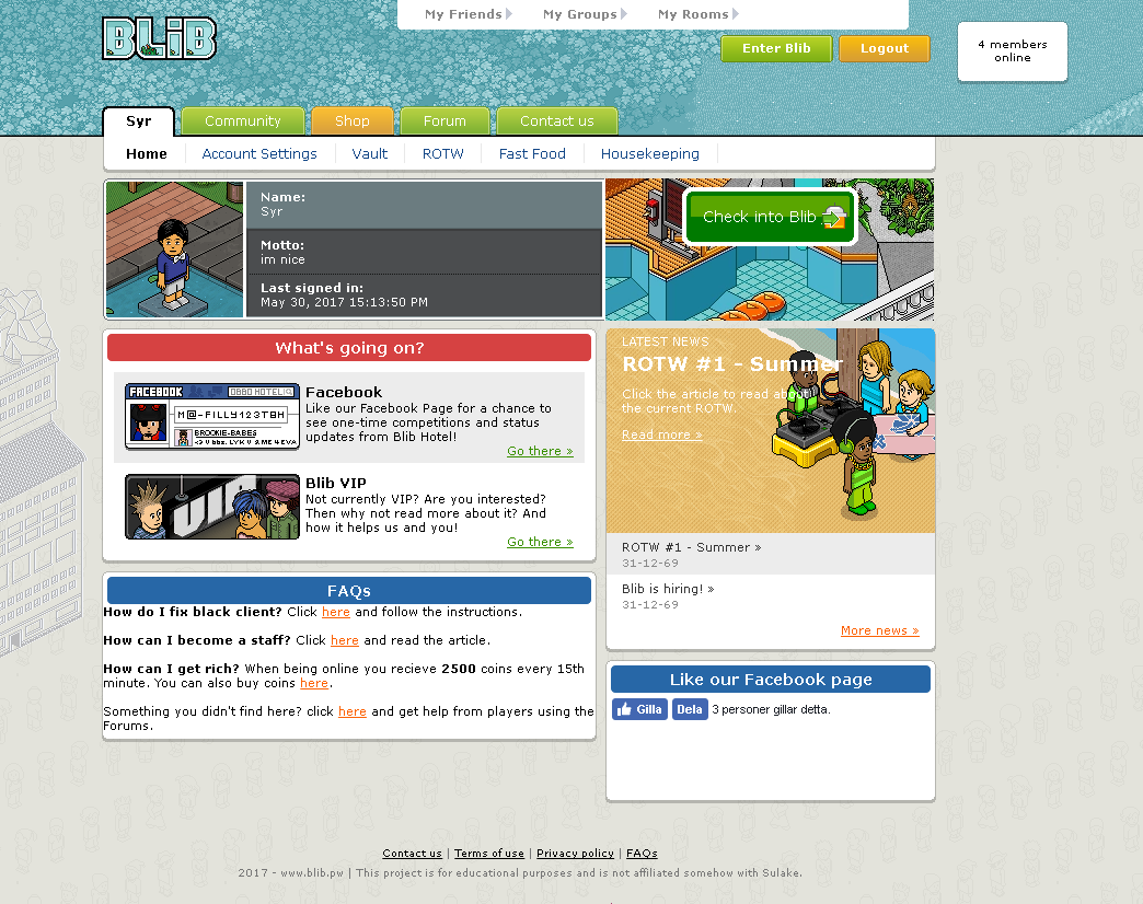
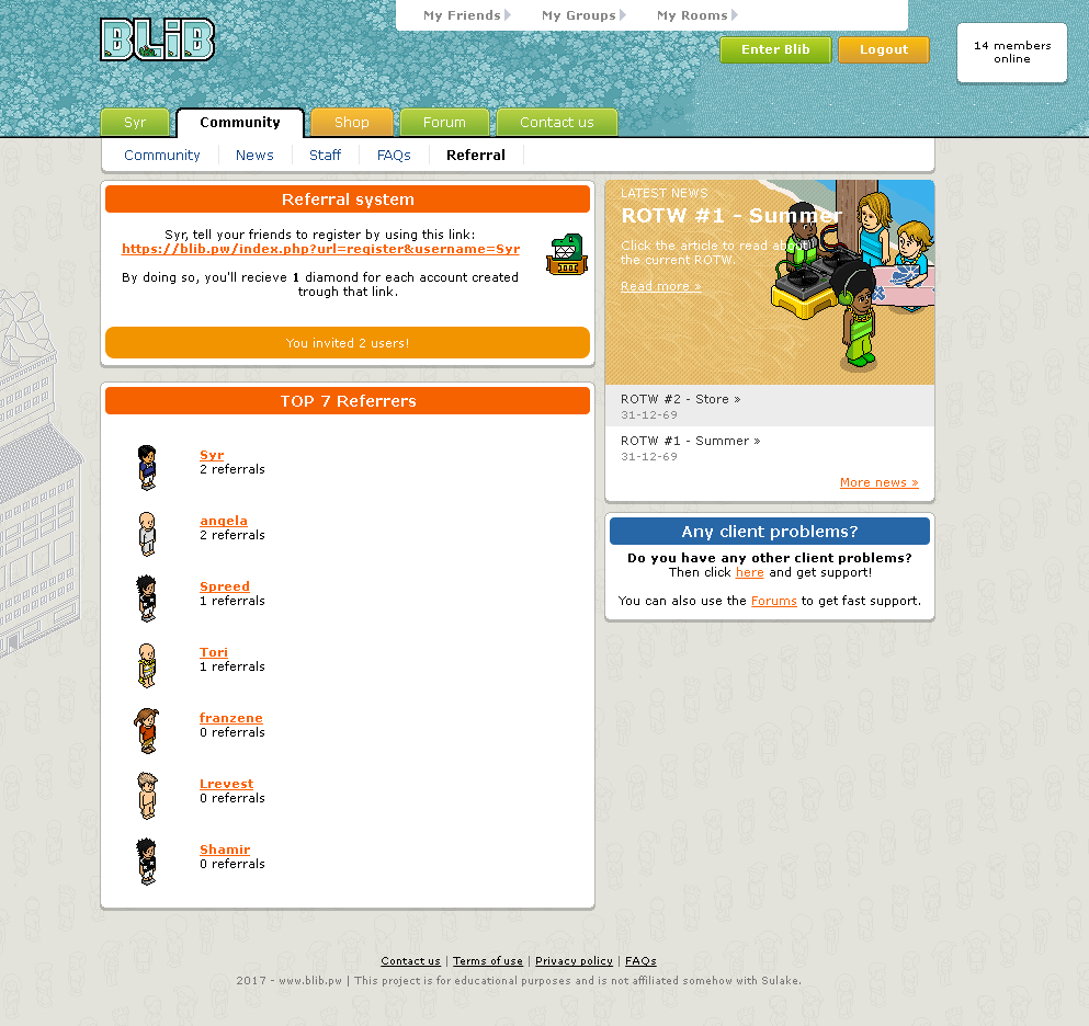
Updated the /me page, implemented a referral system and changed some colors. Tell me your thougts.
Updated the pictures in the main post, also included a screenshot of the Forums.
Syr
Member
- Jun 10, 2014
- 68
- 9
- Thread starter
- #33
We have 2 staffs atm and I am pretty sure none of them has been cocky, I don't hire those sort of people. Please tell me who and I'll check it out.Nice retro, users are not very welcoming and some staff are cocky good luck.
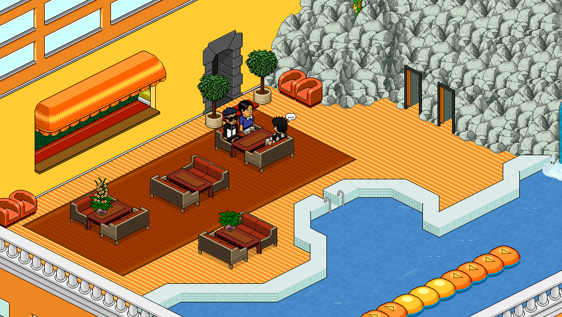
Pool's closed (lol meme).
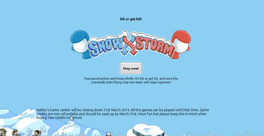
Does anybode have an idea for that little game in the pool? I could code some game using commands or something, suggestions?
Syr
Member
- Jun 10, 2014
- 68
- 9
- Thread starter
- #37
The index is not included in the theme, and the images is not originally there.I personally love the CMS, it's very unique. Do you have a link to this RevCMS style? I can't find a decent one with working downloads anywhere.
You must be registered for see links
(this is the skin I've edited)Brought
更加努力
- Jan 14, 2013
- 595
- 203
I visited the hotel and noticed a few things-
The index was a great choice. I like it and it does bring back good memories within this community. Although the edges are not properly rounded around the login box which was something I immediately noticed upon visiting, it made a style difference.
Your fastfood leaderboard on the CMS is nice and definitely a feature of the hotel that will attract users. Competition is something that users enjoy and that is a fun and easy way to keep users entertained and competing as well.
A personal opinion of mine is that the Facebook content should be included somewhere in the topbg as maybe just the like button? It would remove some of the clutter from the CMS content area and allow people to focus more on more important content. It doesn't fit the content area well as it sits now, either. (
Another personal opinion of mine and it's sad to say, considering it does compliment your CMS styling well, but the tab choice is horrible. Those tabs were ruined and overused by a horrible hosting company that's been around forever and does automated retro setups for their customers and uses those exact tabs for ALL of their setups. Moving away from this tab choice would make people assume less frequently that you paid for your hotel to be setup by said hosting company. (which I also saw previously in posts)
Good luck on future ventures with this hotel. It seems to be going quite well and has potential considering motivation stays intact and your professionalism also remains!
The index was a great choice. I like it and it does bring back good memories within this community. Although the edges are not properly rounded around the login box which was something I immediately noticed upon visiting, it made a style difference.
Your fastfood leaderboard on the CMS is nice and definitely a feature of the hotel that will attract users. Competition is something that users enjoy and that is a fun and easy way to keep users entertained and competing as well.
A personal opinion of mine is that the Facebook content should be included somewhere in the topbg as maybe just the like button? It would remove some of the clutter from the CMS content area and allow people to focus more on more important content. It doesn't fit the content area well as it sits now, either. (
You must be registered for see links
)Another personal opinion of mine and it's sad to say, considering it does compliment your CMS styling well, but the tab choice is horrible. Those tabs were ruined and overused by a horrible hosting company that's been around forever and does automated retro setups for their customers and uses those exact tabs for ALL of their setups. Moving away from this tab choice would make people assume less frequently that you paid for your hotel to be setup by said hosting company. (which I also saw previously in posts)
Good luck on future ventures with this hotel. It seems to be going quite well and has potential considering motivation stays intact and your professionalism also remains!
Syr
Member
- Jun 10, 2014
- 68
- 9
- Thread starter
- #39
Hi, thanks for all suggestions. I love hearing this!I visited the hotel and noticed a few things-
The index was a great choice. I like it and it does bring back good memories within this community. Although the edges are not properly rounded around the login box which was something I immediately noticed upon visiting, it made a style difference.
Your fastfood leaderboard on the CMS is nice and definitely a feature of the hotel that will attract users. Competition is something that users enjoy and that is a fun and easy way to keep users entertained and competing as well.
A personal opinion of mine is that the Facebook content should be included somewhere in the topbg as maybe just the like button? It would remove some of the clutter from the CMS content area and allow people to focus more on more important content. It doesn't fit the content area well as it sits now, either. (You must be registered for see links)
Another personal opinion of mine and it's sad to say, considering it does compliment your CMS styling well, but the tab choice is horrible. Those tabs were ruined and overused by a horrible hosting company that's been around forever and does automated retro setups for their customers and uses those exact tabs for ALL of their setups. Moving away from this tab choice would make people assume less frequently that you paid for your hotel to be setup by said hosting company. (which I also saw previously in posts)
Good luck on future ventures with this hotel. It seems to be going quite well and has potential considering motivation stays intact and your professionalism also remains!
However, I switched to blue tabs, it looks much better and cleaner now. Also removed the Facebook like box completely as nobody is using Facebook anyways lol. (There is also another link to our FB on the /me page).
Also, I haven't noticed that the index login box is supposed to have rounded corners. Will fix it tomorrow though.
I'll keep focusing on the emulator and new features such as (snowstorm) now, as the CMS looks decent.
Hayd3n
peace.wtf
- Jun 14, 2013
- 76
- 29
1 other small thing is your banner (newest clotthing)Hi, thanks for all suggestions. I love hearing this!
However, I switched to blue tabs, it looks much better and cleaner now. Also removed the Facebook like box completely as nobody is using Facebook anyways lol. (There is also another link to our FB on the /me page).
Also, I haven't noticed that the index login box is supposed to have rounded corners. Will fix it tomorrow though.
I'll keep focusing on the emulator and new features such as (snowstorm) now, as the CMS looks decent.
- Status
- Not open for further replies.
Users who are viewing this thread
Total: 2 (members: 0, guests: 2)