WeDesign • Company Portfolio Template • Free

Sysode

Front-End Developer
Dec 11, 2012
1,673
848
Okay time to release again,

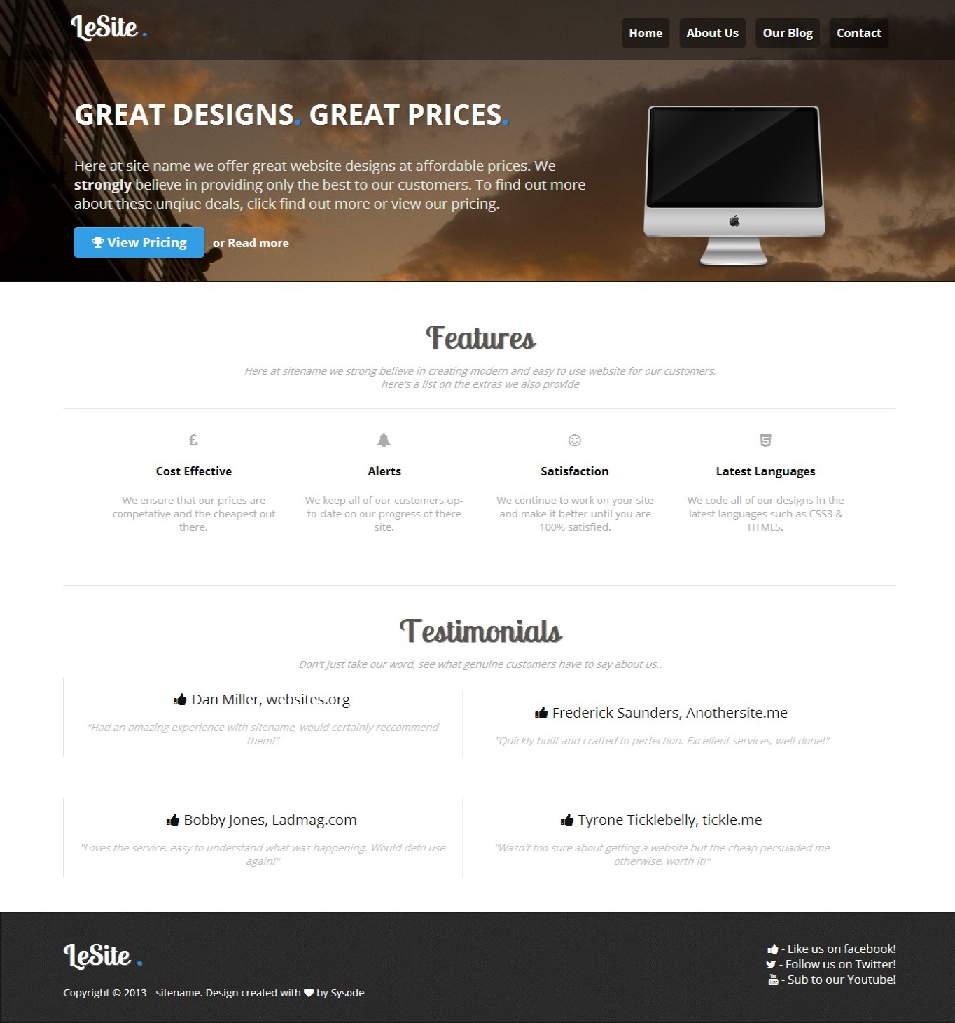
This is my latest piece of work which I was planning on using for myself but then later decided I'd be a nice guy and release it - for free of course. I've attempted to keep it looking as clean as possible and use different columns where possible (especially on the index). The code is written pretty cleanly, so it's easy to edit and it's 100% valid (css and html).

Preview of index (rest can be seen at the !)

INDEX:

1ii7q.jpeg


Like?
Extra info;
Pages: 4 - index, about, blog & contact
Released under: (incase anyone gets all 'technical' like in previous threads.
I am willing to set this up on your webhost if you need, just supply the content you wish to have added.

Credits
iconfinder -
Font Awesome -
Me.
Hope you enjoy this release, feel free to leave some feedback below :)
 

Nehalem

Aug 31, 2013
293
47
You should totally change the header image and the background.
But I love the font, and the template is simple and nice. I like it!

Good work, and thanks for sharing this :up: <3_<3
 

Kaz

BooYah
Staff member
Nov 16, 2010
3,064
1,025
Look quite nice Reece, good job with it.
Have noticed a small problem though.
On the about and blog pages, the bullet points are right on the edge of the container
These need some padding to align up with the general text
 

Sysode

Front-End Developer
Dec 11, 2012
1,673
848
Look quite nice Reece, good job with it.
Have noticed a small problem though.
On the about and blog pages, the bullet points are right on the edge of the container
These need some padding to align up with the general text
Ah, I take it you're using Firefox?

Forgot about this, padding-left on <li> elements doesn't seem to work in Firefox and where I develop using chrome I forgot about this. Thanks for mentioning.
 

Brackson

卍卍卍卍卍卍卍卍卍卍卍
Jun 20, 2013
262
46
Could you maybe remove parts? Other than that, great!

I'm genuinely happy that you're are releasing content that has a clear message as to what the end user can and cannot do. Thanks!
 

Sysode

Front-End Developer
Dec 11, 2012
1,673
848
Could you maybe remove parts? Other than that, great!

I'm genuinely happy that you're are releasing content that has a clear message as to what the end user can and cannot do. Thanks for releasing!

Sure man, if you don't like them just locate the "<hr/>" in the HTML and simply remove them. Thanks as well :)

Man, I love this template. It's so clean and nicely done. 10/10 Nice job.
Thanks bro :)
 

Macemore

Circumcised pineapples
Aug 26, 2011
1,681
819
italics always makes me think you're sassy because i'm on tumblr too much
Looks amazing, but you should always use Seattle as a background because Seattle is the best city ever.
 

Sysode

Front-End Developer
Dec 11, 2012
1,673
848
Yeah, I'd fuck it.

The only thing I don't like is this, this needs some seeing to:
8ei1.png

Go for it, wear some rubber though it's still a virgin.

background image ruins it

Fair enough, easily changeable though if need be. Thanks.

Seems like another overused template. 7/10 Its still nice and very neat and tidy.

How do you mean by 'overused', do you mean the fact it's a company portfolio template or it's design? Either thanks for the feedback.
 

LeChris

John 15:18
Sep 30, 2013
2,786
1,395
Go for it, wear some rubber though it's still a virgin.


Fair enough, easily changeable though if need be. Thanks.


How do you mean by 'overused', do you mean the fact it's a company portfolio template or it's design? Either thanks for the feedback.
Jus the overall setup and structure so yea because of what its made for
 

Queef

Some people...
Jul 27, 2012
645
289
Watched him make this from the start, its come a long way!

Good job man. I especially like the blog you have thrown in.
 

Users who are viewing this thread

Top