Its a while since I've posted around here, i didn't intent too but i liked the look of where your headed here so ill give you some advice.
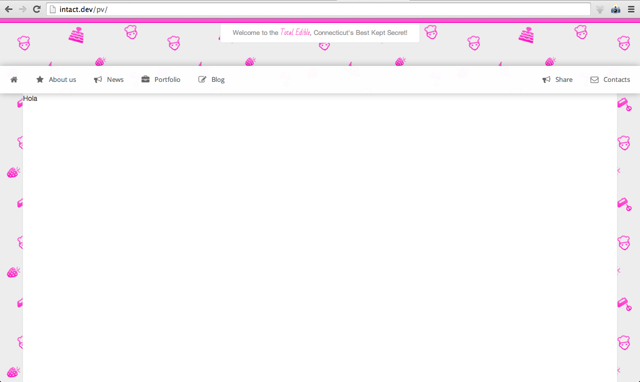
In the navigation bar, add padding to both the left and right sides to line the left and right edges up with the white background. e.g. line the "s"of contacts up vertically with the right edge of the white content area below.
As for the content area, you could scrap that white background and use some sort of white overlaying content container system, similar to what facebook uses i guess, put all content in its individual white content box that overlays the background image. (in doing that would make my first suggestion pointless but nevertheless i think increasing the spacing on the edges of the navigation to the edges of the screen would make it look better.)
Good luck, what you already have looks pretty sweet.
It confused me, the white horizontal bar seems to be the header, yet the grey/purple 'underneath' appears to be some sort of header as well, yet it's the main background image.
The pink is a little bit too neon. You can build sections like: Our best Cakes, or Our best fruit sculptures or something similar. Just wondering, you speak spanish?
The pink is a little bit too neon. You can build sections like: Our best Cakes, or Our best fruit sculptures or something similar. Just wondering, you speak spanish?