Jump
You are beautiful beyond comprehension
- Feb 16, 2011
- 167
- 55
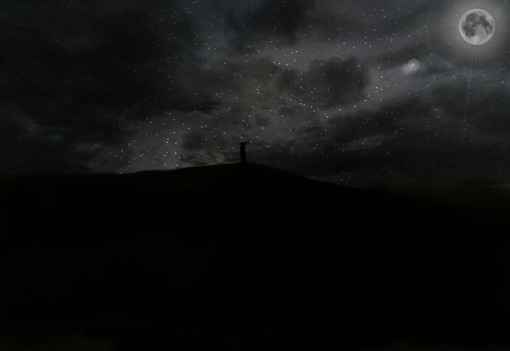
Hey, I recently made a new design that I quite liked, I call it "The Marines Moon" for obvious reasons, it's basically just a marine looking up at the moon in some far far away country.
It's a Royal Marine, not a US marine. I know the moon needs more work to it but it was the best I could get it while remaining original.
I will try to answer any questions as soon as possible, along as they aren't stupid or off-topic.
Software used; Adobe Photoshop CS5 - Adobe Photoshop CS6 - Adobe Photoshop Touch - Cinema 4D - 3DS Max.


