You are using an out of date browser. It may not display this or other websites correctly.
You should upgrade or use an alternative browser.
You should upgrade or use an alternative browser.
LiteHabbo - RevCMS Theme
- Thread starter CrawlRZ
- Start date
themaster2012
Member
- Feb 16, 2012
- 188
- 15
not bad

Night
Active Member
- Aug 30, 2011
- 182
- 27
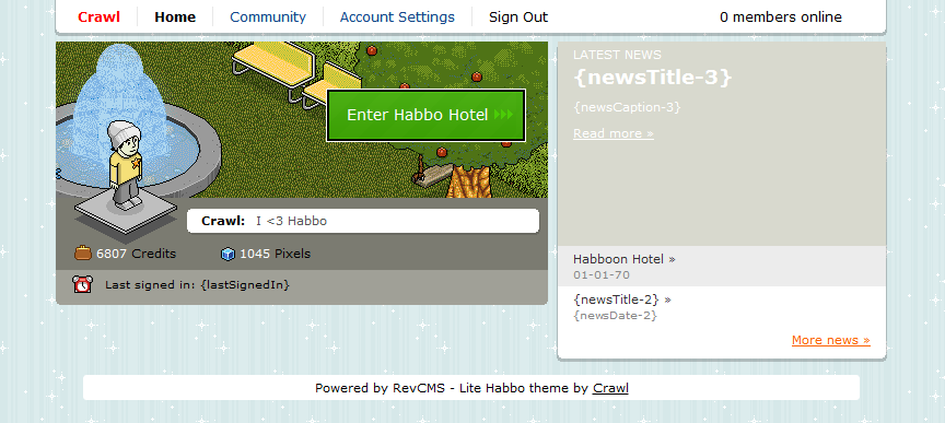
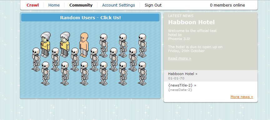
you should make it so if you click community, it goes bold and red on the far left and then other options pop up including staff, news, etc.
meaning that if you look at the images, red/bold crawl would be replaced with community and options would be on the right that fit under the community tab
so basically you click Crawl and you have the option of going to account settings or signing out
and a back arrow so you can go to the main area
meaning that if you look at the images, red/bold crawl would be replaced with community and options would be on the right that fit under the community tab
so basically you click Crawl and you have the option of going to account settings or signing out
and a back arrow so you can go to the main area
AlexFallen
Developer
- Jul 19, 2011
- 490
- 64
Any Housekeeping? Or No?
xxXbesarXxx
New Member
- Jun 23, 2012
- 21
- 0
its ok thanks for release
I have Been Messing around And Made Oneanyone have a staff page for this?
Download
You must be registered for see links
Users who are viewing this thread
Total: 2 (members: 0, guests: 2)


