Feedback Latest Banners

Status
Not open for further replies.

ArchoCrime

Member
Aug 13, 2014
98
1
Hey Devbest,
I've been making some banners, not for retros. (not yet)
I want to see if you guys may see if I'm doing good so far on these 2 banners, when I make more banners I will update the thread.
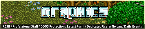

Banner #1
p4VKtes.png

Banner #2
Qdt7Wo0.gif

Banner #3 (Rushed)
GR7wIH7.gif

Banner #4 (Made for Amp Hotel; pending; might update again)
AKGPMyH.gif

Banner #5 (Made for Amp Hotel; pending; 1st animation banner; not so well; will improve)
FHgE9Yj.gif
 
Last edited:

ano2k77

Member
Feb 4, 2013
466
30
First one is not good. Mainly because the transparent layer at the bottom goes over the banner. However the second one, it's better but not really good.

Tip: Try using a Volter Goldfish font, it'll make it look more habbo related.
 

Miserable

Member
Apr 27, 2012
317
164
I personally think the first one is better than the second.
They're both not to good but the second has bulky text, which is pretty yucky.
 

ano2k77

Member
Feb 4, 2013
466
30
Updated thread! 8/20/14
Tbh, it's improved a little. Use a Volter Goldfish font. Go on And search Volter Goldfish. Download it and use it on banners, and make the size of the font either 7 or 9. Which ever looks more right.
 

ArchoCrime

Member
Aug 13, 2014
98
1
Tbh, it's improved a little. Use a Volter Goldfish font. Go on And search Volter Goldfish. Download it and use it on banners, and make the size of the font either 7 or 9. Which ever looks more right.
Ok, I'll use the font, thanks for the feedback.
I'll make another banner in an hour or so, I have some tasks to do.
 

RyanzRetros

Developer of ChakCMS
Jan 14, 2015
978
182
I love the third one, other than that the second is plain and the first is nice but needs improvements which others have already said.
 
Status
Not open for further replies.

Users who are viewing this thread

Top