You are using an out of date browser. It may not display this or other websites correctly.
You should upgrade or use an alternative browser.
You should upgrade or use an alternative browser.
Habboon.pw | #1 English Retro | Active Since 2013
- Thread starter Bossman
- Start date
Just got around to checking out the whole CMS on my PC. I don't like the Staff page at all. It seems quite blurry and I don't like how the image sits on top of another either. The images/badge are fine when you look at them in a new tab but they look quite bad on the page.
They're not consistent either, for example "eliza" and "annabelle" are in different positions on the page.
They're not consistent either, for example "eliza" and "annabelle" are in different positions on the page.
TheNotorious
Im dying slowly.
- Oct 4, 2014
- 228
- 41
These memories!Right now we have about 5 online but we're pulling through.
Riybo
New Member
- Dec 1, 2018
- 8
- 7
Don't rlly like the staff page, takes quite a long time to find who you want with the thing scrolling every so often and the minuscule arrow which is very hard to click. Also I wasn't sure what those random heads were at the top of the staff page.Thanks! Which areas do you feel are the most messy? As said it was a rush job, and some places have duplicated content (e.g. /me and /community), but as more features/content is made, I'll try to evenly distribute it!
You must be registered for see images attach
Also what's the point of a homepage and community tab when they both literally show the same thing lmao
Also the row of articles in /me should be limited to one row and not two.
Not quite sure what the purpose of the badge section on the side is meant to serve, especially on a retro.
Also get rid of "top comments" being displayed on the side, leave it at the bottom of the article and put the top comments at the top of the comments.. (Assuming you're creating a like system for comments). Maybe remove the "more by x staff member" section too.. Every user just only cares about the recently published ones..
Fix the leaderboards. When I press "view more" i cant even close it back
Most of the site just looks like crap dumped anywhere just to fill in space and to make it look a lot less empty. Extremely unplanned and unorganized. It's just really fucking untidy.
Sorry if this reply is messy/too long/doesn't make sense. English isn't my first language. However, I'm trying my best to find something nice to say about the site. Cool account setting page, I guess?
Don't rlly like the staff page, takes quite a long time to find who you want with the thing scrolling every so often and the minuscule arrow which is very hard to click. Also I wasn't sure what those random heads were at the top of the staff page.
Random heads are online staff members, staff page is boring as a list - so it was anew concept to throw them like that. No roles are present, so the issue of needing a specific staff member never crossed my mind, as users normally approach us via the :help command.
7754
What's the point in having "random online users" on the homepage when there is a massive noticeable section of it in the footer. Kinda stupid. Maybe a "hottest rooms" section on the homepage instead.
This is only on the initial guest pages, it's a content filler. Hottest rooms will come, but it seems inappropriate and weird to display it so early on when the user is still a guest at this point.
Also, I'm assuming player profile pages are still in the works? If not, what's the point in having "random online users"
Yup, they'll be here eventually. What's the point? To show random online players, that users are online. And also a little something for users to occasional be like 'hey, that's me!'.
Also what's the point of a homepage and community tab when they both literally show the same thing lmao
This has already been mentioned by me, again it's just content filler for now. The difference is photos have more exposure on /community, however when newer features are ready, the community page will change.
Also the row of articles in /me should be limited to one row and not two.
No, this is wrong. Articles play a huge part of Habboon. tHey've been on pause for the time being due to the new housekeeping development being slow, they're set to resume soon. Articles make Habboon what it is, I'm not limiting this. We average 2 a day when we're on the go.
Not quite sure what the purpose of the badge section on the side is meant to serve, especially on a retro.
Again, I assume you don't play Habboon. We run quests very often, it's nice to give some exposure to upcoming badges. Given the fact we have a very limited client badge shop, and do not plan on giving users badges randomly, it's nice to show them what they can earn.
Also get rid of "top comments" being displayed on the side, leave it at the bottom of the article and put the top comments at the top of the comments.. (Assuming you're creating a like system for comments). Maybe remove the "more by x staff member" section too.. Every user just only cares about the recently published ones..
I personally feel that the page is too tight to remove that, I feel you'd not bother checking the comments if I did that. Comments will return shortly, the top comments will remain up there - users will vote to move them up.
I actually strawpolled the hotel about the 'More by Publisher' section, they like it. Why? We shuffle about positions a lot, some staff may occasional swap their article, or when on holiday another person will take over and maybe swing their take on the original authors article.
Fix the leaderboards. When I press "view more" i cant even close it back
Intentional, it's a card-deck, that's why positioning may go weird when you expand them all. But I see no need it adding the view more back?
Most of the site just looks like crap dumped anywhere just to fill in space and to make it look a lot less empty. Extremely unplanned and unorganized. It's just really fucking untidy.
Exactly, content fillers. For the most part I'd say it comes across as planned. It gives a community overview & exposure on the community, hence users in the footer, hence articles on several pages, hence camera photos & gallery being displayed in several pages and so on.
Sorry if this reply is messy/too long/doesn't make sense. English isn't my first language. However, I'm trying my best to find something nice to say about the site. Cool account setting page, I guess?
That's fine, you also answered my earlier questions. Thanks!
When I get some more time we'll continue to expand the site and throw in some new things here and there.
Riybo
New Member
- Dec 1, 2018
- 8
- 7
Wow. Makes a lot of sense now, thanks! And apologies if I sounded really negative. Good luck =)Random heads are online staff members, staff page is boring as a list - so it was anew concept to throw them like that. No roles are present, so the issue of needing a specific staff member never crossed my mind, as users normally approach us via the :help command.
This is only on the initial guest pages, it's a content filler. Hottest rooms will come, but it seems inappropriate and weird to display it so early on when the user is still a guest at this point.
Yup, they'll be here eventually. What's the point? To show random online players, that users are online. And also a little something for users to occasional be like 'hey, that's me!'.
This has already been mentioned by me, again it's just content filler for now. The difference is photos have more exposure on /community, however when newer features are ready, the community page will change.
No, this is wrong. Articles play a huge part of Habboon. tHey've been on pause for the time being due to the new housekeeping development being slow, they're set to resume soon. Articles make Habboon what it is, I'm not limiting this. We average 2 a day when we're on the go.
Again, I assume you don't play Habboon. We run quests very often, it's nice to give some exposure to upcoming badges. Given the fact we have a very limited client badge shop, and do not plan on giving users badges randomly, it's nice to show them what they can earn.
I personally feel that the page is too tight to remove that, I feel you'd not bother checking the comments if I did that. Comments will return shortly, the top comments will remain up there - users will vote to move them up.
I actually strawpolled the hotel about the 'More by Publisher' section, they like it. Why? We shuffle about positions a lot, some staff may occasional swap their article, or when on holiday another person will take over and maybe swing their take on the original authors article.
Intentional, it's a card-deck, that's why positioning may go weird when you expand them all. But I see no need it adding the view more back?
Exactly, content fillers. For the most part I'd say it comes across as planned. It gives a community overview & exposure on the community, hence users in the footer, hence articles on several pages, hence camera photos & gallery being displayed in several pages and so on.
That's fine, you also answered my earlier questions. Thanks!
When I get some more time we'll continue to expand the site and throw in some new things here and there.
Wow. Makes a lot of sense now, thanks! And apologies if I sounded really negative. Good luck =)
No, it's honestly fine. Appreciate the feedback. The site was done in a couple of days just out of boredom, more is to come - it's just, I'm now back at work, so the motivation to code at home is zero!
Cheers.
Popped on Habboon yesterday and noticed your new Hub & additions that'd I'd not heard about - very cool some of the best additions ideas I've seen on a retro that are really useful not just gimmickry! 
For anyone interested:

For anyone interested:
You must be registered for see links
I really like the new hub, good work 
I was curious about the economy here and I've noticed it's changed a lot, especially if you buy diamonds in the store. £1.75 per throne seems really steep, maybe that could be changed up as it used to be a lot less.

I was curious about the economy here and I've noticed it's changed a lot, especially if you buy diamonds in the store. £1.75 per throne seems really steep, maybe that could be changed up as it used to be a lot less.
Popped on Habboon yesterday and noticed your new Hub & additions that'd I'd not heard about - very cool some of the best additions ideas I've seen on a retro that are really useful not just gimmickry!
For anyone interested:You must be registered for see links
Thank you! Much appreciated. Yeah, we've been behind for years in terms of custom features - we've just always preferred the vanilla vibe - but the hotel has been stale for a while, as has Habbo, so we're attempting to throw in some new bits here and there.
I really like the new hub, good work
I was curious about the economy here and I've noticed it's changed a lot, especially if you buy diamonds in the store. £1.75 per throne seems really steep, maybe that could be changed up as it used to be a lot less.
Thanks! As for the economy, we're working on it - slowly. We buffed diamond prices due to an exploit we had lying about with diamond items, easiest solution(?) for the time being was to increase the prices.
We currently give those who purchase diamonds a bonus, as a thanks for supporting us - we're working on being able to offer more for the users who spend actual currency on the hotel, but it's not really the focus. We kept diamonds on the store mostly as a filler. We mostly just sell VIP, and fund the hotel from VIP.
---
Updates:
- As mentioned above, we posted an article with some tweaks, that can be found
You must be registered for see links
. We've also been working on a lot of backend stuff, we've been trying to overhaul the emulator as much as possible (we broke it with reSharpr months ago and gave up). We've since amended the source, rebuilt a fair bit and finally going asynchronous where deemed appropriate! So far, it's working a treat. We've another update log to push with many game map updates and bot fixes, including a ton of speed boosts for Wired.We've launched a new homeroom, just simply naming it 'the hub' for simplicity. This hub will be heavily used for our 'birthday bash' that is coming in July, we're trying to get as ahead of it as we can. Some will know that we did the Christmas features on the 19th of December D:... Want to avoid that again.
Features:
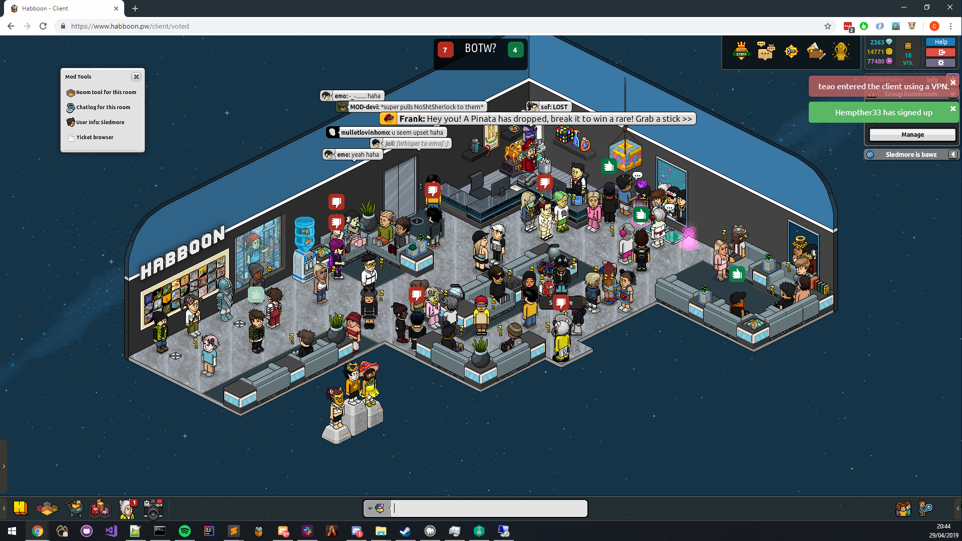
- Photo wall - the photo wall automatically updates every 15 minutes with the latest photos taken on the hotel.
- Random Pinata spawn - Pinatas will randomly spawn with a preset array of rares with different chances.
- Room polls (disabled for the most part to be fair, too buggy w/ the white symbols!)
- Frank announces activity (e.g. pinatas & events).
- When an event is on, Frank will announce it, the elevator will open & a room ad with 'Events Active' will spawn.
- GOTW Podium - The top 3 contestants of the current GOTW running will display on the podium, when a player out matches another, they'll announce they're the champion and do a little twirl, and also get a crown (only on the bot).
- Crates - Crates are finally starting to be pushed out, this starts on our Birthday Bash, 'Crate Guy' will allow you to open them.
- Quests Bot - TBC.
- Daily Rewards - Coming soon, working out some logic on it, simply there as a filler.
- Crates -
You must be registered for see links
- Events -
You must be registered for see links
- Photo Wall -
You must be registered for see links
- GOTW -
You must be registered for see links
Parsov
Member
- May 18, 2016
- 315
- 206
Thank you! Much appreciated. Yeah, we've been behind for years in terms of custom features - we've just always preferred the vanilla vibe - but the hotel has been stale for a while, as has Habbo, so we're attempting to throw in some new bits here and there.
Thanks! As for the economy, we're working on it - slowly. We buffed diamond prices due to an exploit we had lying about with diamond items, easiest solution(?) for the time being was to increase the prices.
We currently give those who purchase diamonds a bonus, as a thanks for supporting us - we're working on being able to offer more for the users who spend actual currency on the hotel, but it's not really the focus. We kept diamonds on the store mostly as a filler. We mostly just sell VIP, and fund the hotel from VIP.
---
Updates:
- As mentioned above, we posted an article with some tweaks, that can be foundYou must be registered for see links. We've also been working on a lot of backend stuff, we've been trying to overhaul the emulator as much as possible (we broke it with reSharpr months ago and gave up). We've since amended the source, rebuilt a fair bit and finally going asynchronous where deemed appropriate! So far, it's working a treat. We've another update log to push with many game map updates and bot fixes, including a ton of speed boosts for Wired.
We've launched a new homeroom, just simply naming it 'the hub' for simplicity. This hub will be heavily used for our 'birthday bash' that is coming in July, we're trying to get as ahead of it as we can. Some will know that we did the Christmas features on the 19th of December D:... Want to avoid that again.
Features:
Gifs:
- Photo wall - the photo wall automatically updates every 15 minutes with the latest photos taken on the hotel.
- Random Pinata spawn - Pinatas will randomly spawn with a preset array of rares with different chances.
- Room polls (disabled for the most part to be fair, too buggy w/ the white symbols!)
- Frank announces activity (e.g. pinatas & events).
- When an event is on, Frank will announce it, the elevator will open & a room ad with 'Events Active' will spawn.
- GOTW Podium - The top 3 contestants of the current GOTW running will display on the podium, when a player out matches another, they'll announce they're the champion and do a little twirl, and also get a crown (only on the bot).
- Crates - Crates are finally starting to be pushed out, this starts on our Birthday Bash, 'Crate Guy' will allow you to open them.
- Quests Bot - TBC.
- Daily Rewards - Coming soon, working out some logic on it, simply there as a filler.
Screenshots:
- Crates -
You must be registered for see links- Events -
You must be registered for see links- Photo Wall -
You must be registered for see links- GOTW -
You must be registered for see links

Love the new update! Keep it up

Brave or ballsy, no idea.
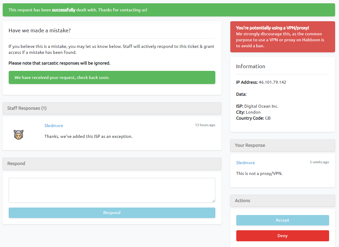
Not the most luxurious update in the world, but we've recently began trials for attempting to block our VPNs/proxies - obviously this is something you can't do overnight, so the lists will be regularly updated.
We ran a test last night, launched it at 3 PM (it had been pre-launched in stages prior to this), and we managed to hit 700 online (which is now becoming more and more rare for us), so blocking out the VPNs didn't really harm us that much.
We've added a simple area for users to apply for an 'account whitelist' in which once they've applied for it, and we've added it to the account; they can use a VPN - it helps us filter the toxic users out, in some case we'll allow them due to school, uni etc. We have had some false positives so far, but we're working through it.
On a lighter note, our Birthday month starts on the 1st, and we've currently coded none of it - so that'll be fun.

Hypothesis
Programmer
- Jan 6, 2019
- 524
- 361
Nice addition.Brave or ballsy, no idea.
Not the most luxurious update in the world, but we've recently began trials for attempting to block our VPNs/proxies - obviously this is something you can't do overnight, so the lists will be regularly updated.
We ran a test last night, launched it at 3 PM (it had been pre-launched in stages prior to this), and we managed to hit 700 online (which is now becoming more and more rare for us), so blocking out the VPNs didn't really harm us that much.
We've added a simple area for users to apply for an 'account whitelist' in which once they've applied for it, and we've added it to the account; they can use a VPN - it helps us filter the toxic users out, in some case we'll allow them due to school, uni etc. We have had some false positives so far, but we're working through it.
On a lighter note, our Birthday month starts on the 1st, and we've currently coded none of it - so that'll be fun.

Users who are viewing this thread
Total: 2 (members: 0, guests: 2)


