Show DevBest DigitalCam.co.uk | an Amazon Afilliate website dedicated on Camera & Accessories

Sly

I don't break the rules I bend them.
Oct 28, 2016
246
38
What is this website about?
I've decided to make a website only for digital cameras & it's accessories. Products I use aren't mine they, are hosted from Amazon UK via the affiliate program. What is does this mean? This means that whenever someone purchases an item from my website they will be re-directed to Amazon checkout and I will receive a 10% commission depending on the price of the item.

Why should I use this website when I can buy it from Amazon directly?

I'm not saying that I'm going head-to-head with Amazon but... let's say you want a camera or an accessory for your Nikon. Would you rather go to a website that has dedicated itself only on digital cameras or to a website that sells anything from a to z up to baby dolls? Well if you ask me I'll go on a website that only specializes on digital cameras & why would I do this? Because niche websites are more detailed and customer specific. E.g DigitalCam.

Any more reasons?
Let's say you want to buy a camera for your YouTube videos or for a new channel you want to start up, would you find the correct article to read on Amazon to see suggestions? The answer is easy no. And why no? Because Amazon doesn't write up contents about the top 10 cameras to use for your YouTube channel.

Right now I can't provide any pics of the website because it would be easier if you just visit it; (GB)

Goal: to intercept customer on the way to Amazon to my website.

I would love to hear everyone's views on the site for future improvements!

I will keep you guys updated!
UPDATES;
The website is still under con. 23/01/2018
 
Last edited:

Moon

If life is a Bitch, Fuck it |
Dec 25, 2017
59
20
Looking forward to this being launched @Sly, and I think what @RhyceH is trying to ask is does the website include reviews on the products ?
 

Sly

I don't break the rules I bend them.
Oct 28, 2016
246
38
yes i mean from other customers have they left you feedback based on the experienced using Digitalcam??
Nope not yet, website hasn't been launched :)
 
Looking forward to this being launched @Sly, and I think what @RhyceH is trying to ask is does the website include reviews on the products ?
Yes it includes reviews from Amazon, I'm literally taking my time with the site no rush :p
 

Jeffrey

Devbest Indian Tech Support
FindRetros Moderator
Feb 5, 2013
1,180
412
It still seems like you rushed on things..
You must be registered for see images attach

I still don't understand your revenue model and i still have to go through your checkout, and there's no clear indication that you are a amazon affiliate (at least your old site labeled it).
 
Feb 27, 2013
140
70
Good luck with this site! There are going to people who don't see your perspective, but don't let them demotivate you! There's lots of money to be made in this niche. I think the best thing you can do as a new site is set a goal and stick with it through thick and thin no matter what. The consistency will put you ahead of thousands of websites.

Suggestion: Even though you're in beta (I assume), add more products so that if someone is just lurking they dont see empty spots or run out of items to view
 

Sly

I don't break the rules I bend them.
Oct 28, 2016
246
38
Good luck with this site! There are going to people who don't see your perspective, but don't let them demotivate you! There's lots of money to be made in this niche. I think the best thing you can do as a new site is set a goal and stick with it through thick and thin no matter what. The consistency will put you ahead of thousands of websites.

Suggestion: Even though you're in beta (I assume), add more products so that if someone is just lurking they don't see empty spots or run out of items to view
Thank you, Dragonborn @dranborn, one of the best advice I got this year. I will stick to it through the bad and good days it will be slow but I can't imagine how great & successful it would be in 2 years time or so.
 

Weasel

👄 I'd intercept me
Nov 25, 2011
4,135
2,461
I'm going to be brutally honest, but I think most people would rather use Amazon, especially because they still need to go through Amazon's checkout.

It also looks like you're already moving away from your niche. I open the page, and the first thing I see are MacBook's and watches. Nothing says to me, hey, this site is dedicated to camera's. If you're playing around with contents and this isn't used for production yet, close your site of for public.

As for the site itself, I really dislike the design. A lot of shading, big round bars, the whole thing feels crowded and I see 3 menu's. Almost all your elements are the same. Big, with a thick border (and/or shadowing), huge fonts and way too big or too much whitespace. Some elements also aren't aligned correctly for me (for example best sellers), when I hover an article it overlaps another article. When I have the best sellers on my screen, I only see a huge menu bar and 7 products. Can't see anything else. It also took me way to long to figure out the "Game Consoles" within the best sellers bar is a clickable link, and even longer to figure out that in the bar above the < > are for navigating products.

Your website still needs a lot of work in order for it to take in orders. And before you're fully finished, I highly advice you to close off the site for the public. At least move it to some kind of beta domain with a lock on it. In the current day and age everything is cached and saved, and this might even hurt your SEO etc.

I do think you have hit a niche. Photography is something that has existed for a long time, and seems to still have a steady growth. I wish you lots of luck with this.
 

Sly

I don't break the rules I bend them.
Oct 28, 2016
246
38
I'm going to be brutally honest, but I think most people would rather use Amazon, especially because they still need to go through Amazon's checkout.

It also looks like you're already moving away from your niche. I open the page, and the first thing I see are MacBook's and watches. Nothing says to me, hey, this site is dedicated to camera's. If you're playing around with contents and this isn't used for production yet, close your site of for public.

As for the site itself, I really dislike the design. A lot of shading, big round bars, the whole thing feels crowded and I see 3 menu's. Almost all your elements are the same. Big, with a thick border (and/or shadowing), huge fonts and way too big or too much whitespace. Some elements also aren't aligned correctly for me (for example best sellers), when I hover an article it overlaps another article. When I have the best sellers on my screen, I only see a huge menu bar and 7 products. Can't see anything else. It also took me way to long to figure out the "Game Consoles" within the best sellers bar is a clickable link, and even longer to figure out that in the bar above the < > are for navigating products.

Your website still needs a lot of work in order for it to take in orders. And before you're fully finished, I highly advice you to close off the site for the public. At least move it to some kind of beta domain with a lock on it. In the current day and age everything is cached and saved, and this might even hurt your SEO etc.

I do think you have hit a niche. Photography is something that has existed for a long time and seems to still have a steady growth. I wish you lots of luck with this.
Thank you for your comment. The website is still undergoing improvements. Also "niche" means a specific genre area, it could be electric shavers or just dirt bike sales. Not motorbikes, "dirt bikes" these are examples of a niche site, and mine is on cameras, not all electronics. Just wanted to say that.
 
How about my slider
 
And there isn't a lot of shadings do you have a problem with shading. I think it suits my website. :)
 

Weasel

👄 I'd intercept me
Nov 25, 2011
4,135
2,461
Thank you for your comment. The website is still undergoing improvements. Also "niche" means a specific genre area, it could be electric shavers or just dirt bike sales. Not motorbikes, "dirt bikes" these are examples of a niche site, and mine is on cameras, not all electronics. Just wanted to say that.
 
How about my slider
 
And there isn't a lot of shadings do you have a problem with shading. I think it suits my website. :)


1. Read my post again. I know what a niche is. You obviously don't, because the first thing I see when I come on your website is a MacBook and multiple menu items for computer related stuff. Then read it once more, because I told you that if your site is still undergoing improvements, it should not be out in the public yet.

2. Your slider is crowded and touches the top of the nav bar.

3. When I open your site without scrolling almost EVERY element has shading. Only the search bar has no shading, and the second menu under it which is just pure text has no shading. Keep up to date with new design standards, shading is outdated and only lightly used in Material design (where it actually fits and has a purpose). I don't think it suits your website.

It doesn't seem like you're willing to listen to constructive feedback, so spending more time in to this thread is a waste.
 

Sly

I don't break the rules I bend them.
Oct 28, 2016
246
38
1. Read my post again. I know what a niche is. You obviously don't, because the first thing I see when I come on your website is a MacBook and multiple menu items for computer related stuff. Then read it once more, because I told you that if your site is still undergoing improvements, it should not be out in the public yet.

2. Your slider is crowded and touches the top of the nav bar.

3. When I open your site without scrolling almost EVERY element has shading. Only the search bar has no shading, and the second menu under it which is just pure text has no shading. Keep up to date with new design standards, shading is outdated and only lightly used in Material design (where it actually fits and has a purpose). I don't think it suits your website.

It doesn't seem like you're willing to listen to constructive feedback, so spending more time in to this thread is a waste.

1. The website has dummy products for editing (so I know how it looks like if I had real products) and it's not out in public because Google analytics and SEO hasn't been optimized.
2. The slider is awesome I don't know what you're talking about lol.
3. Having shading isn't out-dated it just a matter of choice, I like it like that.
4. Looks like you haven't mentioned a single nice thing about my website so why would I listen to you?
 

Markshall

Русский Стандарт
Contributor
Dec 18, 2010
2,638
2,393
1. The website has dummy products for editing (so I know how it looks like if I had real products) and it's not out in public because Google analytics and SEO hasn't been optimized.
2. The slider is awesome I don't know what you're talking about lol.
3. Having shading isn't out-dated it just a matter of choice, I like it like that.
4. Looks like you haven't mentioned a single nice thing about my website so why would I listen to you?
----------------------

1. So the website obviously isn't ready to be put in the public domain yet? Move it elsewhere whilst you fully develop it. This is what @Wess is saying.
2. The slider looks cool, but it is too big. I have a 21.5" iMac and when I scroll to attempt to fit the slider into view, the blue navigation bar overlaps it. It's far too tall. Think about the people on standard computers/laptops which will most likely be 15.6". This is what @Wess is saying.
3. The shadowing is too heavy, I mentioned this to you in your logo also. It's cool if you like it, but you've also got to take into consideration what looks good. That doesn't. This is what @Wess is saying.
4. He doesn't necessarily have to say anything nice? He's giving you great criticism; if I were you, I'd take it on board and stop being so defensive about everything that gets said. Learn to understand that not everything you make is the best thing ever. And just because he doesn't say anything nice about the website doesn't mean you shouldn't listen to him. He wished you luck with your project and gave you detailed feedback. What more could you want? We're a community of developers (and gamers), we're obviously going to heavily critique content that gets posted such as this. This is what I'm saying.

So all in all: stop being so defensive, learn to accept criticism, and understand not everything you do is the dogs bollocks.
 

Weasel

👄 I'd intercept me
Nov 25, 2011
4,135
2,461
1. The website has dummy products for editing (so I know how it looks like if I had real products) and it's not out in public because Google analytics and SEO hasn't been optimized.
2. The slider is awesome I don't know what you're talking about lol.
3. Having shading isn't out-dated it just a matter of choice, I like it like that.
4. Looks like you haven't mentioned a single nice thing about my website so why would I listen to you?
1. Just because something isn't optimized, doesn't mean it can hurt your rankins, SEO or whatever. Let's say a user visits your website now, they see all the stuff, see it isn't working and will never return. Also things like archive.org can cache your site in its current state. Moving it to a subdomain can prevent this. Your website doesn't even state it are dummy products. I can't smell they are?
2. - I can barely see the top of "MACBOOK", besides that there's maybe a few pixels between the nav, title and product name.
3. No. It is outdated. Yes, it is a matter of choice, doesn't mean it's the correct choice.
4. I'm giving constructive feedback. I said the idea you have is great and could work, I just have nothing nice to say about your website because there is nothing nice to say about it. If you can't take constructive feedback and won't listen to people because they don't say nice things, I'll close your thread in a heartbeat.
 

Sly

I don't break the rules I bend them.
Oct 28, 2016
246
38
Okay thank you, both I really appreciate it sorry I was a bit defensive but after reading what you wrote @Wess several times now I understand what you're telling me makes sense. I will take everything into serious consideration and move on from there. I will keep on coming back to this thread to read it again and revise it.

@Markshall You're a great guy, in 4 words. <3
 

Joe

Well-Known Member
Jun 10, 2012
4,172
1,955
Not sure how you’re an affiliate market expert... Anyway, I doubt this would even take off.

Try not to get defensive about constructive criticism too.
 
Feb 27, 2013
140
70
I'm going to be brutally honest, but I think most people would rather use Amazon, especially because they still need to go through Amazon's checkout.
If he sends 1 person to amazon it creates a 24 hour cookie which he gets 4% - 8% revenue from any purchased item. One successful YouTube video at 100,000 views (which is a lot easier than you think in a technology niche) would be 2,000 potential buyers sent to his site and ultimately sent to amazon all looking for products over $100. Affiliate sites aren't made to replace Amazon, they're made to create more traffic for amazon. What does Amazon care if they're paying 4% - 8% for it?

You're a lot more savvy than the average consumer @Wess. I'd say a majority of econsumers don't think of the inner workings of ecommerce based on the way your analysis is laid out. Good developer perspective, not a good consumer perspective. If people are looking for something (even camera information) and he has it, he's achieving the purpose of his site.

@Sly I wouldn't turn the website offline if I were you because there's literally no reason to. You're not appealing to an audience right now, so whats the difference if you leave it online or not?
 

Weasel

👄 I'd intercept me
Nov 25, 2011
4,135
2,461
If he sends 1 person to amazon it creates a 24 hour cookie which he gets 4% - 8% revenue from any purchased item. One successful YouTube video at 100,000 views (which is a lot easier than you think in a technology niche) would be 2,000 potential buyers sent to his site and ultimately sent to amazon all looking for products over $100. Affiliate sites aren't made to replace Amazon, they're made to create more traffic for amazon. What does Amazon care if they're paying 4% - 8% for it?

You're a lot more savvy than the average consumer @Wess. I'd say a majority of econsumers don't think of the inner workings of ecommerce based on the way your analysis is laid out. Good developer perspective, not a good consumer perspective. If people are looking for something (even camera information) and he has it, he's achieving the purpose of his site.

@Sly I wouldn't turn the website offline if I were you because there's literally no reason to. You're not appealing to an audience right now, so whats the difference if you leave it online or not?
I know how the affiliate program works. Please read my post thoroughly.

Developer perspective? I'm looking at it from the eyes of an consumer. If I don't like a website, I'll bounce. If it looks sketchy/unprofessional, I'll bounce. Every customer does this. It has nothing to do with being a developer. An attractive website with clear functionality attracts customers.

No reason to turn his website offline? It is filled with dummy content. Everyone that comes across his website now will never return because it is not appealing and not working. So yes, there is a difference. Don't give incorrect information.
 

JynX

Posting Freak
Feb 6, 2016
710
438
I agree with Wess's facts about the overall design of the website as it does have some flaws that make it look unappealing. I'd also say it is a great idea to take the website out of a public view as honestly if someone was to see it now they would be gone and they would not be returning anytime soon. Everything in this day and age is judged and created mainly with the thought of looks alone. Books, ads, newspapers, and just the news itself is a prime example. If you see something eye-catching you may stick around. If you see something ugly and offputting you won't be sticking around.

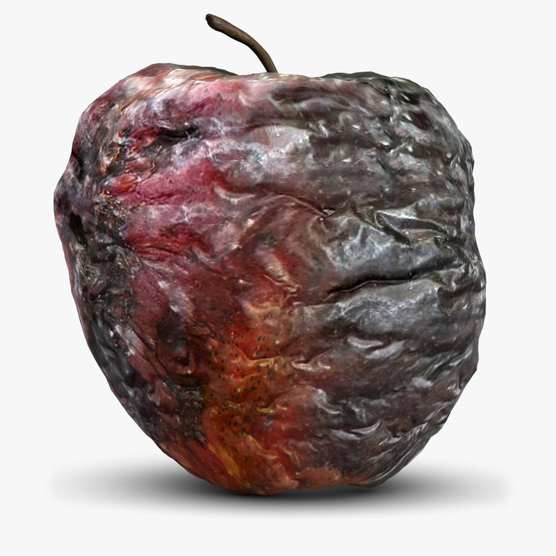
For example, the first picture in most cases will be more offputting and not wanted compared to the second. Both are an apple, but one is much more pleasant.
RottenApple2chk247.jpg8d33e5e5-9d97-41a5-bf47-63b1c45af509Original.jpg

RedApple.jpg
 

Users who are viewing this thread

Top