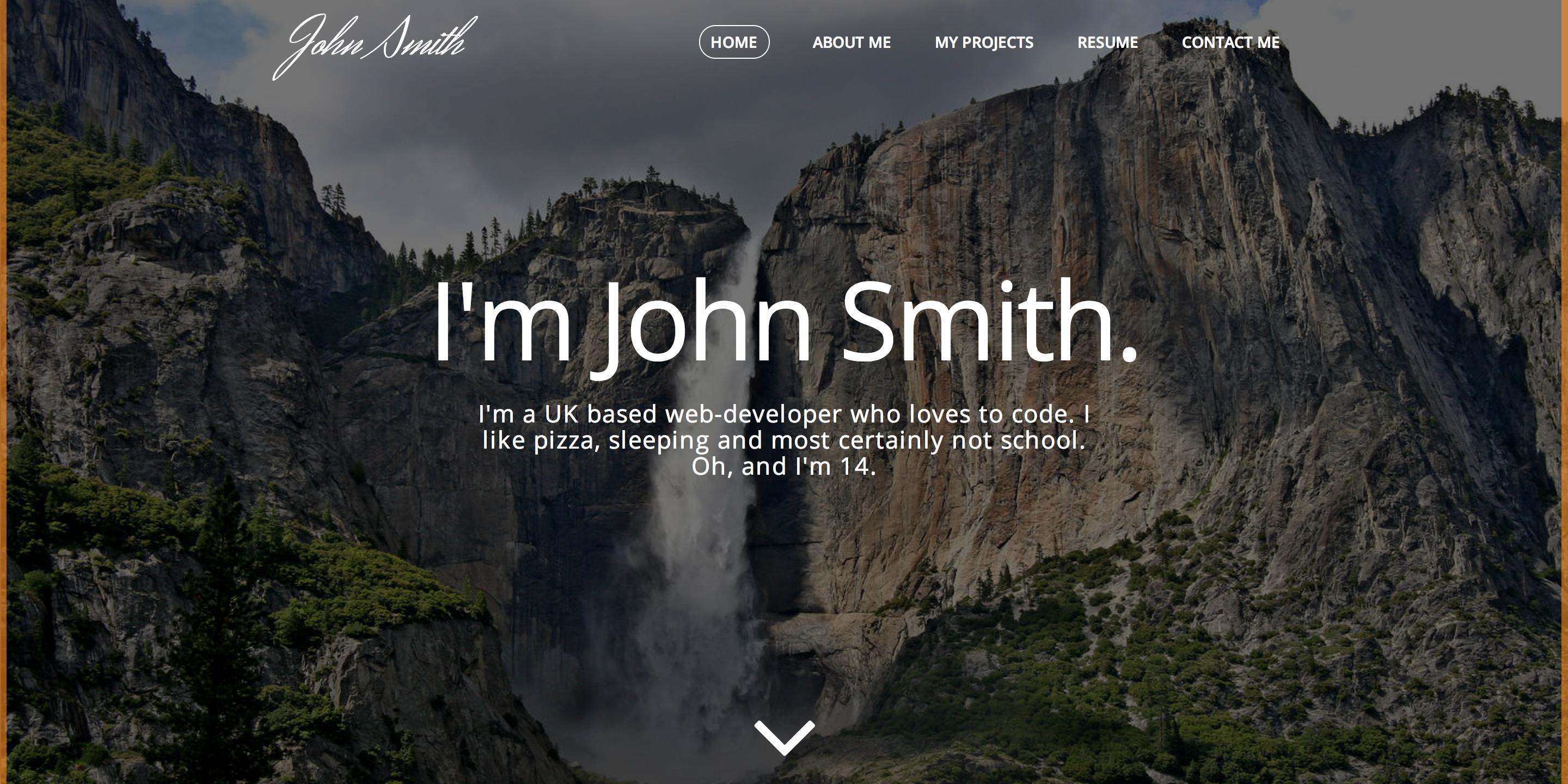
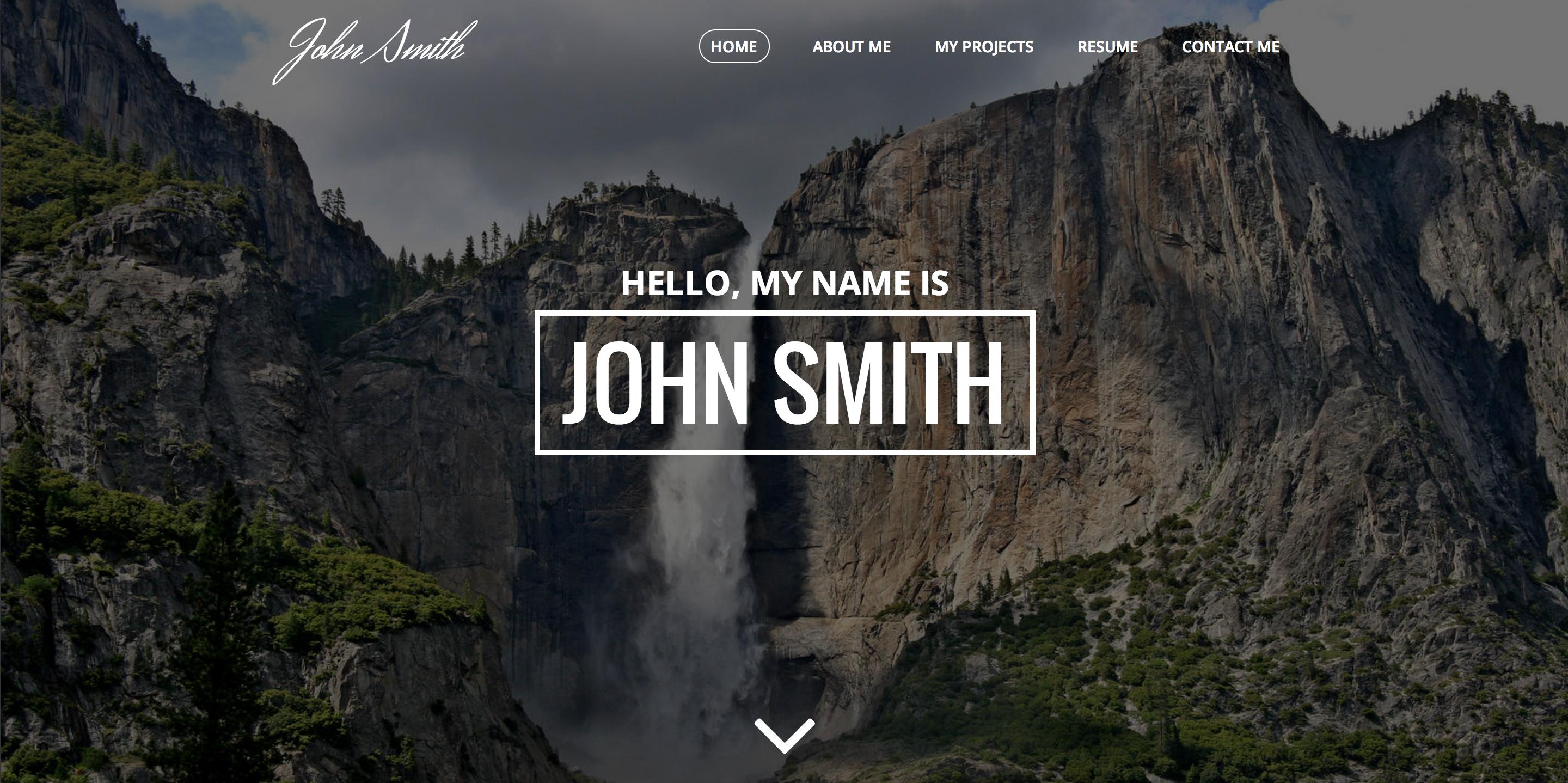
I'm more a fan of the top design. Information people see on the second design is just your name (first impressions account for a lot mayn) - although on the first design I'd use less text and keep it simple just like your design.
I do like the navigation as you've created it, it just flows well in my opinion. Keep us updated with your progress!
Can't really give much feedback as of now, we have no example code and no other content besides the introduction.
Edit: Moved thread to "showcase" as you're not really asking for any help in particular, feedback is better suited in the showcase section.
Personally I thought the top design didn't look simplistic enough - although I do think maybe a possible short sentence or some kind of information should be added. Also, I'm planning on releasing it when it's finished.
I prefer the top one tbh but increase the line height in your paragraph. And ignore these, the navigation you have now is fine. Don't decrease the border radius. Just increase the line height and it'll be good.
I prefer the top one tbh but increase the line height in your paragraph. And ignore these, the navigation you have now is fine. Don't decrease the border radius. Just increase the line height and it'll be good.


")

")