Show DevBest Chris-Pettyjohn.cu.cc [Customly Coded]

Leader

github.com/habbo-hotel
Aug 24, 2012
1,030
307
Thanks to eckostylez for the free hosting!
Thanks to Legion for an idea of the header color
And Thanks to my bipolarness to make the boxes transparent
-----------------------------------------------
I coded all of this on my own excluding the buttons.
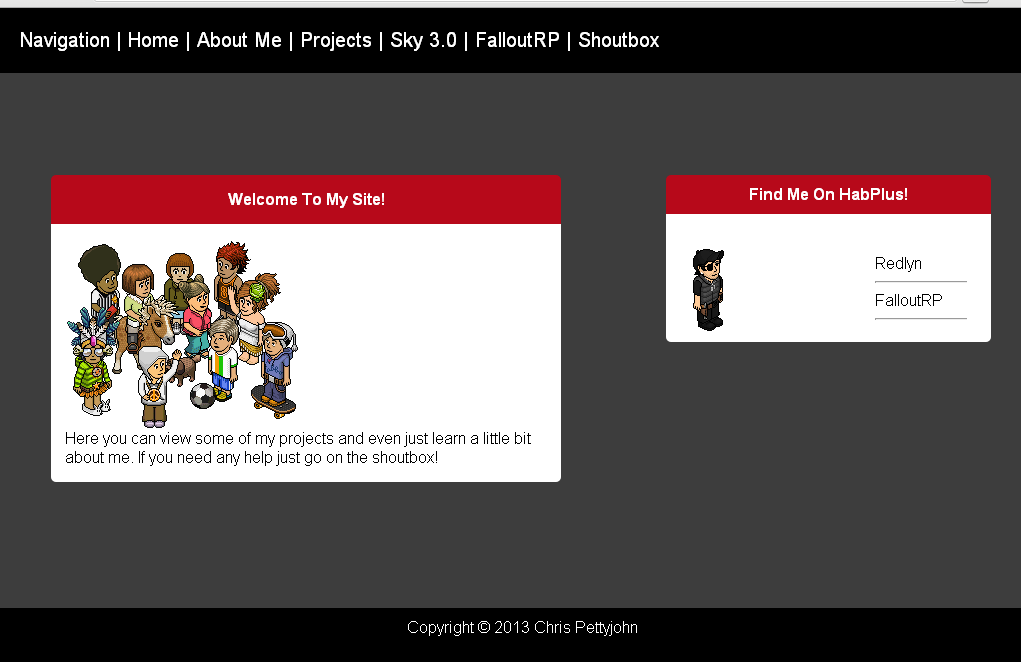
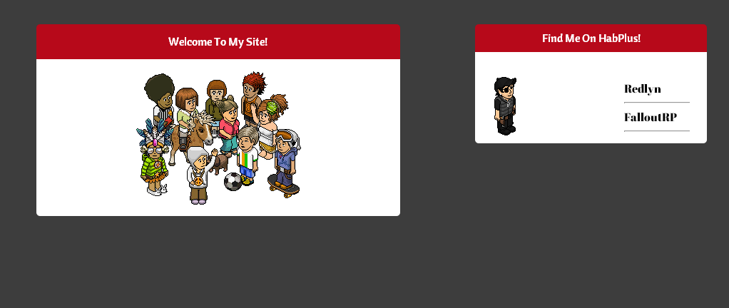
I decided to change the way the content boxes looked because I had a pyscho spree and changed the entire css over to a newer one. I will release my old css, but it isnt very good lol.
Please do not take any of my work without asking <3 and always leave copyrights

3671841835a947aebe522f8.png

Old CSS And HTML
HTML:
<Html>
<Title>Portal</Title>
<link rel="stylesheet" type="text/css" href="Main.css">
<link rel="stylesheet" type="text/css" href="Navi.css">
<Link rel="stylesheet" type="text/css" href="Box.css">
<Div Id="Header">
<br>
<center> <img src='http://i.sharefa.st/eqVtld0Ujwq0.png'>
</div>
<a href="#" class="classname">Home</a>
<a href="/sky" class="classname">Sky Series</a>
<a href="/light" class="classname">Light Series</a>
 
<Div Id="Center">
<br><br><br><br>
<Div Class="Box1T">
<center> What Can I Find Here? </center>
</div>
<Div Class="Box1C">
Here you can find all my projects that I released to the public, and you can also view some of my unfinished projects, and finished projects live!
There will also be a comment system so that way people can see reviews about the product before downloading.
</Div>
 
<Div Id="Right">
<Div Class="BoxRT">
<center> About Me </center>
</Div>
<Div Class="BoxC">
I mainly play on Habplus hotel, and my username is Redlyn.  I usually code for things like Habbo since I been with it for 5 years, but sometimes I code off habbo for the fun of it and if its requested.  I just started out coding so I may not be the best but I am improving everyday.  If you have a comment or anything please visit my guestbook
</div>
</Html>
Code:
body{
background-image:url('http://layerlovers.com/wp-content/uploads/2011/03/yikes-stripes_preview.jpg');
margin: 0;
padding: 0;
 
}
 
#Left{
float: left;
}
#Right{
margin-left:auto;
margin-right:1%;
width:20%;
}
#Center{
margin-left:auto;
margin-right:auto;
width:87%;
}
#Header{
background-color: #B7DD1D;
width: 100%;
height: 21%;
border-bottom: 5px solid black;
}
.Box1T
{
position: absolute;
top: 32%;
color: white;
font-weight: bold;
background-color: #C5D112;
width: 27%;
height: auto;
-webkit-border-top-left-radius: 6px;
-webkit-border-top-right-radius: 6px;
-moz-border-radius-topleft: 6px;
-moz-border-radius-topright: 6px;
border-top-left-radius: 6px;
border-top-right-radius: 6px;
}
.Box1C
{
background-color: white;
width: 31%;
height: auto;
padding-top: 5px;
-webkit-border-bottom-right-radius: 6px;
-webkit-border-bottom-left-radius: 6px;
-moz-border-radius-bottomright: 6px;
-moz-border-radius-bottomleft: 6px;
border-bottom-right-radius: 6px;
border-bottom-left-radius: 6px;
}
 
.BoxRT
{
position: absolute;
right: 17%;
top: 32%;
color: white;
text-align; center;
font-weight: bold;
background-color: #18B4C4;
width: 24%;
height: auto;
-webkit-border-top-left-radius: 6px;
-webkit-border-top-right-radius: 6px;
-moz-border-radius-topleft: 6px;
-moz-border-radius-topright: 6px;
border-top-left-radius: 6px;
border-top-right-radius: 6px;
}
.BoxC
{
position: absolute;
right: 17%;
top: 34%;
background-color: white;
width: 24%;
height: auto;
-webkit-border-bottom-right-radius: 6px;
-webkit-border-bottom-left-radius: 6px;
-moz-border-radius-bottomright: 6px;
-moz-border-radius-bottomleft: 6px;
border-bottom-right-radius: 6px;
border-bottom-left-radius: 6px;
}
Some of the methods I used on the old css are not very clean ones lol
Rate n slate
 

NSA

sudo apt-get thefuckout.tar.gz
Dec 9, 2011
715
86
Look nicer if the Navigation and the box was connected to the header.
Instead of having the black strip underneath the box before the box / navigation.
 

Leader

github.com/habbo-hotel
Aug 24, 2012
1,030
307
Lol, doesn't padding just make it bigger? I dont understand much about padding
 

Sysode

Front-End Developer
Dec 11, 2012
1,673
848
Lol, doesn't padding just make it bigger? I dont understand much about padding

It can do. However, padding is normally used to make text inside a box not touch the edges of the box - if that makes sense?

Sorry if it doesn't, half asleep.
 

Sysode

Front-End Developer
Dec 11, 2012
1,673
848
Completely Re Did The Site 3 times now...
EeARwau.png
It's turned all tardy?


Anyway, you have NO TRANSPARENCY ! Woo. This looks much neater and a more organised.

Ways you could possibly improve:
  • Align the image in the main box to the left, so the text can be to the side of it; it'll look better than just moving it below
  • Maybe add some box-shadow to the boxes
  • Pick a different font for the box heading, looks a little plain (Maybe go for; - Not too sure, depends how you would like it)
  • Maybe add a border-bottom to the current page in the navigation, so the visitor knows what page they are on?
Just a few suggestions to maybe help you improve. You may disagree, it's totally up to you :)
 

Leader

github.com/habbo-hotel
Aug 24, 2012
1,030
307
It's turned all tardy?


Anyway, you have NO TRANSPARENCY ! Woo. This looks much neater and a more organised.

Ways you could possibly improve:
  • Align the image in the main box to the left, so the text can be to the side of it; it'll look better than just moving it below
  • Maybe add some box-shadow to the boxes
  • Pick a different font for the box heading, looks a little plain (Maybe go for; - Not too sure, depends how you would like it)
  • Maybe add a border-bottom to the current page in the navigation, so the visitor knows what page they are on?
Just a few suggestions to maybe help you improve. You may disagree, it's totally up to you :)

I give it a shot when I get home! I was thinking the same thing with image alignment, but one thing I dont like about this style. It seems more newbish since almost anybody can make this layout. But atleast its more ogranized :)
 

NSA

sudo apt-get thefuckout.tar.gz
Dec 9, 2011
715
86
Be nice if when you added more content the navigation stayed at the top using position:fixed;
 

Roon

Member
Mar 31, 2013
60
9
<center> tags are easier, but less 'professional'.
Use....
Code:
h3 {
align: center;
align: left;
align: right;
}
 
(Above is mostly for div's or for css that only affects text. This is because it will align whatever is contained in the tags - in this example, it only affects the <h3></h3> tags.)
I also gave some other useful examples.
 
h3 {
text-align: center;
text-align: left;
text-align: right;
}
 
This will only align the text in the div, span or just generic tags.
Again, some other useful examples are shown.
Good luck with your coding, some skills for a 13 year old. Although I am only 14, still goes with out saying - bright future if you decide to do web development in college/whatever. :)

EDIT:
Also, maybe put some padding on the text, as it's touching the edge of the div, I assume it's a div. It doesn't look 'neat'.
 

BetaSparkUK

Steamworks & Greenlight Developer
Mar 25, 2013
195
238
This is starting to look promising.
If the owner of this looked at all the suggestions, and followed them. I could see a potential in this script.

So, without any more doubts, I wish you luck and it looks very good, and I hope your future additions make a good CMS.
 

Leader

github.com/habbo-hotel
Aug 24, 2012
1,030
307
This is starting to look promising.
If the owner of this looked at all the suggestions, and followed them. I could see a potential in this script.

So, without any more doubts, I wish you luck and it looks very good, and I hope your future additions make a good CMS.
Already on it....
<center> tags are easier, but less 'professional'.
Use....
Code:
h3 {
align: center;
align: left;
align: right;
}
 
(Above is mostly for div's or for css that only affects text. This is because it will align whatever is contained in the tags - in this example, it only affects the <h3></h3> tags.)
I also gave some other useful examples.
 
h3 {
text-align: center;
text-align: left;
text-align: right;
}
 
This will only align the text in the div, span or just generic tags.
Again, some other useful examples are shown.
Good luck with your coding, some skills for a 13 year old. Although I am only 14, still goes with out saying - bright future if you decide to do web development in college/whatever. :)

EDIT:
Also, maybe put some padding on the text, as it's touching the edge of the div, I assume it's a div. It doesn't look 'neat'.


Thanks ,3 I thought I added padding because for me it looks just fine but Im also using only a little bit of padding. I do what you said for the text alignment though <3
 

Roon

Member
Mar 31, 2013
60
9
Already on it....
Thanks ,3 I thought I added padding because for me it looks just fine but Im also using only a little bit of padding. I do what you said for the text alignment though <3
You're welcome, Leader.
It's just the way the text is like... touching the side of your div (again, assuming).
 

Users who are viewing this thread

Top