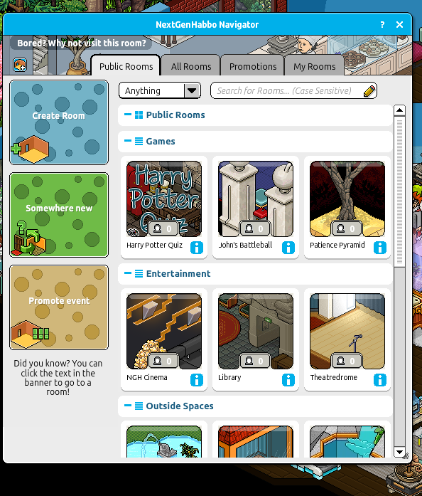
Feedback Working on a new Navigator.

HarmonicRain

NextGenHabbo.com
Jun 27, 2012
177
163
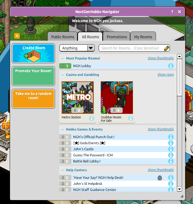
So I love a bit of XML Editing, and I started overhauling the navigator, early days, but would appriciate feedback, keep in mind all texts on this are placeholders.
Also ignore the pink header, it's because of the Valentine's Theme we currently have on.
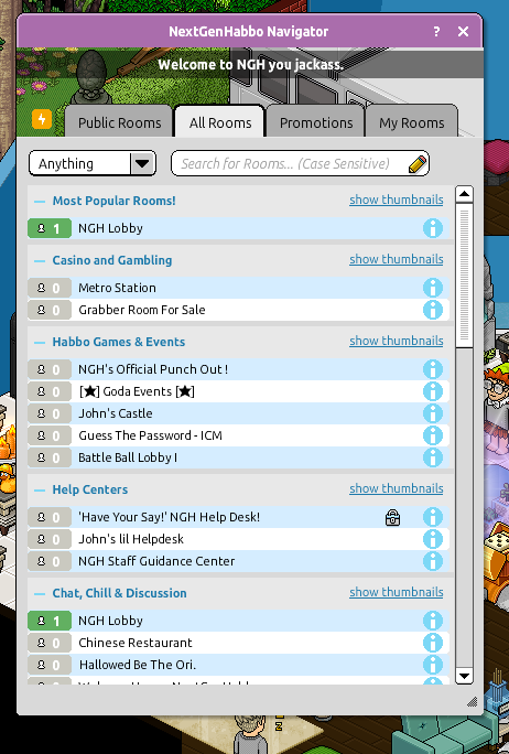
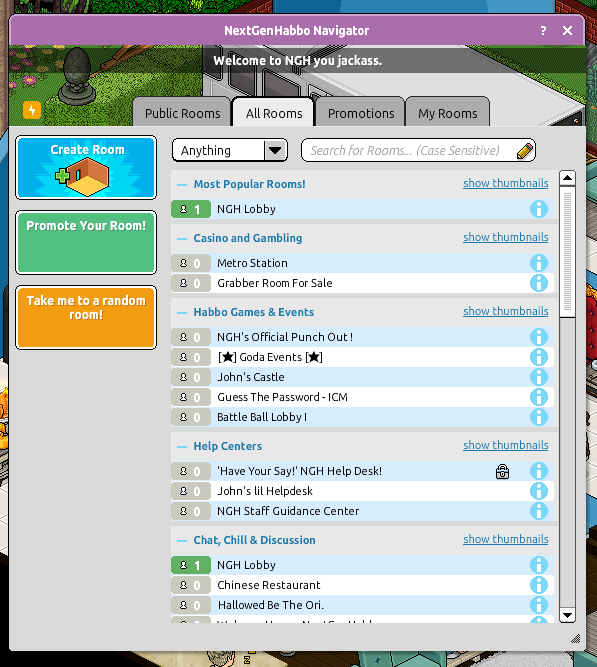
SOHqRQh.png

weZNcfE.png


4FhVH7W.png
 

HarmonicRain

NextGenHabbo.com
Jun 27, 2012
177
163
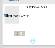
Don't usually ask for help, but if anyone has any xml knowledge feel free to reply. was trying to show owner names within the boxes, and it doesn't seem to work anymore. possibly actionscript?
QZxgIZM.png

<text x="0" y="0" width="89" height="15" params="17" style="3" name="owner_link" caption="Ownername%20PH" treshold="0" tags="OWNER">

Code used ^
Post automatically merged:

Interesting, can't wait to see what the end result is. I'm assuming you're going more for of an older style?

It's inspired by a few of Habbos work in progress navigators, won't be the exact same but here's how they looked at the time.
Post automatically merged:

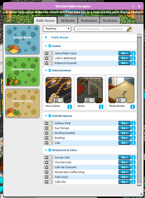
Been working hard on this today with Ridge. Here's a preview of it so far, remember feedback is appriciated.
1uprpMW.png
 

Attachments

  • Bwx850yCcAEIK3X.png
    Bwx850yCcAEIK3X.png
    359.1 KB · Views: 95
  • Feature_3.gif
    Feature_3.gif
    739.3 KB · Views: 89
  • Navigateur_mangetoica02_1411583378_6362.png
    Navigateur_mangetoica02_1411583378_6362.png
    76.2 KB · Views: 80
Last edited:

HarmonicRain

NextGenHabbo.com
Jun 27, 2012
177
163
I'll release the bins once finished. However it will have watermarks on it i'd rather not be removed.

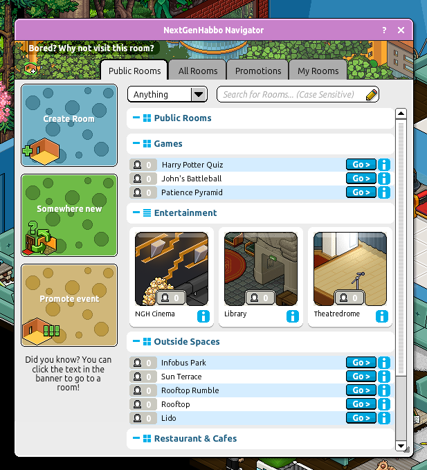
Here's the latest build as of today.
NhrUb7U.png
 

Ridge

Member
Jul 11, 2016
45
39
My current images for the Create/Promote etc Rooms are rather ugly, if anybody has some resources for good graphics I could use, please HMU! I can mish mash images okay but I'm not as good at creating alone :p
Also if there's any changes you can recommend, throw them our way too! Been loving working on this, I work on it during the day and Harmonic works at night, I download in the morning and make the edits he requests that he struggled to do ;)
 

cammy

Member
May 15, 2014
481
238
My current images for the Create/Promote etc Rooms are rather ugly, if anybody has some resources for good graphics I could use, please HMU! I can mish mash images okay but I'm not as good at creating alone :p
Also if there's any changes you can recommend, throw them our way too! Been loving working on this, I work on it during the day and Harmonic works at night, I download in the morning and make the edits he requests that he struggled to do ;)
Idk, the whole thing got progressively worse. :lol:
 

Ridge

Member
Jul 11, 2016
45
39
Hi, it had to be changed mostly for functionality. John's original reference image, and his first design looked great; but some things couldn't pass over. Room Owner couldn't be displayed as he'd wished, nor could it only have 2 navigator entry tiles when expanded, instead of the 3 on default. Both of those couldn't be changed due to our lack of knowledge on Actionscript. The black bar had to be changed to a floating container because, with the black bar, the navigator was too tall for smaller resolutions using the Johns size of the header. Otherwise only the black bar would be seen, and not the image. I stretched the images into more square shape because otherwise the side bar looked extremely empty and I didn't like it.

I'm sad people didn't like my work, but Harmonic is happy with it which I can settle for.
 

cammy

Member
May 15, 2014
481
238
Hi, it had to be changed mostly for functionality. John's original reference image, and his first design looked great; but some things couldn't pass over. Room Owner couldn't be displayed as he'd wished, nor could it only have 2 navigator entry tiles when expanded, instead of the 3 on default. Both of those couldn't be changed due to our lack of knowledge on Actionscript. The black bar had to be changed to a floating container because, with the black bar, the navigator was too tall for smaller resolutions using the Johns size of the header. Otherwise only the black bar would be seen, and not the image. I stretched the images into more square shape because otherwise the side bar looked extremely empty and I didn't like it.

I'm sad people didn't like my work, but Harmonic is happy with it which I can settle for.
The functionality is excellent, it's the design that's off-putting.
You must be registered for see images attach
 

Ridge

Member
Jul 11, 2016
45
39
The functionality is excellent, it's the design that's off-putting.
You must be registered for see images attach
That's my point. John's wasn't as functional; the room buttons didn't work so you couldn't create rooms, the header overstretched when minimised, and as I said I stretched the images due to the empty space. He picked the user count icon, I think.
 

Users who are viewing this thread

Top