Show DevBest What Should I Do Next? [Web Design]

IntactDev

Member
Nov 22, 2012
399
71
Hello DevBest.

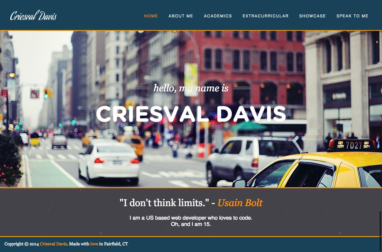
I use to only code, and never design, because I never knew what to do next on one of my designs. But now, I'm pushing to become great at both coding and designing, so I would have a full set of skills. I designed a portfolio for myself, and I am at a standstill, in terms of what content to add next. Here is what I have now.


Can anyone suggest what I should change, or what I should add to complete the webpage?

Thanks in Advance,
Chris
 
Last edited:

Sysode

Front-End Developer
Dec 11, 2012
1,673
848
I swapped the labels for the images around, you had them the wrong way :p

Anyway, here are a few tips you could use for improving in my opinion:

  • Design your website around your logo (or vice versa) - For some reason I feel the yellow in the logo doesn't really match with anything on the site;
  • Typography is a key part of design, choosing fonts that go well is always good and considering what their role is, is even better. For example, at the moment I feel your navigation font would suit better as a paragraph font and your main text over the image would suit better if it was bigger and stood out more on the page;
  • Chill with the shadows on the text, it looks like you're going for a flat sort of feel, keep it that way. By all means keep the shadow just go a little lighter maybe?
  • The colour of the font on the green doesn't feel right, maybe go for a white or lighter font or else the contrast starts to clash
  • I don't think the footer needs to be so large, it's not an important part of the page and it doesn't need much attention at all - reduce the padding you're using and maybe center the text
Sorry if this seems a lot, in reality it's not.. I've just attempted to explain why I've said each point. If there's anything you don't understand (probably because I rushed this and it doesn't make sense) just ask. It's a design that could be nice and modern, stick with it and take in to account what others have to say about it.

--
Also, moved this to "showcase" as that's the best place for feedback.
 

IntactDev

Member
Nov 22, 2012
399
71
I changed the layout colorway a bit. How's this @Sysode?

V2wcwiJ.jpg
 
Last edited:

IntactDev

Member
Nov 22, 2012
399
71
UPDATE:


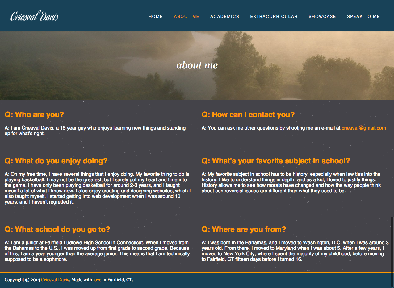
How does this look? I wasn't sure how to design this page so I did it in a "FAQ" kinda layout.
B5Qi0Bp.png
 
Last edited:

Users who are viewing this thread

Top