Show DevBest Website Template - DoS V2

Status
Not open for further replies.

Kryptos

prjRev.com
Jul 21, 2010
2,205
1,252
So, here's a template I have made, right now I am trying to sell it so I can have the money to buy a domain for future projects, etc.
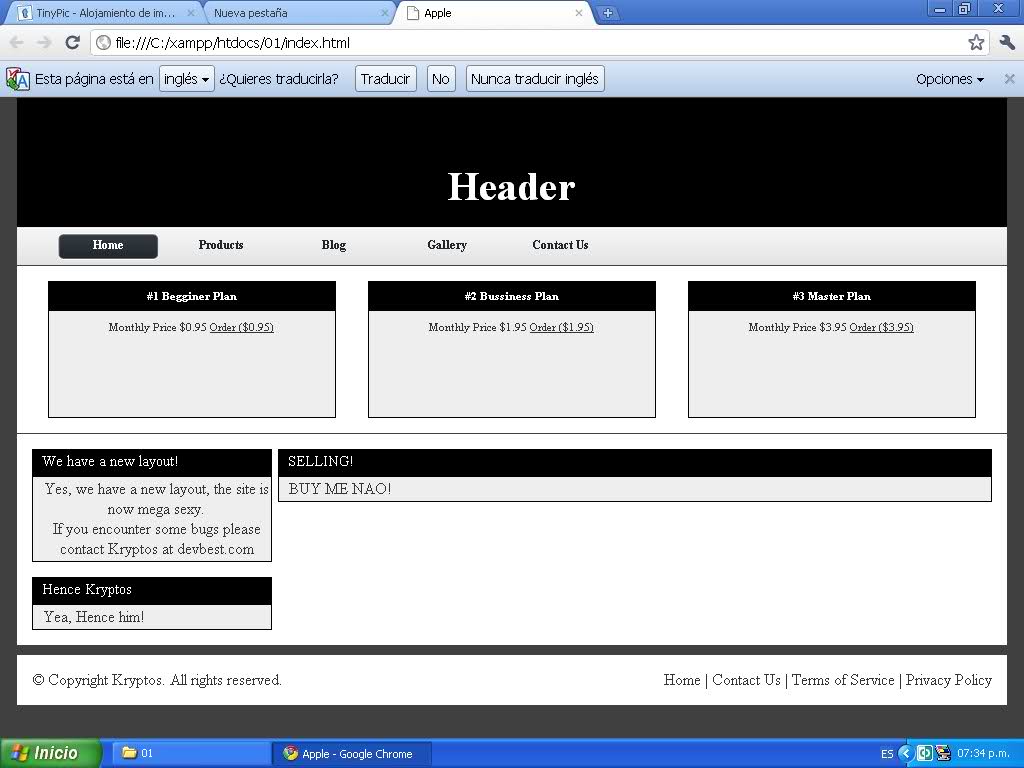
Here it is:
hu13bp.jpg


If you're interested in buying it go here:

Any suggestions are welcomed, I would really appreciate your thoughs as I think the design can be a lot better, just need some ideas for this design, I have ideas for other designs, etc. But I think this one can be a lot better.
So, share your thoughs, opinions and your feedback pl0x.
 

Kryptos

prjRev.com
Jul 21, 2010
2,205
1,252
I suggest you add more colour, its kinda plain.
I do agree with you, I think the Combination of colors is a bit sad, but really, I have tried many colors and they just don't go with the design, so I think I should start from scratch again, but I still wanna sell this one, as it took some hours of work getting everything right.
 

RastaLulz

fight teh power
Staff member
May 3, 2010
3,926
3,921
I'd fix the following things:
  • Text could look better.
  • Text throught the layout should generally be the same.
  • Header is too plain.
  • Margin should appear the same throughout the layout in all mediums of content boxes.
  • As stated above, the layout could use more color. It's gray at the moment.
  • Padding is off in the headers of content boxes.

Other than that, it's good. You will only get better. :cool:
 

Kryptos

prjRev.com
Jul 21, 2010
2,205
1,252
I'd fix the following things:
  • Text could look better.
  • Text throught the layout should generally be the same.
  • Header is too plain.
  • Margin should appear the same throughout the layout in all mediums of content boxes.
  • As stated above, the layout could use more color. It's gray at the moment.
  • Padding is off in the headers of content boxes.

Other than that, it's good. You will only get better. :cool:

Thanks for the suggestions, I will work on the text + I'll get another header or just another header color and maybe just recolor everything from there.

I'll work on the margin, I shall update this thread tomorrow or Tuesday with the template.

Any more thoughts, suggestions, or opinions on how it looks? :)
 

habbz

Custom Title bitchssssssss
Nov 12, 2010
227
1
Looks really nice, but the boxe tops should be a little rounded to take the edge off.
8/10
 
Status
Not open for further replies.

Users who are viewing this thread

Top