Soup Index - Login/Register -

Dec 7, 2016
65
5
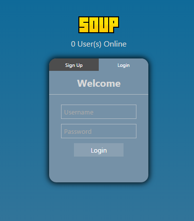
Previously I attempted to create a Index and it was pretty much a disaster, I'm proud of it but it was still a disaster and I felt pretty bad that some people had to see that, SO! I decided I'd make up for it with hopefully a much less blocky, ugly Register/Login Index, which I'm calling:

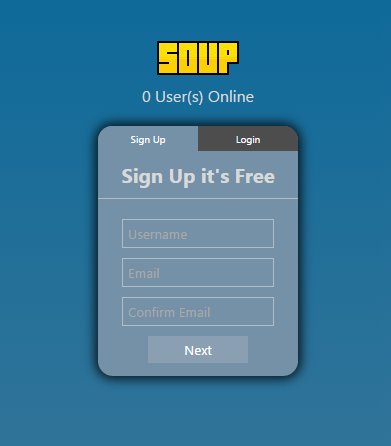
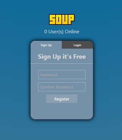
Soup Version 1.We Don't Mention the Previous Version
It's simple, I know, it's less ugly though, I hope :c It was my first attempt at using JavaScript, you can't see it but it actually has a fade effect when you change from "Login" > "Register":
login.png

reg1.png

reg2.png
 

JayC

Always Learning
Aug 8, 2013
5,493
1,398
Nope, still just as ugly and still wouldn't use it.

However; with this one I will provide help in making it better :) Then it can be v1 fuck the previous versions.

- Add border around Register button
- Sign Up and Login should have a bigger font size
- Password, Confirm Password and Sign Up Its Free need to be a very light color (White as you can get).
- Maybe try a gradient with the box color (To go along with your nice box shadow :up:)
- Remove the snow effect (Doesn't look all that great anyway - slows down the loading time as well)

I generally feel your page is pretty large and that box isn't very big... I feel this way because of the width of the box is almost the same width as the logo.. so I suggest getting rid of all the white space you didn't show us ;)
 
Dec 7, 2016
65
5
Nope, still just as ugly and still wouldn't use it.

However; with this one I will provide help in making it better :) Then it can be v1 fuck the previous versions.

- Add border around Register button
- Sign Up and Login should have a bigger font size
- Password, Confirm Password and Sign Up Its Free need to be a very light color (White as you can get).
- Maybe try a gradient with the box color (To go along with your nice box shadow :up:)
- Remove the snow effect (Doesn't look all that great anyway - slows down the loading time as well)

I generally feel your page is pretty large and that box isn't very big... I feel this way because of the width of the box is almost the same width as the logo.. so I suggest getting rid of all the white space you didn't show us ;)

Yeah was more for me to try using jquery for the first time, I've only been doing this for about 8 days, making progress. As for the snow effect that's actually on this website ;p
 

NeedForSpreed

Member
May 18, 2014
326
71
This website looks more "mobile friendly", it's pretty much a large box, on my honor 8 it would look great, but for wider screens doubt it. Try adding more stuff [emoji14]

Skickat från min FRD-L09 via Tapatalk
 

Users who are viewing this thread

Top