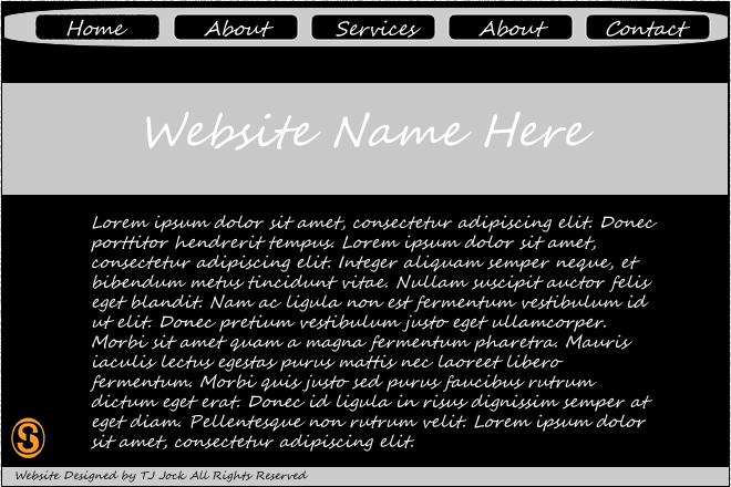
My first web design on fireworks, very simple took me about 10 minutes to do.
Kush Member Nov 12, 2010 296 10 Nov 23, 2010 #1 My first web design on fireworks, very simple took me about 10 minutes to do.
Ayumi Joshua Pike. Sep 13, 2010 1,028 73 Nov 23, 2010 #5 Simple, but not exactly well thought out if I say so myself. try adding a bit more too it?
RastaLulz fight teh power Staff member May 3, 2010 3,926 3,921 Nov 23, 2010 #6 There are many things wrong with this design: The font looks horrible. The border-radius on the navigation bar doesn't look good at all. You really should use different colors. Try getting ideas You must be registered for see links . The design should be much bigger, as most layouts average between 800 to 1000 pixels in width. Practice makes prefect.
There are many things wrong with this design: The font looks horrible. The border-radius on the navigation bar doesn't look good at all. You really should use different colors. Try getting ideas You must be registered for see links . The design should be much bigger, as most layouts average between 800 to 1000 pixels in width. Practice makes prefect.
Livar Now 35% cooler! Oct 15, 2010 846 86 Nov 23, 2010 #7 Not thing that I would use tbh, Just improve the font, and the size of it!
Kush Member Nov 12, 2010 296 10 Nov 23, 2010 Thread starter #9 Well its only my first, I personally would give it 1/10. More to come soon.
Jo$h Posting Freak Jul 7, 2010 1,030 79 Nov 23, 2010 #10 You really should try learning barebones coding rather than using fireworks
habbz Custom Title bitchssssssss Nov 12, 2010 227 1 Apr 20, 2011 #12 You must be registered for see images attach This your name? [footer] Anyways i dont like 1/10


")