Heaplink
Developer & Designer
So, recently me and a friend of mine started on a project. We decided to make an application, where you can store snippets of text or code that you can use later. The main goal for the app is that it is easy to use, it's portable so you can keep all your snippets with you and also have a nice and sleek UI that makes you wan't to use this app, rather than just an application you just have there.
Our ideas so far is that it's a small application that is located in your taskbar in the notification area. When you wan't to make a new snippet either a combination of hotkeys is pressed and you can paste your snippet and save it right in your "Snippt Book" as we call them. These books can be shared not only between your devices, but also to the public!
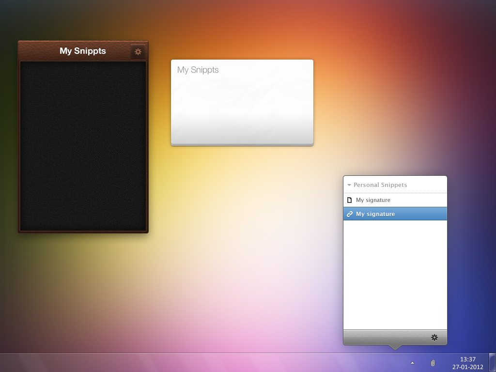
Each Snippt Book contains categories, that can be created by the user and snippets for the categories the user choose. But enough for me talking about the app, let's get right to it. I'm the designer (and part developer) of the application and currently designing the application's UI. This is what I've made so far:

Note that it's not three (3) different applications, but just one with different design. I wan't to make a simple but yet good looking UI for the app that the user will like for the finished product. So if you can help me with these questions...

Our ideas so far is that it's a small application that is located in your taskbar in the notification area. When you wan't to make a new snippet either a combination of hotkeys is pressed and you can paste your snippet and save it right in your "Snippt Book" as we call them. These books can be shared not only between your devices, but also to the public!
Each Snippt Book contains categories, that can be created by the user and snippets for the categories the user choose. But enough for me talking about the app, let's get right to it. I'm the designer (and part developer) of the application and currently designing the application's UI. This is what I've made so far:

Note that it's not three (3) different applications, but just one with different design. I wan't to make a simple but yet good looking UI for the app that the user will like for the finished product. So if you can help me with these questions...
- Which of these looks best in your eyes?
- What could be improved (note that they're not finished projects)


