Reech Maintenance

Moon

If life is a Bitch, Fuck it |
Dec 25, 2017
59
20
Hey guys, I'm new to Devbest and don't have alot of Web Development skills, only the basics but as I'm learning I think the best way for me to learn would be for me to study and edit something on my level. So I was searching on Devbest and I love the style of the maintenance page released by @KyleVonnie. I cleaned up some of the code I think and managed to make it easier to read. I know its sloppy but its the best I could do and hopefully next time I should do better!
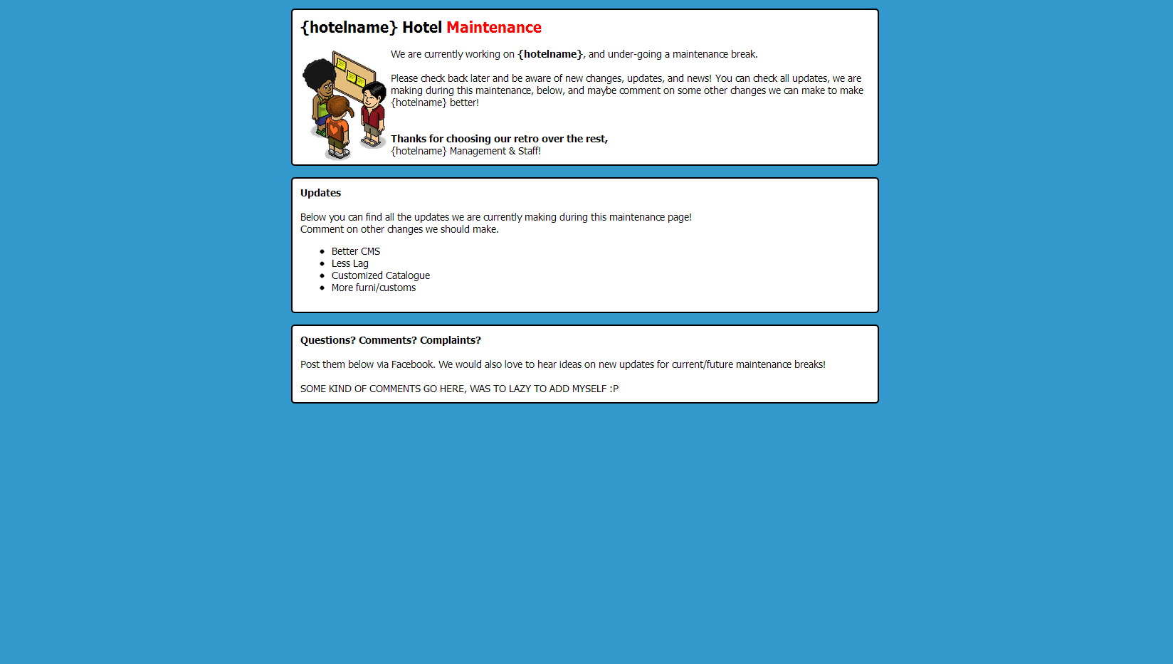
DlYjSTc.png
capture-png.6698
capture-png.6698
Also the code before I edited it:
HTML:
<!DOCTYPE html>
 
 
    <title>Maintenance Break</title>
 
    <style type="text/css">
 
    body {
 
      font-family:"Tahoma",Verdana,Arial;
 
      font-size:13px;
 
      background: #3399CC repeat;
 
    }
 
    #container {
 
      background: #ffffff;
 
      width: 728px;
 
      margin: 15px auto 15px auto;
 
      padding: 10px; border: 2px solid black;
 
      -moz-border-radius: 5px;
 
      -webkit-border-radius: 5px;
 
      border-radius: 5px;
 
    }
 
    </style>
<div id="fb-root"></div>
<body>
 
 
<div id="container">
 
<b style="font-size: 150%;">{hotelname} Hotel <font color="red">Maintenance</font></b>
 
<br /><br />
<IMG SRC="http://habboemotion.com/resources/images/figures/Figure%20(4).gif"  ALIGN=LEFT>
    We are currently working on <strong>{hotelname}</strong>, and under-going a maintenance break.
<br>
<br>Please check back later and be aware of new changes, updates, and news! You can check all updates, we are making during this maintenance,
below, and maybe comment on some other changes we can make to make {hotelname} better!
<br><br>
<br><strong>Thanks for choosing our retro over the rest,</strong>
<br>{hotelname} Management & Staff!<br>
 
</div>
 
<div id="container">
 
<b style="font-size: 100%;">Updates</b><br><br>
 
Below you can find all the updates we are currently making during this maintenance page! <br>
Comment on other changes we should make.
<br>
<ul>
    <li>Better CMS</li>
    <li>Less Lag</li>
    <li>Customized Catalogue</li>
    <li>More furni/customs</li>
</div>
<div id="container">
 
<b style="font-size: 100%;">Questions? Comments? Complaints?</b><br><br>
Post them below via Facebook. We would also love to hear ideas on new updates for current/future maintenance breaks!
<br><br>
 
SOME KIND OF COMMENTS GO HERE, WAS TO LAZY TO ADD MYSELF :P
 
</body>
 
</html>
And the Code after I edited it:
HTML:
<!DOCTYPE html>
<!-- Reech Maintenace Page V 1.0 -->
<html>
<!-- Link to CSS File -->
<link rel="stylesheet" type="text/css" href="css/main.css">

<head>
    <title>Maintenance Break</title>
    <link rel="shortcut icon" href="css/img/favicon.ico" type="image/x-icon">
    <link rel="icon" href="css/img/favicon.ico" type="image/x-icon">
</head>
<body>
 
  <div id="container">
 
    <b style="font-size: 150%;">Under <font color="red">Maintenance</font></b>
 
    <br>
    <IMG SRC="css/img/figure2.gif"  ALIGN=LEFT>
    <p> Hey, we're sorry but unfortunatley our website is under <strong>  Maintenance </strong> at the momment, but don't worry ! </p>
    <br>
    <br>
    <p> We're sorry that our website is under maintenance, but when it's back, it will be better & faster, but we're sorry for any trouble
    that this has caused you! On the bright-side you can look forward to a new slick & fast website ! <p>
    <br>
    <br><strong> <p> Thanks for baring with us for a little bit, </strong> Reech Management! </p>
 
  </div>
 
  <div id="container">
 
  <b style="font-size: 100%;">What will be on the new update !</b><br><br>
 <!-- Change depending on what would be on the website/web-update -->
  <p>On the new website update you can expect these slick new features !</p>
  <ul>
    <li>Feature1</li>
    <li>Feature2</li>
    <li>Feature3</li>
    <li>Feature4</li>
  </ul>
  </div>
  <div id="container">
 <!-- Contact Section -->
  <h2> Contact us ! </h2>
  <b style="font-size: 100%;">Interested in speaking to us at Reech ?</b><br><br>
  <p>Why not shoot a message to Reech's Founder on Twitter ! @{TwitterName}</p>

 
</body>
</html>
I think I did a semi-alright job at making it a little bit better !
Link to download:

Be honest with your opinions, and yes I know that <br> is bad to use, but it was in the original code and I couldn't think of a way to clean it up.
 
Also the background is a gif, so it looks alot better when you actually open it instead of the scrnshot.
 
Have no idea why it was moved to Habbo Releases as the only relation to Habbo is an image, While other maintenance forums are almost 100% Habbo, confusing but still, at least it's on Habbo.
 

Attachments

  • Capture.PNG
    Capture.PNG
    140.3 KB · Views: 392

Kristo

Website & Software Developer
Feb 5, 2015
269
69
Hiya,

I personally am not keen on the design of the page. The modules are just not my type of design. A public perspective on this page would be that it's simple and easy to navigate. It's not over complicated and is easy enough to understand.
The code that you have linked is good and easy to find content in. I will not hide from the fact that my code is always messy and hard to navigate but I do try when I have time to make it neat and more understandable.

Good Work!
 

Gang67

|Jump out gang, we jump out those vehicles|
May 5, 2017
303
54
Hey guys, I'm new to Devbest and don't have alot of Web Development skills, only the basics but as I'm learning I think the best way for me to learn would be for me to study and edit something on my level. So I was searching on Devbest and I love the style of the maintenance page released by @KyleVonnie. I cleaned up some of the code I think and managed to make it easier to read. I know its sloppy but its the best I could do and hopefully next time I should do better!
DlYjSTc.png
capture-png.6698
capture-png.6698
Also the code before I edited it:
HTML:
<!DOCTYPE html>
 
 
    <title>Maintenance Break</title>
 
    <style type="text/css">
 
    body {
 
      font-family:"Tahoma",Verdana,Arial;
 
      font-size:13px;
 
      background: #3399CC repeat;
 
    }
 
    #container {
 
      background: #ffffff;
 
      width: 728px;
 
      margin: 15px auto 15px auto;
 
      padding: 10px; border: 2px solid black;
 
      -moz-border-radius: 5px;
 
      -webkit-border-radius: 5px;
 
      border-radius: 5px;
 
    }
 
    </style>
<div id="fb-root"></div>
<body>
 
 
<div id="container">
 
<b style="font-size: 150%;">{hotelname} Hotel <font color="red">Maintenance</font></b>
 
<br /><br />
<IMG SRC="http://habboemotion.com/resources/images/figures/Figure%20(4).gif"  ALIGN=LEFT>
    We are currently working on <strong>{hotelname}</strong>, and under-going a maintenance break.
<br>
<br>Please check back later and be aware of new changes, updates, and news! You can check all updates, we are making during this maintenance,
below, and maybe comment on some other changes we can make to make {hotelname} better!
<br><br>
<br><strong>Thanks for choosing our retro over the rest,</strong>
<br>{hotelname} Management & Staff!<br>
 
</div>
 
<div id="container">
 
<b style="font-size: 100%;">Updates</b><br><br>
 
Below you can find all the updates we are currently making during this maintenance page! <br>
Comment on other changes we should make.
<br>
<ul>
    <li>Better CMS</li>
    <li>Less Lag</li>
    <li>Customized Catalogue</li>
    <li>More furni/customs</li>
</div>
<div id="container">
 
<b style="font-size: 100%;">Questions? Comments? Complaints?</b><br><br>
Post them below via Facebook. We would also love to hear ideas on new updates for current/future maintenance breaks!
<br><br>
 
SOME KIND OF COMMENTS GO HERE, WAS TO LAZY TO ADD MYSELF :P
 
</body>
 
</html>
And the Code after I edited it:
HTML:
<!DOCTYPE html>
<!-- Reech Maintenace Page V 1.0 -->
<html>
<!-- Link to CSS File -->
<link rel="stylesheet" type="text/css" href="css/main.css">

<head>
    <title>Maintenance Break</title>
    <link rel="shortcut icon" href="css/img/favicon.ico" type="image/x-icon">
    <link rel="icon" href="css/img/favicon.ico" type="image/x-icon">
</head>
<body>
 
  <div id="container">
 
    <b style="font-size: 150%;">Under <font color="red">Maintenance</font></b>
 
    <br>
    <IMG SRC="css/img/figure2.gif"  ALIGN=LEFT>
    <p> Hey, we're sorry but unfortunatley our website is under <strong>  Maintenance </strong> at the momment, but don't worry ! </p>
    <br>
    <br>
    <p> We're sorry that our website is under maintenance, but when it's back, it will be better & faster, but we're sorry for any trouble
    that this has caused you! On the bright-side you can look forward to a new slick & fast website ! <p>
    <br>
    <br><strong> <p> Thanks for baring with us for a little bit, </strong> Reech Management! </p>
 
  </div>
 
  <div id="container">
 
  <b style="font-size: 100%;">What will be on the new update !</b><br><br>
 <!-- Change depending on what would be on the website/web-update -->
  <p>On the new website update you can expect these slick new features !</p>
  <ul>
    <li>Feature1</li>
    <li>Feature2</li>
    <li>Feature3</li>
    <li>Feature4</li>
  </ul>
  </div>
  <div id="container">
 <!-- Contact Section -->
  <h2> Contact us ! </h2>
  <b style="font-size: 100%;">Interested in speaking to us at Reech ?</b><br><br>
  <p>Why not shoot a message to Reech's Founder on Twitter ! @{TwitterName}</p>

 
</body>
</html>
I think I did a semi-alright job at making it a little bit better !
Link to download:

Be honest with your opinions, and yes I know that <br> is bad to use, but it was in the original code and I couldn't think of a way to clean it up.
 
Also the background is a gif, so it looks alot better when you actually open it instead of the scrnshot.
 
Have no idea why it was moved to Habbo Releases as the only relation to Habbo is an image, While other maintenance forums are almost 100% Habbo, confusing but still, at least it's on Habbo.
Really don't like the design, as for your code cleanup all you have to do is go to 'DirtyMarkup HTML' and it does it for you lol
 

Moon

If life is a Bitch, Fuck it |
Dec 25, 2017
59
20
Really don't like the design, as for your code cleanup all you have to do is go to 'DirtyMarkup HTML' and it does it for you lol
Thanks, DirtyMarkup will save me alot of time lol. But the whole point of it really was just to learn and add some things its not meant to be actually used as I agree it's not the best looking.
 
Hiya,

I personally am not keen on the design of the page. The modules are just not my type of design. A public perspective on this page would be that it's simple and easy to navigate. It's not over complicated and is easy enough to understand.
The code that you have linked is good and easy to find content in. I will not hide from the fact that my code is always messy and hard to navigate but I do try when I have time to make it neat and more understandable.

Good Work!
Thanks, and yeah I didn't like the design to much either, but it's alright I guess. Thanks
 

Queso

echo 'Web Developer';
Nov 29, 2016
232
72
@xFlyx don't be rude :eek: keep doing you @Moon this was a great practice template, you will definitely go far if you keep up your work. Also try to release more content like this, I like how you modified this template, looks a lot cleaner than the original.
 

Moon

If life is a Bitch, Fuck it |
Dec 25, 2017
59
20
@xFlyx don't be rude :eek: keep doing you @Moon this was a great practice template, you will definitely go far if you keep up your work. Also try to release more content like this, I like how you modified this template, looks a lot cleaner than the original.
Ah, I've got alot better since this, if you look at some of my posts, I've released alot of better things.
 

treebeard

Member
Jan 16, 2018
317
173
Hey I totally got what you were trying to say in your original post. Sure the design is basic and not so standout-ish but you were just trying to get some experience under your belt!

I think if you learned to do a few things right, a few things to avoid doing, and had a little fun in the process then this was a success!
I look forward to seeing more of your work in the future :)
 

Users who are viewing this thread

Top