You are using an out of date browser. It may not display this or other websites correctly.
You should upgrade or use an alternative browser.
You should upgrade or use an alternative browser.
Show DevBest [Rate] My new website template!
- Thread starter AaidenX
- Start date
Sysode
Front-End Developer
Consistency is key on a website, it just helps it to flow better.
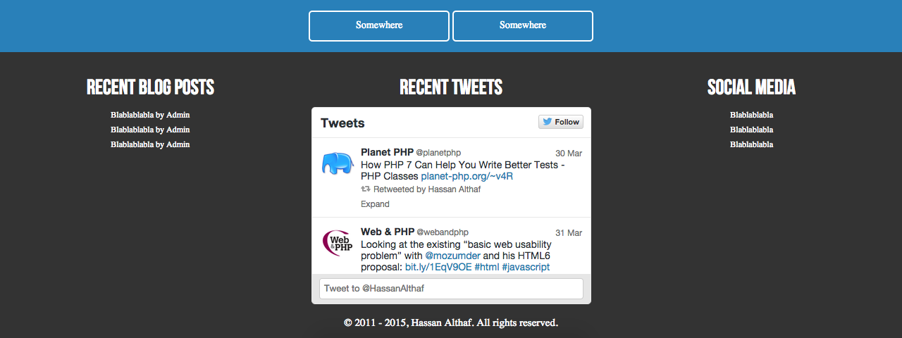
Sorry to start with that, it was just the first thing that hit me when I visited - on the navigation and so on you have a nice amount of padding being used but as you scroll down to what I assume is the content area, it becomes all squished, then you're hit with a footer that's larger than the content area itself.
Think about what you want your visitors to focus on and make that the primary attention grabber - a footer doesn't have that much of an important role on most websites, it just needs to be there - I'd avoid making it as large as you currently have it.
Can't really make any other comments as you haven't done an awful lot but all in all, it's a pretty nice website. It'd be better if the background image was actually your setup but it's modern and pretty clean - keep with that! Keep us updated man.
Sorry to start with that, it was just the first thing that hit me when I visited - on the navigation and so on you have a nice amount of padding being used but as you scroll down to what I assume is the content area, it becomes all squished, then you're hit with a footer that's larger than the content area itself.
Think about what you want your visitors to focus on and make that the primary attention grabber - a footer doesn't have that much of an important role on most websites, it just needs to be there - I'd avoid making it as large as you currently have it.
Can't really make any other comments as you haven't done an awful lot but all in all, it's a pretty nice website. It'd be better if the background image was actually your setup
 but it's modern and pretty clean - keep with that! Keep us updated man.
- Thread starter
- #8
Haha. Thanks @Markshall any recommendations to improve the desktop version?
Thanks for all your response guys, without you guys, my website wouldn't be as it is now without you guys' feedback.
@Sysode Footer updated, any better now?
@brsy Check now please.
@Hannurh Is the spacing of buttons better now? It is not a navigation, just some hotlinks.
More progress! I did a part of the About page, but can't think of more content to write. :/
Sysode
Front-End Developer
Yeah, I see what Mark's saying, on a mobile it's lot tidier.. I think it's due to no real container being present. Viewing on a 24" monitor everything is super stretched.
Anyway, in reguards to the footer (going to be honest I can't remember the old one) but I think you've just made it smaller, right? I didn't necessarily mean that, you can have larger footers it just doesn't seem right when the footer is larger and holds more content than the actual body of the page itself.
I'd defo try and aim for some more content on the homepage, it feels a little lonely at the moment.
Keep it up though man

Sysode
Front-End Developer
Since it's a personal site you don't really need to add anything - keep it as it now, just fill your page with some more content.Yup, I dont know what to do add in the footer.
Users who are viewing this thread
Total: 3 (members: 0, guests: 3)


