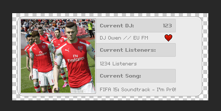
Radio Stats Box

Owen

Mar 20, 2013
1,208
614
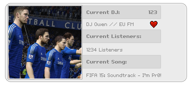
This looks a little bit habbo-ish but at this moment it isn't but yeah this is what I've came up with so far. I don't know what really to fit in the side of the right since theres not much to fit in there but once I've sorted the design etc, I'm going to code this then I might release it.
Uwx579b.png
 

Ghost

Legacy, it's all anyone leaves behind.
Jun 8, 2012
1,640
503
I like it the color goes well together! For the 2nd one, Blue with Grey doesn't go well unless the blue is like really dark like Navy Blue.
 

Unidentified

Living the Developer Life...
Jun 19, 2012
144
20
I love it But the Corners have too much of a Radius.. A Radius is not really needed
You must be registered for see images attach
 

Owen

Mar 20, 2013
1,208
614
I love it But the Corners have too much of a Radius.. A Radius is not really needed
You must be registered for see images attach
I was thinking of just doing it in a square but I thought I'd change it around since like every radio straight mainly have it in squares these days but yeah I kinda agree with you there, thanks for the feedback.

I like it the color goes well together! For the 2nd one, Blue with Grey doesn't go well unless the blue is like really dark like Navy Blue.
I don't think it really doesn't matter about the image box for the album art cuz anyway when a song plays it will just do an album art of that artist. Anyway, thanks for the feedback.
 

Users who are viewing this thread

Top