Shado
Member
- Oct 7, 2013
- 146
- 17
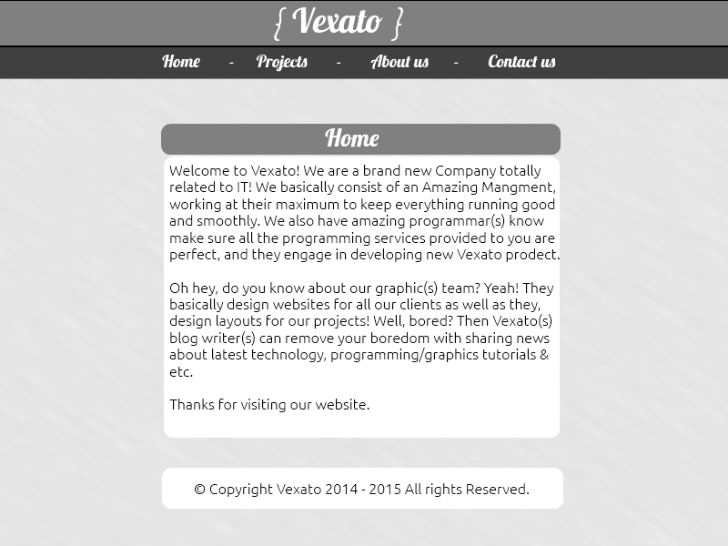
PREVIEW (Images):
Information:
I created this template for Vexato (MyIndursty) and I just want your feedbacks, Hope you like it guys.
NOTES:
PDN mean
I fired from Vexato so Hassan can't do anything
---------------------------------------------------------------------------------------------------------------------------------------------------------------------------------------
Thanks Shado.
Information:
I created this template for Vexato (MyIndursty) and I just want your feedbacks, Hope you like it guys.
NOTES:
PDN mean
You must be registered for see links
So I didn't created it from PhotoshopI fired from Vexato so Hassan can't do anything
---------------------------------------------------------------------------------------------------------------------------------------------------------------------------------------
Thanks Shado.
Last edited:


