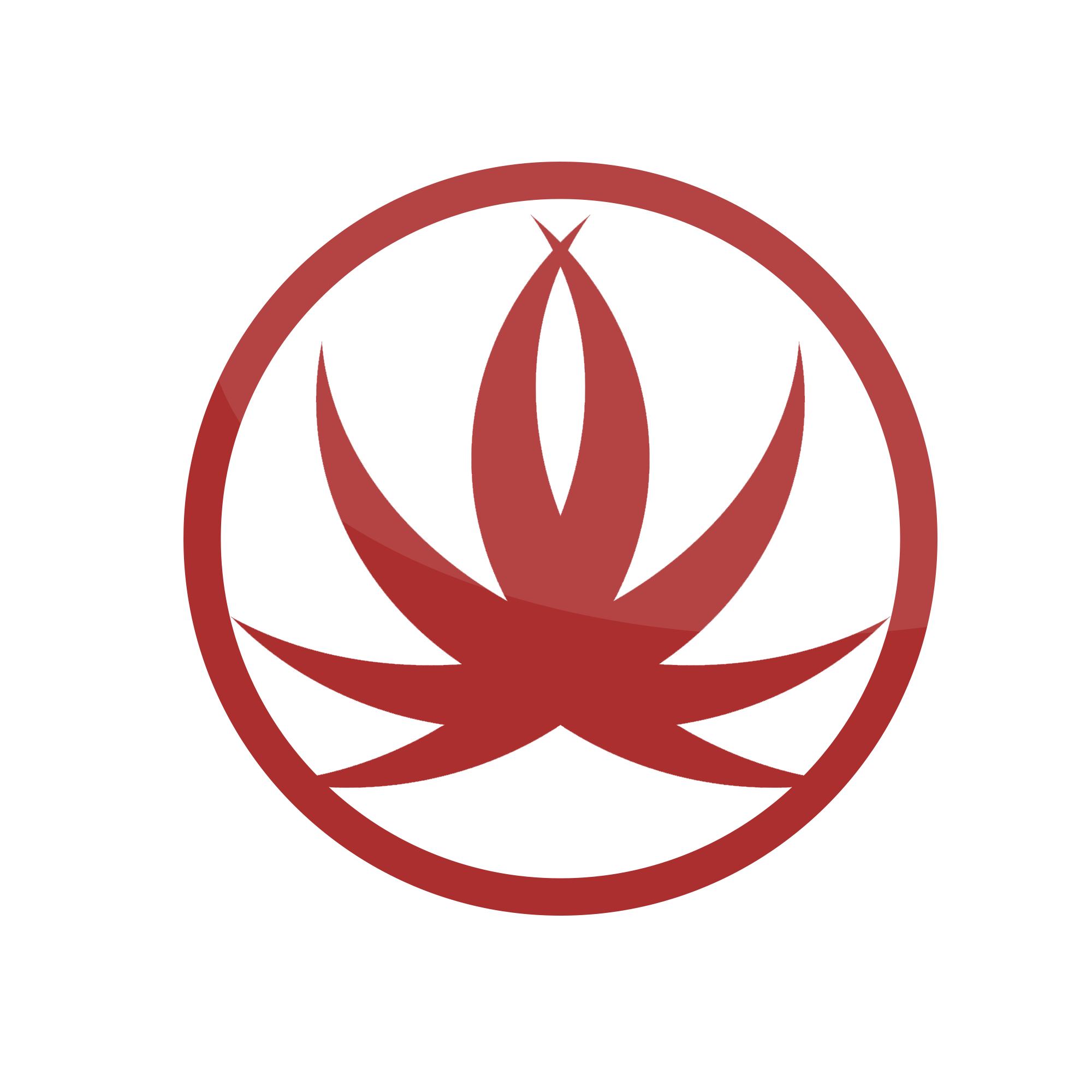
For some reason "pimped up weed leaf" came in to mind.
Even though its just a brush or a selection of shapes, it doesn't look too bad. What's the meaning though? What is it for? I'd also think about the color scheme as well - feels a bit bland at the moment.
For some reason "pimped up weed leaf" came in to mind.
Even though its just a brush or a selection of shapes, it doesn't look too bad. What's the meaning though? What is it for? I'd also think about the color scheme as well - feels a bit bland at the moment.
A concept is a concept, some are good and some are bad, in your case it's the very definition of in-between. The idea of it to represent you is a good one and if weed is your life, then sure. But the design of it is poorly done with a lot of jiggered edges. Keep experimenting, it really helps.
A concept is a concept, some are good and some are bad, in your case it's the very definition of in-between. The idea of it to represent you is a good one and if weed is your life, then sure. But the design of it is poorly done with a lot of jiggered edges. Keep experimenting, it really helps.
I don't know why people are hating on this just because its basic?
@KeironParkes It's not about if something is flashy it's about being creative.
After all people want something that is basic and easy to remember like the Nike tick.
Anyways dude, this logo is awesome although it needs few touch ups.
I done a modified version, maybe this could give you some sort of idea.
Anyways ignore the silly comments unless the are ACTUAL feedback both negative and positive. Good on working, I see something good.


") Good on working, I see something good.
Good on working, I see something good.