NightWorks.io - Website Design

Status
Not open for further replies.

Weasel

👄 I'd intercept me
Nov 25, 2011
4,135
2,461
Hi all,

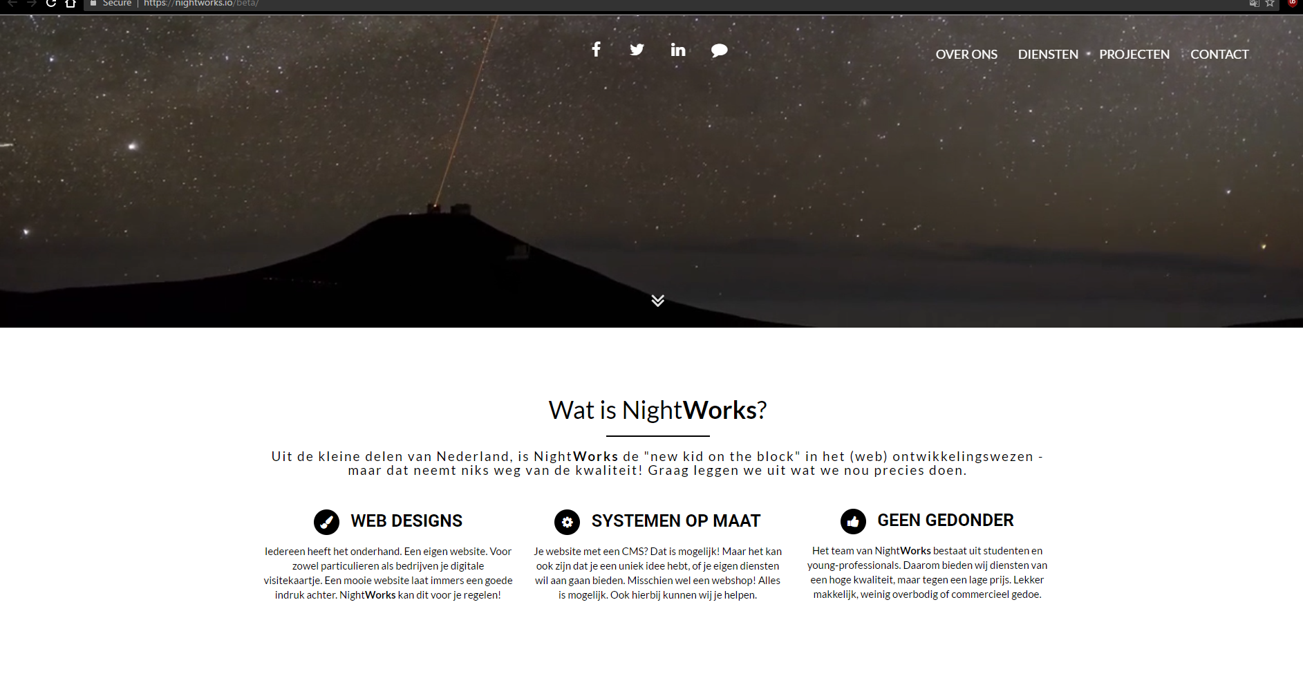
A while back I started with PLAY. Due to personal reasons and other issues this project never came near what I wanted, and I kept doing freelance work under my own name. However the idea stayed with me, and I decided to rebrand it and start over, with some new partners. Ofcourse, we need a website. And that's what I'm currently working on. I'd love feedback on the design. I'll keep this thread updated with changes.

SITE:

List of known issues / To-Do:
- Navigation is non-functional DONE
- Smoothscroll still needs to be implemented for menu items DONE
- Header video autoplay not starting on iOS devices
- Links aren't working yet
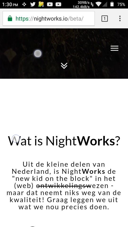
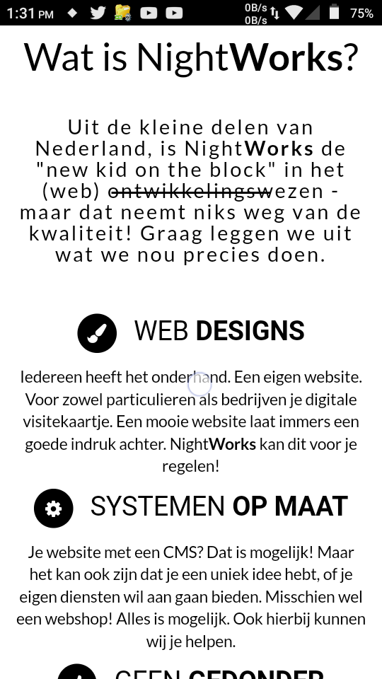
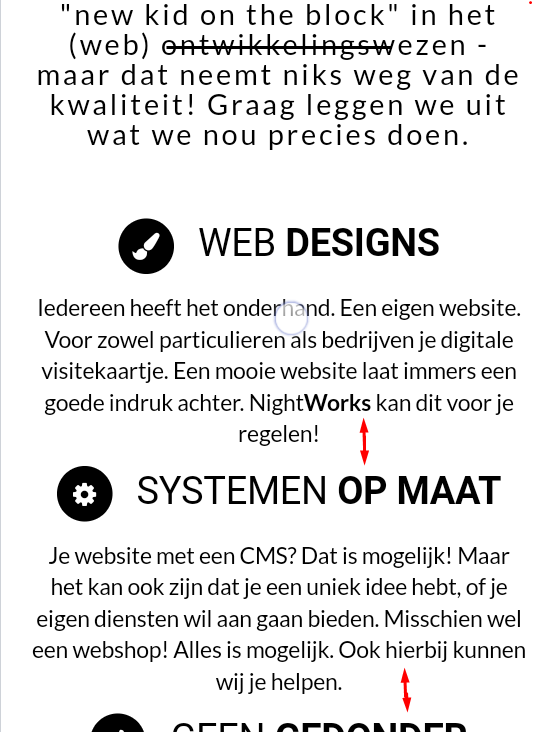
- Better spacing on mobile
- Properly align all the icons in their boxes (social/titles)
- Add animations (for example the social links)

And ofcourse, most of the page still needs to be done.
 
Last edited:

griimnak

You're a slave to the money then you die
Jul 20, 2013
957
800
d07826ae3e8541399207576a90b1e746.png

I'll check back in a few hours, site seems to be down at the moment.
What exactly is the objective of this project, is it a game database that you are re-writing or another entirely different project?
 

Weasel

👄 I'd intercept me
Nov 25, 2011
4,135
2,461
d07826ae3e8541399207576a90b1e746.png

I'll check back in a few hours, site seems to be down at the moment.
What exactly is the objective of this project, is it a game database that you are re-writing or another entirely different project?
Made a typo in the link. Fixed now (nighworks instead of nighTworks), thanks.

It's not a project. It's more of a service.
 

griimnak

You're a slave to the money then you die
Jul 20, 2013
957
800
8a71fb60f2da4f2b96d348c2d6c380a2.png

is that your own front end? I digg it, looks great.

I like this logo aswell, modern and relates to the site.
e1ff435bcd7d49edaca2c72d96da765c.png


lookin good, so what's this service for?
 

Weasel

👄 I'd intercept me
Nov 25, 2011
4,135
2,461
8a71fb60f2da4f2b96d348c2d6c380a2.png

is that your own front end? I digg it, looks great.

I like this logo aswell, modern and relates to the site.
e1ff435bcd7d49edaca2c72d96da765c.png


lookin good, so what's this service for?
Yeah, I'm making everything myself. It's far from done, but it's getting somewhere.

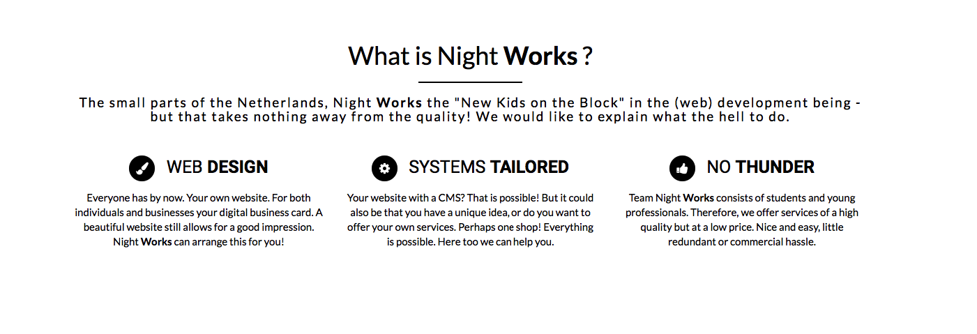
NightWorks is basicly going to be some kind of "freelance company" based on (web) development. Me and some friends are starting up NightWorks to give our projects a common place, and ofcourse the work we do can now be linked to NightWorks. We'll be offering a wide range of services, for a decent price (way cheaper than most companies) as we're students, and do it a bit different than bigger companies. For now, we'll mostly focus our marketing closer to home.

Besides that, sometimes I have an idea for a project. So as Reverse Box from Josh is the "mother company" for DevBest and FindRetros, NightWorks will also function as a "mother company" for our own projects.
 

griimnak

You're a slave to the money then you die
Jul 20, 2013
957
800
Yeah, I'm making everything myself. It's far from done, but it's getting somewhere.

NightWorks is basicly going to be some kind of "freelance company" based on (web) development. Me and some friends are starting up NightWorks to give our projects a common place, and ofcourse the work we do can now be linked to NightWorks. We'll be offering a wide range of services, for a decent price (way cheaper than most companies) as we're students, and do it a bit different than bigger companies. For now, we'll mostly focus our marketing closer to home.

Besides that, sometimes I have an idea for a project. So as Reverse Box from Josh is the "mother company" for DevBest and FindRetros, NightWorks will also function as a "mother company" for our own projects.
Seems like a good idea, and especially if you're good with freelance I can see you servicing alot of clients.
Watching this thread, goodluck man, looks nice so far.
 

Weasel

👄 I'd intercept me
Nov 25, 2011
4,135
2,461
Seems like a good idea, and especially if you're good with freelance I can see you servicing alot of clients.
Watching this thread, goodluck man, looks nice so far.
Besides a lot of work experience, me and the people I'm doing this with have done multiple freelance projects already. The name "NightWorks" is also for a reason, because we all have jobs, internships or are still in school most of the work is done at night (/in the weekends). Getting clients won't be a problem.
 

griimnak

You're a slave to the money then you die
Jul 20, 2013
957
800
You should make an "About us" page, or something similar, showing your team's resume/past work.

You know, for the l33t professional points. I'm sure you already had an about us page in mind already though
 

Weasel

👄 I'd intercept me
Nov 25, 2011
4,135
2,461
You should make an "About us" page, or something similar, showing your team's resume/past work.

You know, for the l33t professional points. I'm sure you already had an about us page in mind already though
Yeah I already have a projects section in mind. I've done a lot of work for companies which I'm not allowed to list (internal tools, such as HRM/payroll stuff, all that shit) because they want to keep it private. Currently focussing on more frontend stuff so we can list more. There's a lot of stuff I want to add, mostly to stand out (what makes us special, why do we offer such low prices, who are we, etc.) - but also a lot I can't add yet, because we're new (clients counter, for example). So sometimes it's quite hard to come up with creative ideas to fill the site.
 

griimnak

You're a slave to the money then you die
Jul 20, 2013
957
800
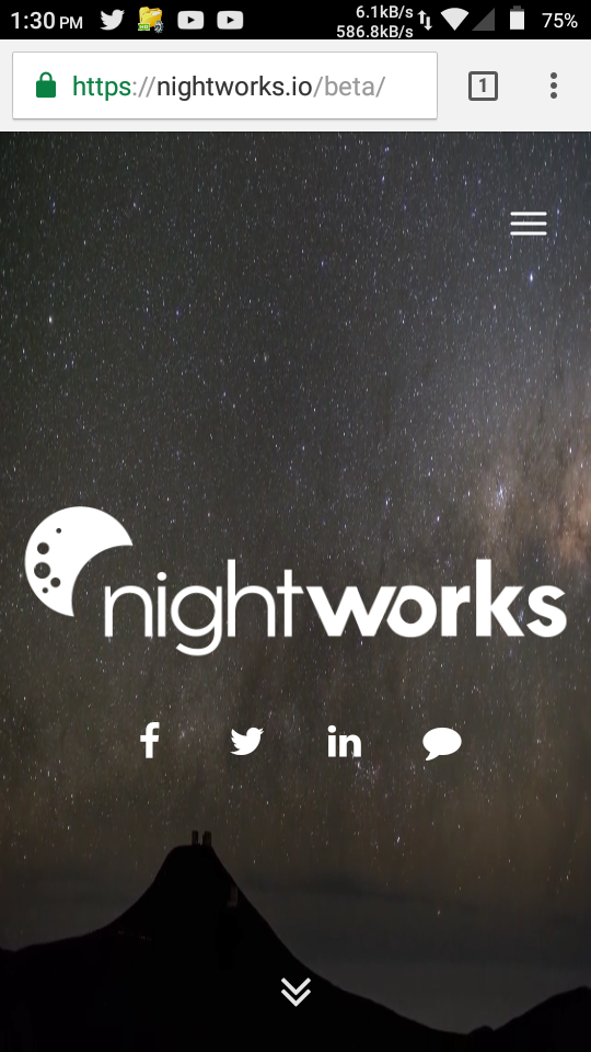
Tested the site on mobile, LG volt ls740 (idk screen dimensions)
16923777_1435946416458065_1851837058_n.png

16933642_1435946386458068_70171804_n.png

16933695_1435946373124736_731357665_n.png

Like @Markshall said, sub content could use more spacing, mostly noticeable on mobile rather than desktop.
2c758ee9483d480cafbc0daae6d12412.png
 

Weasel

👄 I'd intercept me
Nov 25, 2011
4,135
2,461
I've added spacing on mobile (responsiveness) to the known issues list.

Pushed a small update. Worked on adding some more boxes and added a parallax section, still needs to be filled.
 

Lame

Member
Nov 6, 2014
303
78
Makes me think of this when I look at it:

Although I do like it, it's very generic.
 

Weasel

👄 I'd intercept me
Nov 25, 2011
4,135
2,461
Looks very nice, you should put a fade on the social links.
Yeah such animations are still planned. I'll add it to the todo list tomorrow.

Makes me think of this when I look at it:

Although I do like it, it's very generic.
It's like 3 sections. Even though bootstrap is being used, it has no actual elements of bootstrap (besides the nav mobile icon which is still to be changed).
 
Did some small updates today:
- Removed the line between the section title and subtitle.
- Finished some kind of spacer.
- Changed the boxes with information around. Mostly changes in the colors, but it makes a huge difference.
- Started working on the "team" part of the site. Still WIP tho. Any ideas would be cool.
 

Ecko

23:37 [autobots] -!- eckostylez [[email protected]]
Nov 25, 2012
1,398
962


Why do people do this? I've never understood the reasoning behind using a giant image/gif/video. I mean, it creates a large index page size and it being hosted on the same server means it can be maliciously requested repeatedly to eat up your bandwidth:
Code:
└──╼ curl -sI https://nightworks.io/beta/assets/images/header-bg.mp4 | grep Content-Length | awk '{size=$2 / 1024 / 1024; print size "MB"}'
13.6997MB
It would take me a couple of minutes to write up a simple for loop that will request that file from 20-30 different locations. Running that for a few minutes would eat up like 5GB of quite quickly.
 

Brad

Well-Known Member
Jun 5, 2012
2,320
993
Looks nice, but when you click the arrow to go down it happens too quick imo. It should have some sort of transition :p. Other than that it all looks good.
 

Weasel

👄 I'd intercept me
Nov 25, 2011
4,135
2,461


Why do people do this? I've never understood the reasoning behind using a giant image/gif/video. I mean, it creates a large index page size and it being hosted on the same server means it can be maliciously requested repeatedly to eat up your bandwidth:
Code:
└──╼ curl -sI https://nightworks.io/beta/assets/images/header-bg.mp4 | grep Content-Length | awk '{size=$2 / 1024 / 1024; print size "MB"}'
13.6997MB
It would take me a couple of minutes to write up a simple for loop that will request that file from 20-30 different locations. Running that for a few minutes would eat up like 5GB of quite quickly.
There's no reason people would do this. Besides that, it looks really good.

Looks nice, but when you click the arrow to go down it happens too quick imo. It should have some sort of transition :p. Other than that it all looks good.
Already mentioned & on the todo list in the OP.
 

Macemore

Circumcised pineapples
Aug 26, 2011
1,681
819
There's no reason people would do this. Besides that, it looks really good.


Already mentioned & on the todo list in the OP.
Pretty sure ecko's point is that the file is large, and any website with a decent amount of traffic would have a very high bandwidth.
 
Status
Not open for further replies.

Users who are viewing this thread

Top