You are using an out of date browser. It may not display this or other websites correctly.
You should upgrade or use an alternative browser.
You should upgrade or use an alternative browser.
Show DevBest New website design
- Thread starter Markshall
- Start date
- Thread starter
- #3
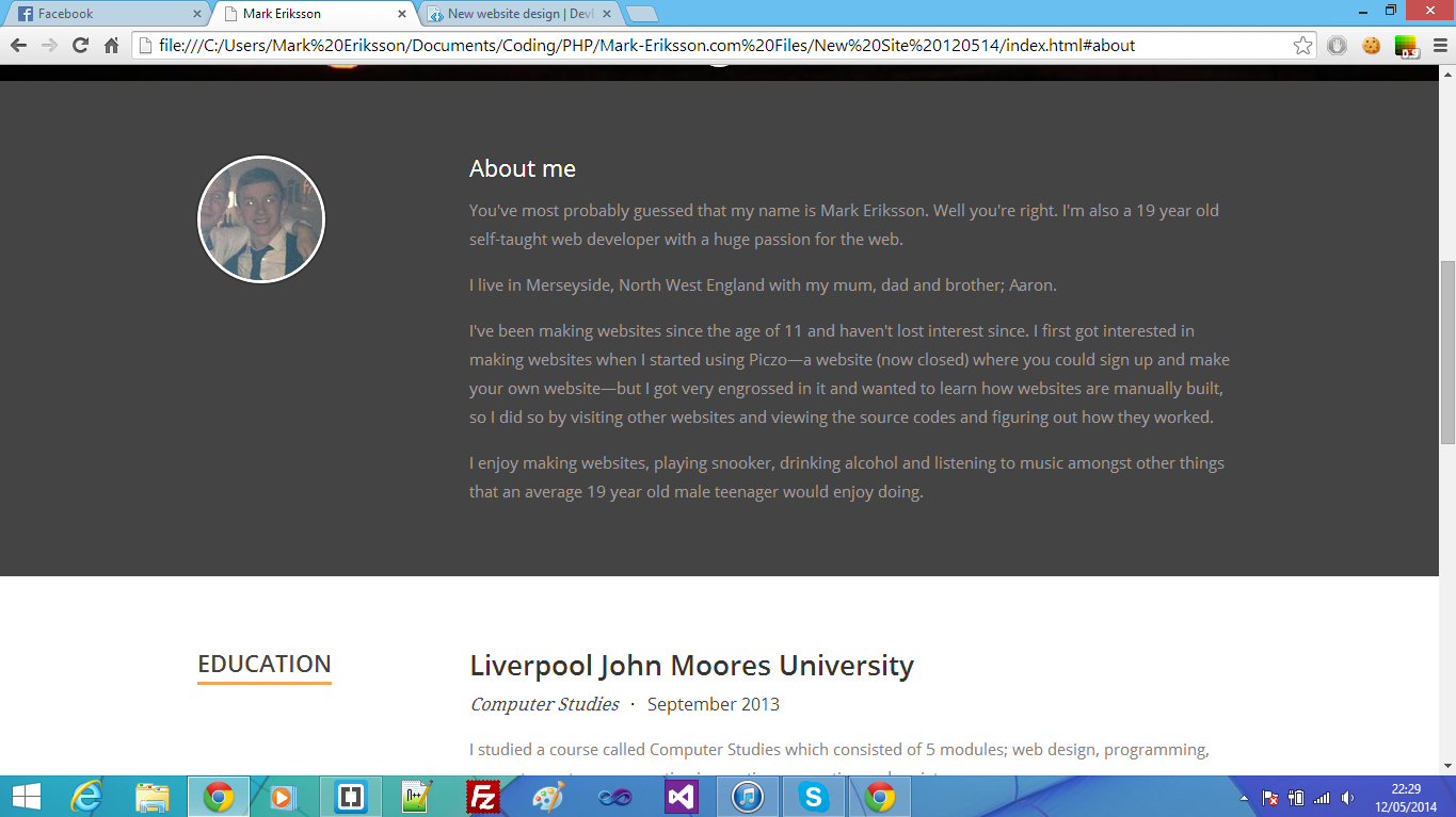
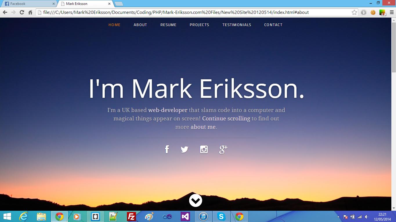
Looks really neat, though I wonder how it looks when you scroll down.

- Thread starter
- #7
@JackSparrow yes, when you move completely away from the top header.
@Shorty cheers babe
@RastaLulz ur cousins newphew's mum
@Shorty cheers babe
@RastaLulz ur cousins newphew's mum
Sysode
Front-End Developer
Looking swish and modern man. I'm liking it (design wise) .
Only feedback at the moment is to do with the UX - navigation to pinpoint it. Think about it.. User clicks the link and scrolls to where they want, right? Then they're left with no navigation to guide them. My solution would be to either stick the navi which I think would suck for the design OR have the navigation go to the top left of the side (maybe in a burger menu form) <- this could help with responsiveness as well.
Sorry its picky as fuck but its just an idea. Overall, looks nice. It'll be nice to see the code and so on soon.
- Thread starter
- #12
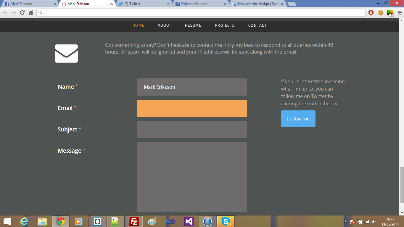
It does stick, when the top header is completely out of the way, it sticks:Looking swish and modern man. I'm liking it (design wise) .
Only feedback at the moment is to do with the UX - navigation to pinpoint it. Think about it.. User clicks the link and scrolls to where they want, right? Then they're left with no navigation to guide them. My solution would be to either stick the navi which I think would suck for the design OR have the navigation go to the top left of the side (maybe in a burger menu form) <- this could help with responsiveness as well.
Sorry its picky as fuck but its just an idea. Overall, looks nice. It'll be nice to see the code and so on soon.

Sysode
Front-End Developer
Ah fair. Couldn't see that from the screenies. Nice work bud - maybe some box-shadow on the top bar? ;pIt does stick, when the top header is completely out of the way, it sticks:

Users who are viewing this thread
Total: 2 (members: 0, guests: 2)


