Show DevBest New Design, so far.

Status
Not open for further replies.

Markshall

Русский Стандарт
Contributor
Dec 18, 2010
2,637
2,389
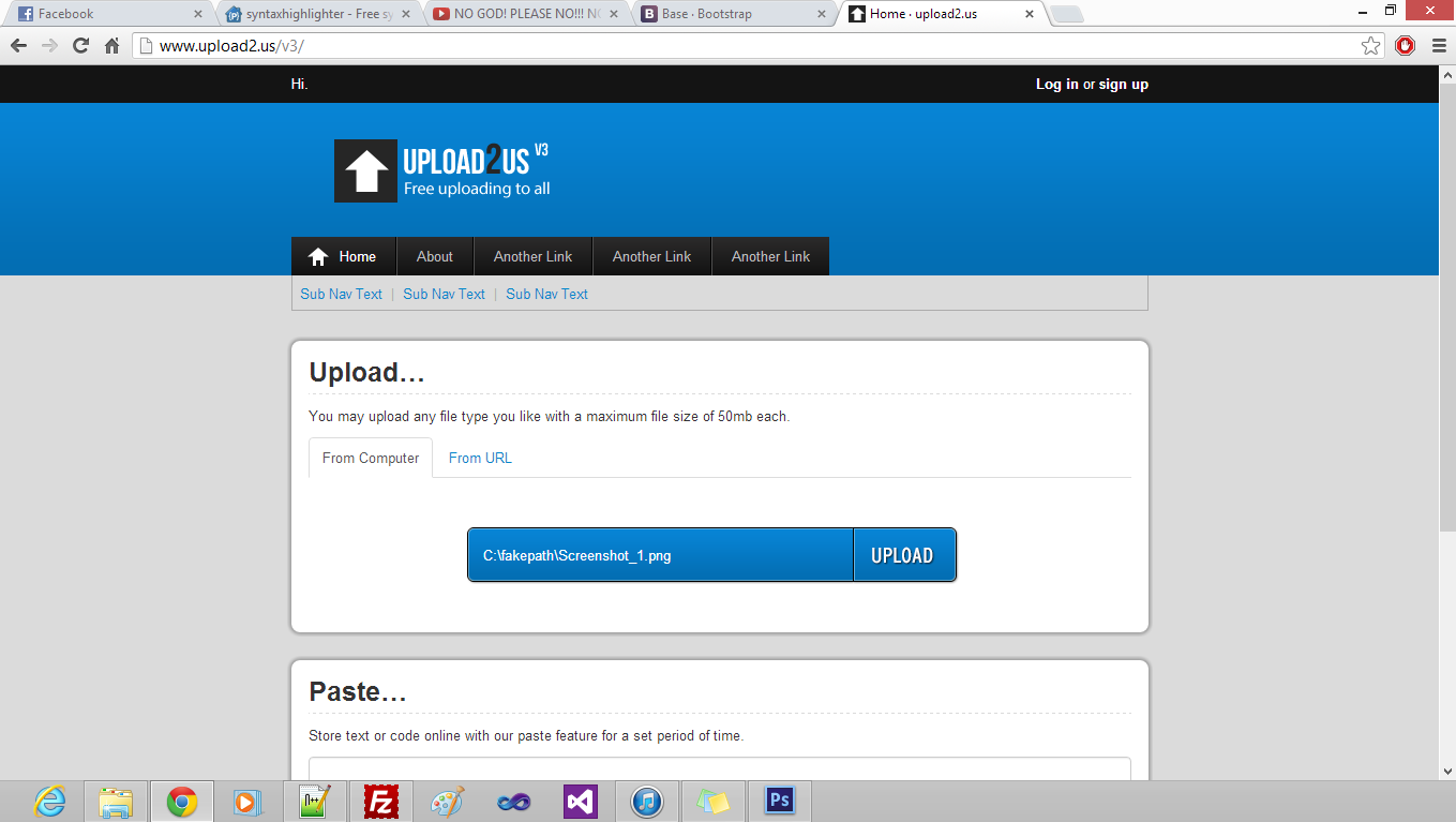
I'm bored of that extremely ugly layout on upload2.us and the whole site needs redoing because it's fooked.

I've designed this today but don't know what to make of it, what do you think?

PS, before you make extreme judgements on the content box, I will improve it, I hate designing content boxes in Photoshop, I prefer to design them in CSS.

All feedback welcome, tell me what I should add/remove.

Blue will be the primary colour on the site, it was that colour on V1 and fuck knows why I changed it to full grey.

1354126355-upload2usv3.png
 

Weasel

👄 I'd intercept me
Nov 25, 2011
4,132
2,456
Looks great, however I don't like the subnav text, maybe make i gray to with dividers between the links.
 

Markshall

Русский Стандарт
Contributor
Dec 18, 2010
2,637
2,389
Looks great, however I don't like the subnav text, maybe make i gray to with dividers between the links.
I thought the blue would be better as the main colour of the site will be focused around blue. And there is dividers between the text. :p
 

Weasel

👄 I'd intercept me
Nov 25, 2011
4,132
2,456
I thought the blue would be better as the main colour of the site will be focused around blue. And there is dividers between the text. :p
I see what you are talking about, however if you don't take a to dark grey colour, and the text-size a little bit smaller, I think it would look better.
 

Weasel

👄 I'd intercept me
Nov 25, 2011
4,132
2,456
Looking awesome Mark! I love your work.
A little buggy:  
Maybe a idea for the upper left corner, add the amount of uploaded files/registered users, or something like that
 

Jo$h

Posting Freak
Jul 7, 2010
1,030
79
This is beautiful! I absolutely love Mark's work. 10/10, thumbs up and all that other shit
 

Khalil

IDK
Dec 6, 2011
1,642
786
Not bad mark, all trough your gonna use the bootstrap library right ?
Keep it up!
 

Markshall

Русский Стандарт
Contributor
Dec 18, 2010
2,637
2,389
Added some new features.

If you're not logged in, you get this:
pwf4ddsw


If you are logged in, you get this:
5ogwa6iu


And this is the paste:
iuf28xcx
 

Kaz

BooYah
Staff member
Nov 16, 2010
3,064
1,025
Looking great Mark, when i first saw this thread, i liked the idea of the header at the top, if user is logged in display x and if they are not logged in they get something else. So i implemented it into my design :p
 
Status
Not open for further replies.

Users who are viewing this thread

Top