Habbo rolled out Open BETA client to .com

Jerry

not rly active lol
Jul 8, 2013
1,957
522
Habbo.com released their open beta to everyone and I'm wondering what's your input on this?

You must be registered for see images attach


You must be registered for see images attach


You must be registered for see images attach


You must be registered for see images attach


You must be registered for see images attach


I just don't like how the UI is just large but other than that it's okay imo

----

I just checked how it looks in 4K resolution and it's actually not that large:
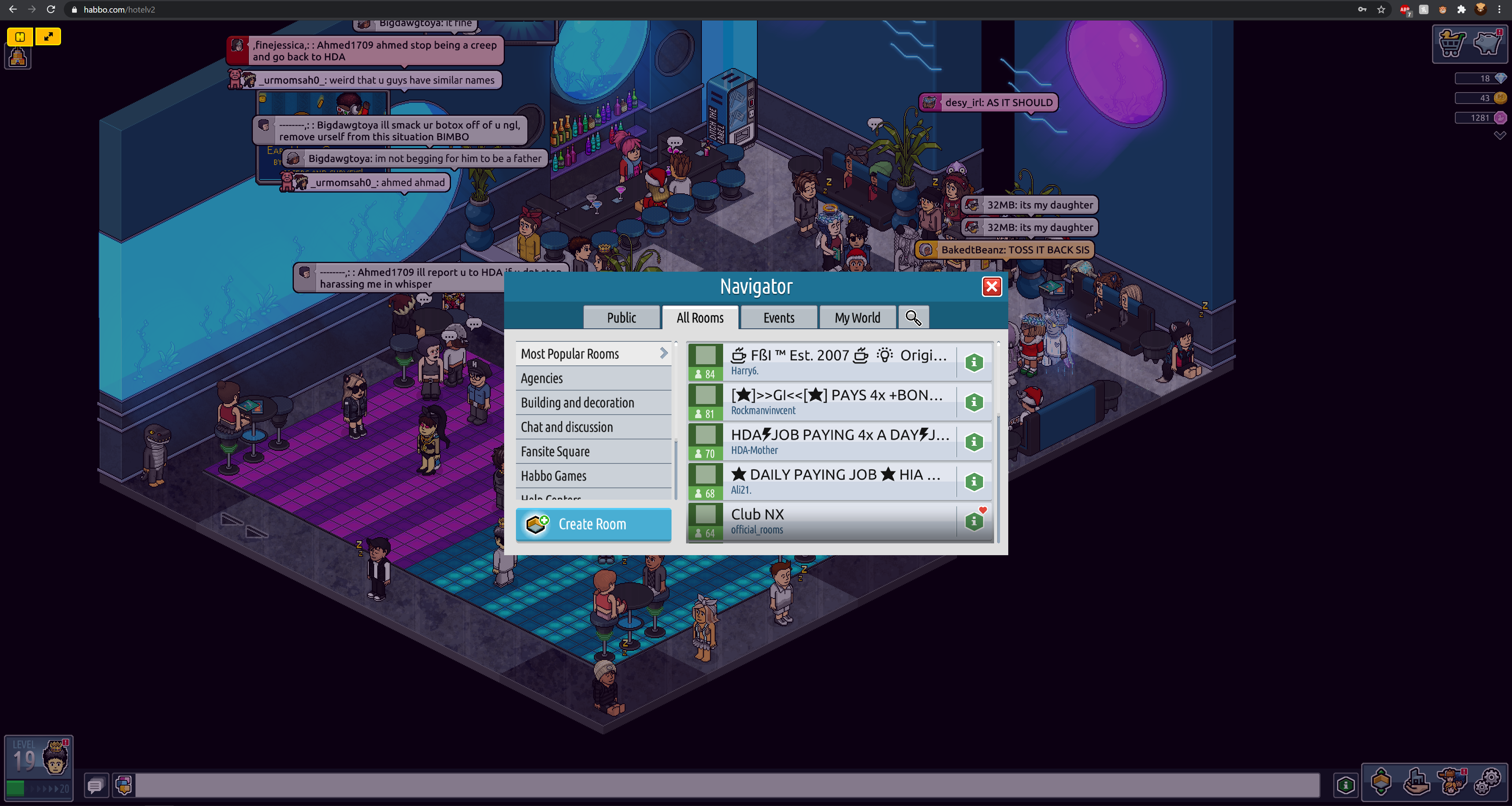
MKYUfbU.png
 
Last edited:

BIOS

ಠ‿ಠ
Apr 25, 2012
906
247
Not a fan, everything just seem so bulky, miniclip-like, and plain ugly. Even on 2k the UI looks huge for me.

UI seems to have a fade in/out effect too which makes everything seem slower than before. It's also harder to find things but I guess that will change with time (would be nice if they added some guidance/tutorial, like they did with the last revision.)

Looks like a lot of small nice features are missing too e.g. hover (on players/paths), move windows around. Can't see friends or certain things right away either, everything seems to be 2-3 clicks away now. Can't seem to find PMs, guessing they haven't been implemented yet.
 
Last edited:

Markshall

Русский Стандарт
Contributor
Dec 18, 2010
2,638
2,393
What's actually new about this? Is it just purely rebuilt to not use Flash? I've not been up to date on Habbo since about 2010 maybe.
If that's the case, what's it built on?

Everything to me just seems too 'big'.
 

LouisJW

Active Member
May 20, 2020
139
53
Unity I believe.
Unity, you're right. I don't like it at all it looks so much more child-like. It seems rushed, I wonder if they took a different route would it be any better? (maybe even used HTML5 instead)

Habbo has failed us, some will love this and many will be upset, it's a NO from me :'D
 

Joe

Well-Known Member
Jun 10, 2012
4,172
1,955
Unity, you're right. I don't like it at all it looks so much more child-like. It seems rushed, I wonder if they took a different route would it be any better? (maybe even used HTML5 instead)

Habbo has failed us, some will love this and many will be upset, it's a NO from me :'D
I said it looked horrible months ago, people were saying how much they liked it. It’s horrific!
 

CosmoPeak

PeakRP.com
May 15, 2016
271
268
it's awful in every way and has zero redeeming qualities, it feels so laggy and slow, and let's not even talk about how they've butchered the game's actual features

i don't know what they were thinking and how anyone has used/tested this at sulake and thought "yeah that's ok"
 

LouisJW

Active Member
May 20, 2020
139
53
it's awful in every way and has zero redeeming qualities, it feels so laggy and slow, and let's not even talk about how they've butchered the game's actual features

i don't know what they were thinking and how anyone has used/tested this at sulake and thought "yeah that's ok"
I think they've more or less just given up kind of thing.
 

BIOS

ಠ‿ಠ
Apr 25, 2012
906
247
Looks like many rooms have updated their name to include "#SaveHabbo" after this update lol:
You must be registered for see images attach
 

Maatt

Active Member
Aug 29, 2012
162
158
I have to admit I wasn’t expecting much but I still left feeling disappointed.

Hopefully much of this will be teething issues and Sulake can pull it back if they listen to people and fix the issues. Historically this isn’t something Sulake have been good at. Watch this space.

I think the retro community could capitalise on this though. Through reintroduction of old school features and betting community etc.
 

Berk

berkibap#4233
Developer
Oct 17, 2015
863
190
Its ugly as fuck, avatars are way too fucking close to screen and it doesn't give that habbo vibe anymore.
 

Shxrty

Shorty#1960
Mar 31, 2018
629
163
I dont fancy it what so ever, Its extremely buggy and weird. I went onto the turkish one the other day and really wanted to puke.


Liam

smooth and dynamic
Staff member
FindRetros Moderator
Apr 10, 2013
1,275
864
The UI looks like the mobile version however, I respect the approach to change it up, as the flash UI was getting a bit stale.

It might not be ideal, and I can definitely see a lot of room for improvement. I haven't yet tried the unity client, but I heard it's unplayable with memory leaks, etc.


The transition from shockwave to flash resulted in a lot of features being removed, those of which made Habbo what we knew and loved it as. I can't see what is explained in the article above doing any favours for them.

"Time will tell"!

Maybe I'll check it out when I can be bothered.
 

Kylie

Princess
Dec 9, 2012
349
228
I quit Habbo a long time ago and definitely haven't regretted it. I guess we were all lucky playing the previous versions of Habbo. Personally, this is the ugliest and worst client they have ever released, I would be surprised if people still play that shit. 🤣
 

RastaLulz

fight teh power
Staff member
May 3, 2010
3,934
3,933
Is this the same client they use for mobile? or is this built from the ground up? It seems really shaky. I wonder how many developers they have working on this, and how much more mature it'll feel in six months. I think the approach makes some sense, as their Hotel Hideaway seems to be doing a lot better than Habbo, and perhaps their idea is to replicate that (which will alienate many desktop players).

A few takes:
  • The startup reminds me of older versions of Habbo (seeing the Sulake logo, and how long it takes).
  • Surprisingly sluggish (and slow).
  • Scrolling on the room list is horrific on Mac.
  • The lack of hover indication is probably one of the worst aspects (in menus, when selecting a tile in a room, etc).
  • You can't click on a Habbo/furniture, and get additional information. which is a staple of Habbo.
 

Benden

maging ang maganda mamatay
Jun 4, 2010
2,286
1,482
Wow, this is brutally bad.

The first thing I noticed is that the UI is huge. It makes it feel like everything is "in your face" they need to relax it a little.
Then, I loaded into a room and wow... It loaded in stages where things just randomly appeared into view and it made it feel as if I was on a server that can't handle the request or as if I had a bad connection.
Then I saw someone talk and well, back to the UI issue. The text bubbles are huge! If someones bubble takes two lines of speech then I feel like half of a room is now blocked until it scrolls away.
Then finally, as Josh mentioned above, the lack of ability to feel as if you're clicking on anything (the lack of furniture info, no tile indicator) really makes it feel incomplete. It makes me think my client is frozen.

I hope they will eventually open a feedback thread sometime soon so that these issues can be brought up and addressed correctly. I understand it was a lot to undertake and there's a long way to go however I feel as though they waited too long to even begin work on this new client and it makes the game feel super incomplete.
 

Users who are viewing this thread

Top