You are using an out of date browser. It may not display this or other websites correctly.
You should upgrade or use an alternative browser.
You should upgrade or use an alternative browser.
Flat Website Design [SUGGESTIONS]
- Thread starter IntactDev
- Start date
Sysode
Front-End Developer
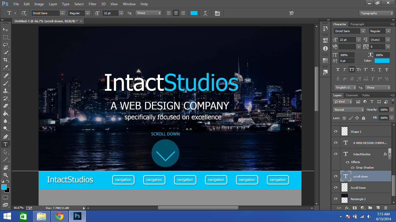
I can see the concept you're going for and you're not far off, there are, however, a few things that look odd.
I'm not sure why you've gone for the "TITLE, SUB title, sub sub title" if you get me? If you can, try and stick to having one large title and then a smaller sub title. I'm not sure if it's the printscreen but it doesn't look like the arrow is aligned properly. Finally, a little more top and bottom padding wouldn't go amiss in the navigation. Give these a few changes and see how it looks then.
Also, the whole idea of flat is so no shadows (very little) are used. You seemed to have used shadows quite a lot, which isn't really keeping it flat. As well as this, are you sure these are the actual flat colours, it sounds strange but yes there are specific hex codes for certain colours in flat. This website may be helpful for that:
Update us if you decide to carry on with this, best of luck.
I'm not sure why you've gone for the "TITLE, SUB title, sub sub title" if you get me? If you can, try and stick to having one large title and then a smaller sub title. I'm not sure if it's the printscreen but it doesn't look like the arrow is aligned properly. Finally, a little more top and bottom padding wouldn't go amiss in the navigation. Give these a few changes and see how it looks then.
Also, the whole idea of flat is so no shadows (very little) are used. You seemed to have used shadows quite a lot, which isn't really keeping it flat. As well as this, are you sure these are the actual flat colours, it sounds strange but yes there are specific hex codes for certain colours in flat. This website may be helpful for that:
You must be registered for see links
Update us if you decide to carry on with this, best of luck.
IntactDev
Member
- Nov 22, 2012
- 399
- 71
- Thread starter
- #3
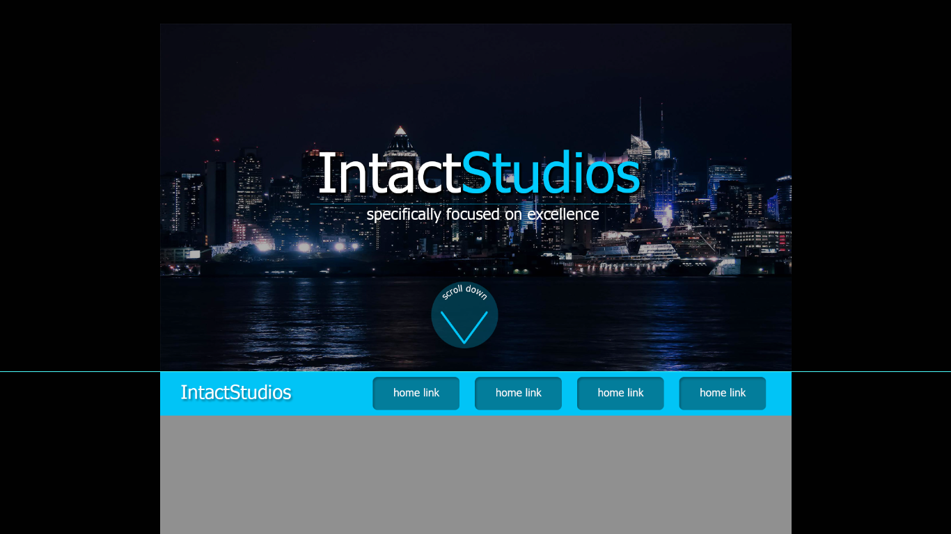
Keeping all of this in consideration, I made some revisions. I removed the sub-sub-title, and I fixed the "scroll down" arrow not being aligned properly. I also redesigned the navigation box, which I'll probably get rid of, since I just noticed that I destroyed the whole idea of "flat" by using shadows.I can see the concept you're going for and you're not far off, there are, however, a few things that look odd.
I'm not sure why you've gone for the "TITLE, SUB title, sub sub title" if you get me? If you can, try and stick to having one large title and then a smaller sub title. I'm not sure if it's the printscreen but it doesn't look like the arrow is aligned properly. Finally, a little more top and bottom padding wouldn't go amiss in the navigation. Give these a few changes and see how it looks then.
Also, the whole idea of flat is so no shadows (very little) are used. You seemed to have used shadows quite a lot, which isn't really keeping it flat. As well as this, are you sure these are the actual flat colours, it sounds strange but yes there are specific hex codes for certain colours in flat. This website may be helpful for that:You must be registered for see links
Update us if you decide to carry on with this, best of luck.

Sysode
Front-End Developer
Well done man, looking a lot better already. I agree with what you said about the navigation destroying it with the shadows etc. Have you tried creating it with small uppercase text, in a lightish sort of weight, with a small border-ed box around it. Just a suggestion?Keeping all of this in consideration, I made some revisions. I removed the sub-sub-title, and I fixed the "scroll down" arrow not being aligned properly. I also redesigned the navigation box, which I'll probably get rid of, since I just noticed that I destroyed the whole idea of "flat" by using shadows.

Looks much better though.
Sysode
Front-End Developer
Still not sure if I like the idea of the scroll down being so big and bold. The contrast will make users turn their attention to that when there will be other things that are more important to look at - if you get me?Here's another trial. I used one of the hex codes from the FlatUIColor site, redesigned the "scroll down" button, and the navigation.

Also, if you're struggling to align elements properly, it may be worth using smart guides (view -> show -> smart guides - windows) which help you align things perfectly when you drag an element around with your mouse. I'd maybe get rid off the "Intact Studios" in the right of the navigation as it's fairly obvious what the site is as the logo is huge up to - this way it'll allow for more space in the navigation which you could use to make the navi wider and more spreadout.
Still an improvement though, keep it up man

Users who are viewing this thread
Total: 2 (members: 0, guests: 2)


