You are using an out of date browser. It may not display this or other websites correctly.
You should upgrade or use an alternative browser.
You should upgrade or use an alternative browser.
[FEEDBACK] Signature + Logo
- Thread starter Kontrol
- Start date
broges
Welcome To The Machine
- Mar 6, 2014
- 571
- 312
They look like they're from the early 2000'sRating? Why you don't?
Damon
Member
- Aug 13, 2012
- 364
- 114
No offence, but i'd take the "Graphics Artist" away for now, as you are not that "very good" with graphics.
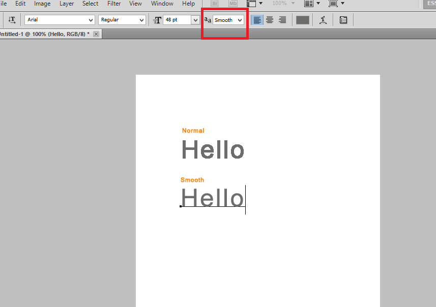
But anyways the text is too pixely.. if you did these in Photoshop you can set it to smooth instead of 'normal'
Also the shadow for 'Graphic artist' does not match the shadow that Kontrol has.
Anyways keep trying, and hopefully you can improve them.
But anyways the text is too pixely.. if you did these in Photoshop you can set it to smooth instead of 'normal'
You must be registered for see links
Also the shadow for 'Graphic artist' does not match the shadow that Kontrol has.
Anyways keep trying, and hopefully you can improve them.
Kontrol
Graphics Artist - Kontrol!
- Feb 23, 2014
- 217
- 28
- Thread starter
- #24
No offence, but i'd take the "Graphics Artist" away for now, as you are not that "very good" with graphics.
But anyways the text is too pixely.. if you did these in Photoshop you can set it to smooth instead of 'normal'
You must be registered for see links
Also the shadow for 'Graphic artist' does not match the shadow that Kontrol has.
Anyways keep trying, and hopefully you can improve them.
I never said I was "very good".. I believe I am a starter, not a "very good" graphics artist, and no I will not remove it.
Thanks for the feedback!

Damon
Member
- Aug 13, 2012
- 364
- 114
Just take the changing it from normal to smooth into consideration. It'll look better.I never said I was "very good".. I believe I am a starter, not a "very good" graphics artist, and no I will not remove it.
Thanks for the feedback!
Kontrol
Graphics Artist - Kontrol!
- Feb 23, 2014
- 217
- 28
- Thread starter
- #26
Just take the changing it from normal to smooth into consideration. It'll look better.
A lot infact, thanks! And I played around with it a little.

EDIT: Just noticed that the "Graphics Artist" shadow is sort of an eye sore, might reduce it's distance.
Damon
Member
- Aug 13, 2012
- 364
- 114
That looks Much better! Do the shadow for Graphics artist the same as 'Kontrol'A lot infact, thanks! And I played around with it a little.
EDIT: Just noticed that the "Graphics Artist" shadow is sort of an eye sore, might reduce it's distance.
Weasel
👄 I'd intercept me
- Nov 25, 2011
- 4,148
- 2,470


This reminds me of Kellogs or something.
Taking images from the internet/use basic Photoshop elements isn't really being a "graphical designer". It's like calling someone playing with LEGO a architect.
Try some tutorials and such, like that Illuminate logo, flat and neat is "in". Less is more.
Taking images from the internet/use basic Photoshop elements isn't really being a "graphical designer". It's like calling someone playing with LEGO a architect.
Try some tutorials and such, like that Illuminate logo, flat and neat is "in". Less is more.

broges
Welcome To The Machine
- Mar 6, 2014
- 571
- 312
Tat looks heaps good now!A lot infact, thanks! And I played around with it a little.
EDIT: Just noticed that the "Graphics Artist" shadow is sort of an eye sore, might reduce it's distance.
")
Fetron
I like to do giveaways :3
- Mar 24, 2014
- 198
- 43
I got bored, so I decided to make a quickie signature, purely out of boredom.


This took a few minutes to do.
Kontrol
Graphics Artist - Kontrol!
- Feb 23, 2014
- 217
- 28
- Thread starter
- #36
I got bored, so I decided to make a quickie signature, purely out of boredom.
I (my opinion), do not like that. It's too, idk, awkward. Don't ask me, I just don't personally like it.
This took a few minutes to do.
And I do not even know what that spells
 but it is nice. "Uarius"?
Users who are viewing this thread
Total: 2 (members: 0, guests: 2)