You are using an out of date browser. It may not display this or other websites correctly.
You should upgrade or use an alternative browser.
You should upgrade or use an alternative browser.
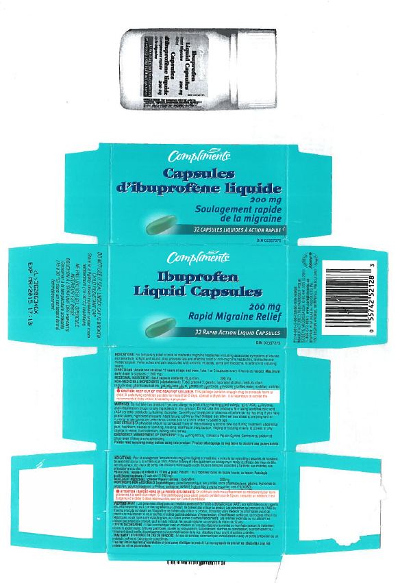
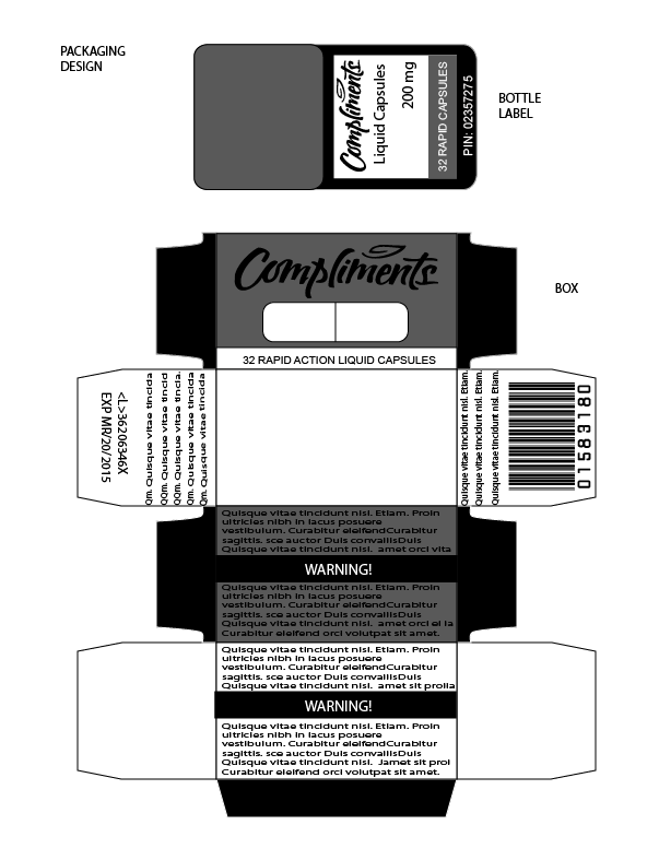
Feedback on this......
- Thread starter Matthewza
- Start date
Benden
maging ang maganda mamatay
I'd discourage using black and white then. It wont stand out to the consumersLike the project was to make it look a lot better, Idk my teacher is f*ed up with making up projects....
- Feb 5, 2013
- 1,180
- 412
200% Nigga If you cant understand then : Darker Master MathewzaDark or light?
HowToHayden
Member
- Oct 16, 2013
- 37
- 7
Some improvements that could be made (If someone was being really picky):
Looks nice though for a school project.
- Move the writing away from the edge of the box.
- Possibly move the Warning message to the top of the box.
Looks nice though for a school project.
Users who are viewing this thread
Total: 3 (members: 0, guests: 3)


