Show DevBest Feedback on this?

zMagenta

Posting Freak
Jul 15, 2011
1,414
682
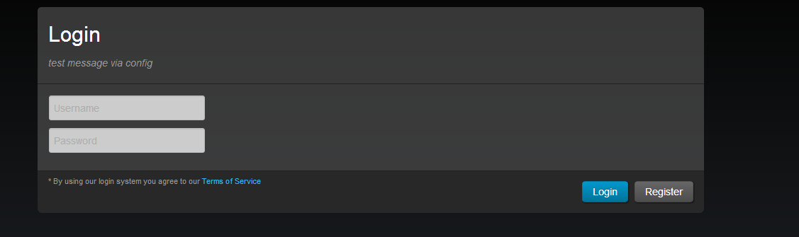
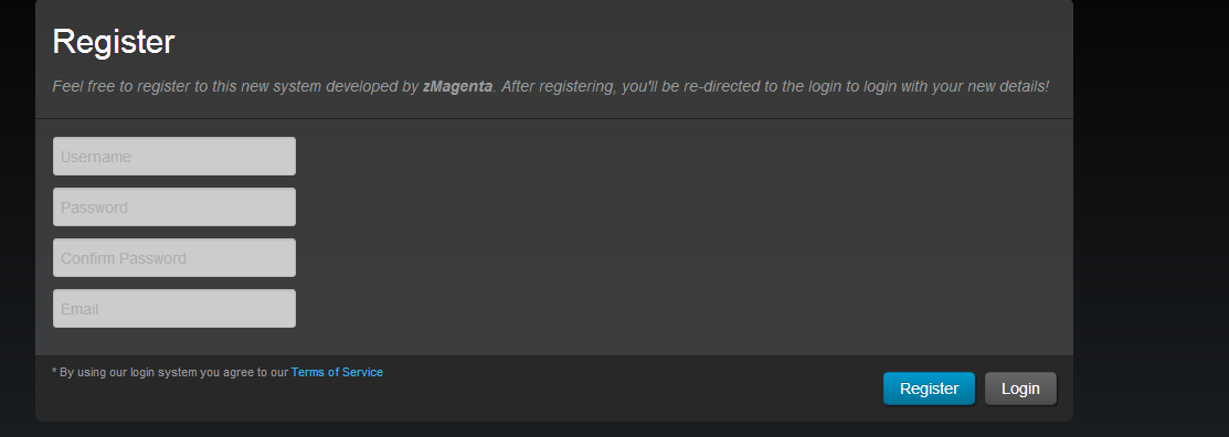
Hi!

I find that I'm not very good at designing as I dislike it - Feedback on my login/register?

7aadf4b4b9234cb1898ace7.png


be04841ec9924d1a88f1596.png


Feedback? ;3
 

Queef

Some people...
Jul 27, 2012
645
289
Looks good, im sure you've thought about this but what about that giant space to the right of each forms?
 

Sysode

Front-End Developer
Dec 11, 2012
1,673
848
I like it, it's nice.

If it could be improved, try a different alignment. For example:

[Username-box] -space- [email-box] <br/>
[password1-box] -space- [password2-box]


^ If you get what I mean? :p
 

zMagenta

Posting Freak
Jul 15, 2011
1,414
682
I like it, it's nice.

If it could be improved, try a different alignment. For example:

[Username-box] -space- [email-box] <br/>
[password1-box] -space- [password2-box]


^ If you get what I mean? :p
I think so? Well this is what I've done for the username, password etc;
PHP:
<form action="register.php" method="POST">
                <div class="modal-header" style="background-color: rgba(85, 85, 85, 0.63);border-top-left-radius: 5px;border-top-right-radius: 5px;">
                    <h2>Register</h2>
                    <p><?php echo $register_msg; ?></p>
                </div>
                <div class="modal-body" style="background-color: rgba(85, 85, 85, 0.63);">
                    <table>
                        <tr>
                            <td><input type="text" name="username" style="height: 25px;" placeholder="Username"></td>
                        </tr>
                        <tr>
                            <td><input type="password" name="password" style="height: 25px;" placeholder="Password"></td>
                        </tr>
                        <tr>
                            <td><input type="password" name="password2" style="height: 25px;" placeholder="Confirm Password"></td>
                        </tr>
                        <tr>
                            <td><input type="text" name="email" style="height: 25px;" placeholder="Email"></td>
                        </tr>
                    </table>
                </div>
 

Legion

Gaming Lord
Staff member
Nov 23, 2011
1,801
669
Looks good, I would recommend changing the text inside of each form, to a darker color. 10/10
 

Reedz

#1 Baller
Jul 9, 2012
640
121
Agree with on the colour side of things, other than that though, nice clean design, well done.
 

Nehalem

Aug 31, 2013
293
47
Too much twitter, and it's also too much gray colors.

I would recommend you to use more images, it looks kinda dead. 4/10.
 

Users who are viewing this thread

Top