FanSite Layout - Release

cokeldv

New Member
Jun 23, 2012
20
2
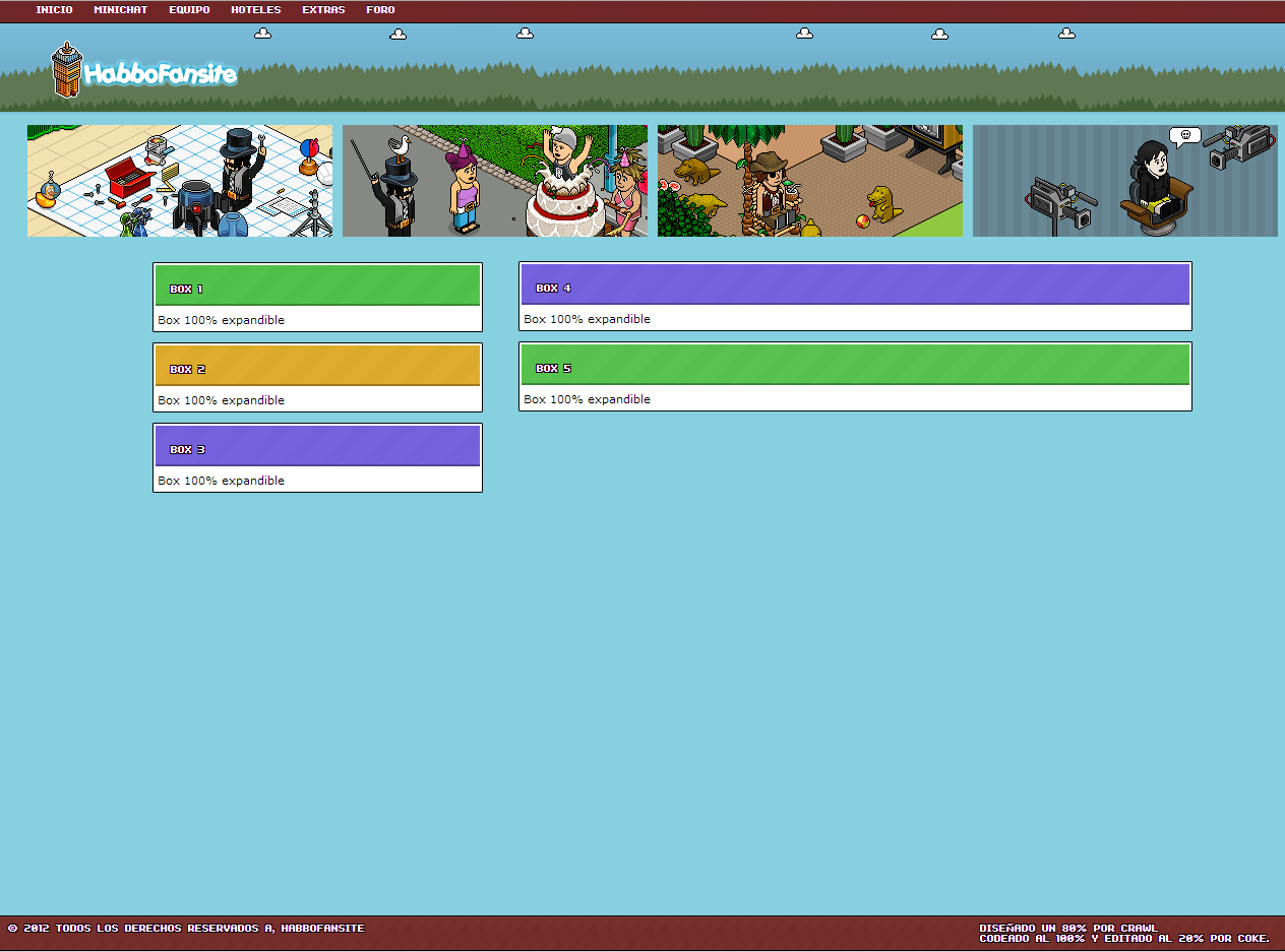
Hello, friends of DevBest this day I bring this layout I publish Crawl while but as I had nothing to do decided coding.

5jkIO.png

Download
VT
Credits
Crawl
Coke.
I'm sorry for the bad english, i am from mexico and i don't speak very good english
 

Kaz

BooYah
Staff member
Nov 16, 2010
3,064
1,025
I dont like it, its too simple, maybe newbie coders may find it useful, but there are many other designs which are available at habboemotion which contain more detail
 

Legion

Gaming Lord
Staff member
Nov 23, 2011
1,801
669
It's not bad for a Editing Fansite. Meaning, take it and use a framework of it to edit.
 

tyr0ne

Active Member
Mar 29, 2012
141
14
If you don't have any more constructive comments, then why don't you fuck off?

"This is shit" > why the fuck would you post if you don't even explain what you don't like?

to OP, it's cool and all, but I would suggest you don't use inline styles and put them in class/id instead. For example those

HTML:
<div style="position:absolute; top:46px; left:50px">

and also use margin instead of

HTML:
<br><br><br><br><br>

Good luck!
 

Sysode

Front-End Developer
Dec 11, 2012
1,673
848
If you don't have any more constructive comments, then why don't you fuck off?

"This is shit" > why the fuck would you post if you don't even explain what you don't like?

to OP, it's cool and all, but I would suggest you don't use inline styles and put them in class/id instead. For example those

HTML:
<div style="position:absolute; top:46px; left:50px">

and also use margin instead of

HTML:
<br><br><br><br><br>

Good luck!

Agree on all of the above! Not only will this improve your skills, it also looks a lot neater than adding line breaks.
 

Reedz

#1 Baller
Jul 9, 2012
640
121
A lot of work needs to be done on this and to be fair, it's not that hard. Just add a few black boarders around the images at the top, change the background to a more appealing one as a blue backdrop to a site really isn't very attractive... You should do that and I am sure that it will become more used.
 

Brop

Member
Jan 27, 2012
88
3
It's alright I guess, as other people have said it's too plain and you could still do a lot more work on it...good try though:)
 

Users who are viewing this thread

Top