Hey Bud,
To best honest i like yours more then the original one it's more organised and neat would be nicer if you had a proper screenshot structured over a page but apart from that i like it - 8/10
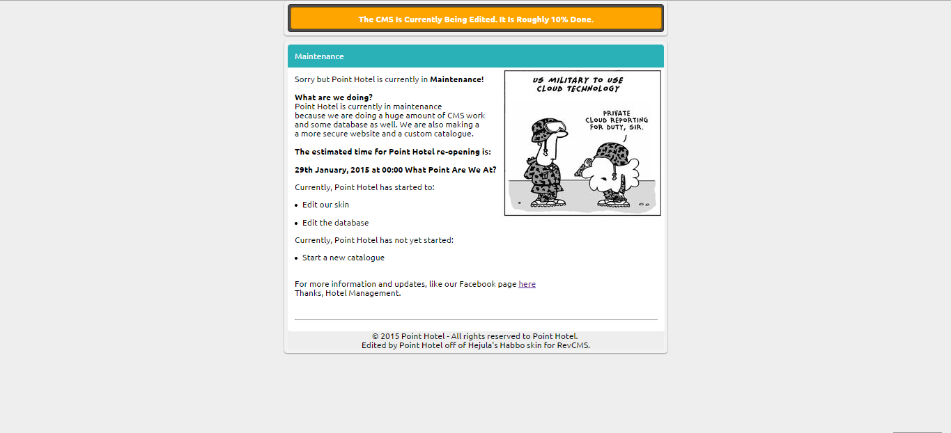
Yeh, I couldn't get a proper screenshot of his as was just a 6 second Youtube video. Now updated the thread with a new edit as I believe I have made this even better.
but would help by saying why. Instead, you have just said you do not like it after I fired you. Anyway, stop trying to boost post count or actually give feedback worth giving.
I'm actually glad you fired me, I Was working with a child.. and you tell me to stop trying to boost post count, stop showing authority? your nothing special. I Was just saying that it does not look nice. Get over yourself.
) is a person between birth and full growth; a boy or girl. Anyway, saying "it doesn't look nice" is not any help to anyone. Say how to improve it? And I am not authority, I agree... But neither are you
The first maint was bad since we could see the text overlapping the image but also that the font is nothing related to Habbo just like your other 'updated' edit.
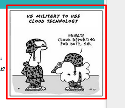
Your new update is politely better but one problem which annoyed me is your new image. Its not even habbo related, what is the point? I'm just giving good feedback so don't take this as offence or anything.
The first maint was bad since we could see the text overlapping the image but also that the font is nothing related to Habbo just like your other 'updated' edit.
Your new update is politely better but one problem which annoyed me is your new image. Its not even habbo related, what is the point? I'm just giving good feedback so don't take this as offence or anything.
Personally,
I like the font, and some of the CSS looks simple, yet cool. Now the cons; bad grammar, you haven't set the text to a certain width as it overlaps the image, so I guess you used <br> a lot. 6/10.
")


")