✦ [ New SICK LOGO ] ✦

SoNuxDesigns

New Member
Jun 16, 2014
11
1
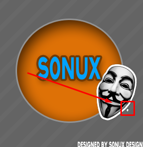
Hᴇʟʟᴏ, I ᴍᴀᴅᴇ ᴀ ɴᴇᴡ ʟᴏɢᴏ ᴘʟᴇᴀsᴇ ʀᴀᴛᴇ ɪs
ғʀᴏᴍ 0-10 ᴀɴᴅ ᴛᴇʟʟ ᴍᴇ ᴡʜᴀᴛ ʏᴏᴜ ʟɪᴋᴇ, ᴏʀ
ᴅᴏɴ'ᴛ ʟɪᴋᴇ ᴀʙᴏᴜᴛ ɪᴛ ᴛʜᴀɴᴋs ʙᴜʏs :0

PS : Iғ ʏᴏᴜ ᴡᴀɴᴛ ᴀ ʟᴏɢᴏ ʀᴇᴍᴇᴍʙᴇʀ ᴀᴅᴅ ᴍᴇ ᴏɴ Sᴋʏᴘᴇ ᴍʏ Sᴋʏᴘᴇ ɪs sᴏɴᴜxᴅᴇsɪɢɴs I ᴅᴏ ᴄʜᴀʀɢᴇ 5$

334uhpi.jpg
 

Markshall

Русский Стандарт
Contributor
Dec 18, 2010
2,637
2,389
Let me get this straight? You got a circle on a horribly striped background, give it a stroke with some bevel & emboss effect, stuck some shitty text over it whom's colour doesn't even mix with the orange circle, then you've got a picture of the V for Vendetta mask off Google and also given that a shit stroke then put a crappy watermark over it, then you call it a 'SICK' logo?

Nah kid, get outta here. 0/10.
 

SoNuxDesigns

New Member
Jun 16, 2014
11
1
Let me get this straight? You got a circle on a horribly striped background, give it a stroke with some bevel & emboss effect, stuck some shitty text over it whom's colour doesn't even mix with the orange circle, then you've got a picture of the V for Vendetta mask off Google and also given that a shit stroke then put a crappy watermark over it, then you call it a 'SICK' logo?

Nah kid, get outta here. 0/10.

Okay, First off Could you do any better? Also Horrible striped background? That's not a background " Kid " That's an overlay. That background is actually grey thank you :) Also that's why i said comment on what u think i should work on, That's all you had to say lmao, And i actually took my time on this and I didn't get that off of Google that's actually a custom shape pack " Kid " Lol, So anyway's please re-post me your work then i'll continue to talk to you.
 

Markshall

Русский Стандарт
Contributor
Dec 18, 2010
2,637
2,389
Okay, First off Could you do any better? Also Horrible striped background? That's not a background " Kid " That's an overlay. That background is actually grey thank you :) Also that's why i said comment on what u think i should work on, That's all you had to say lmao, And i actually took my time on this and I didn't get that off of Google that's actually a custom shape pack " Kid " Lol, So anyway's please re-post me your work then i'll continue to talk to you.
"Also that's why i said comment on what u think i should work on" -- well work on all of it HAHAHAHAHAH
 

TesoMayn

Boredom, it vexes me.
Oct 30, 2011
1,482
1,482
When I first starting doing graphic design, if I was to submit this to my teacher, he would of kicked me out of his class.
You took your time on this? Any novice could do this on MS paint in five minutes.
You can not get mad at Mark for telling you the truth.
 

SoNuxDesigns

New Member
Jun 16, 2014
11
1
"Also that's why i said comment on what u think i should work on" -- well work on all of it HAHAHAHAHAH
Lol, " Kid " You don't even know how to design Also please link me to your work if you do? I would like to see it, " Staff member " Sure don't act like one, That's why you live in the UK you need more respect.
 

Markshall

Русский Стандарт
Contributor
Dec 18, 2010
2,637
2,389
Well I don't brand myself as a designer, I'm a developer. But here are two designs I've been working on lately.


The first one is actually complete, but my website is down.
 

SoNuxDesigns

New Member
Jun 16, 2014
11
1
Well I don't brand myself as a designer, I'm a developer. But here are two designs I've been working on lately.


The first one is actually complete, but my website is down.
OKAY LOL, Okay " Markshall " Talking about my work? That's simple all you did was take a background Stick it on there. You're not good id'e give all of your work a 0/10 thanks.
 

Donkjam

Professional Moderator
Contributor
Nov 20, 2010
1,608
1,603
In all seriousness

I guess this is an alright attempt for your first design (?) maybe try using colours that match each other?
 

Sysode

Front-End Developer
Dec 11, 2012
1,673
848
OKAY LOL, Okay " Markshall " Talking about my work? That's simple all you did was take a background Stick it on there. You're not good id'e give all of your work a 0/10 thanks.

I would have given normal feedback but it seems you're one of them muppets who like to think themselves more superior than others and never listen to others. You got told straight up how it was and you got mad, so you attempt to diss someone better than you? Da fuck is wrong with you.

Mark's a good designer, you're not - face it. Take the criticism and grow a pair, come back soon and work on this.

Anyways, like the Donk said, sort your colour scheme, even if you have to look up some palettes online first to get an idea, here are a few sites that may help:


Also, the trend at the moment isn't all about complexity and a shit tonne of effects, if anything it's more simple and flat, with a few minor shadows - maybe even try geometric designs if you're feeling fancy. Don't over do, sort out your colours and you'll be better off. Imo anyways, good luck.
 
Last edited:

Jian

Resident Weeb
Contributor
Sep 2, 2011
687
437
In all honesty, the "logo" looks too simple. To me, it's just copy and paste work, add some outlines and text, draw some circles, done. A little more effort in making everything blend better would be great.

P.s. @Markshall is an established developer, though he can be harsh at times (Probably all the time cos it's the internet). You should "listen" to what he has to say.

Thread unwatched.
 

lepos

thinking about you. yes you
Dec 11, 2011
2,022
685
And I quote
ᴛᴇʟʟ ᴍᴇ ᴡʜᴀᴛ ʏᴏᴜ ʟɪᴋᴇ, ᴏʀ
ᴅᴏɴ'ᴛ ʟɪᴋᴇ ᴀʙᴏᴜᴛ ɪᴛ

You asked for the criticism, as harsh as it may be. If you can't take it then don't ask for it at all.
 

wite

Posting Freak
Aug 3, 2012
593
131
Sometimes I honestly wonder if people are blind.

Tbh, go back to the drawing board. This isn't even a logo.

1/10, A for effort.
 

Hindi

System.out.println(" ");
Dec 30, 2012
989
192
Okay, First off Could you do any better? Also Horrible striped background? That's not a background " Kid " That's an overlay. That background is actually grey thank you :) Also that's why i said comment on what u think i should work on, That's all you had to say lmao, And i actually took my time on this and I didn't get that off of Google that's actually a custom shape pack " Kid " Lol, So anyway's please re-post me your work then i'll continue to talk to you.
Even on the V for vendetta mask, When you put the stroke effect the're a spot where you forgot to remove something and that's why you're getting this -->
bEgY1Ut.png


And then there's you challenging Markshall.. You're clearly blind and dumb fuck also ignorant fuck that he's better than you in every aspect.
 

DEVVinny

Member
Jun 9, 2014
36
3
Let me get this straight? You got a circle on a horribly striped background, give it a stroke with some bevel & emboss effect, stuck some shitty text over it whom's colour doesn't even mix with the orange circle, then you've got a picture of the V for Vendetta mask off Google and also given that a shit stroke then put a crappy watermark over it, then you call it a 'SICK' logo?

Nah kid, get outta here. 0/10.
It's an inner shadow, not bevel & emboss :ninja:
 

Users who are viewing this thread

Top