Working on something..

Andeh

the best cis-boy
Jun 1, 2010
892
124
Hey guys.

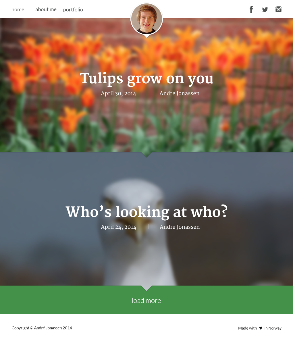
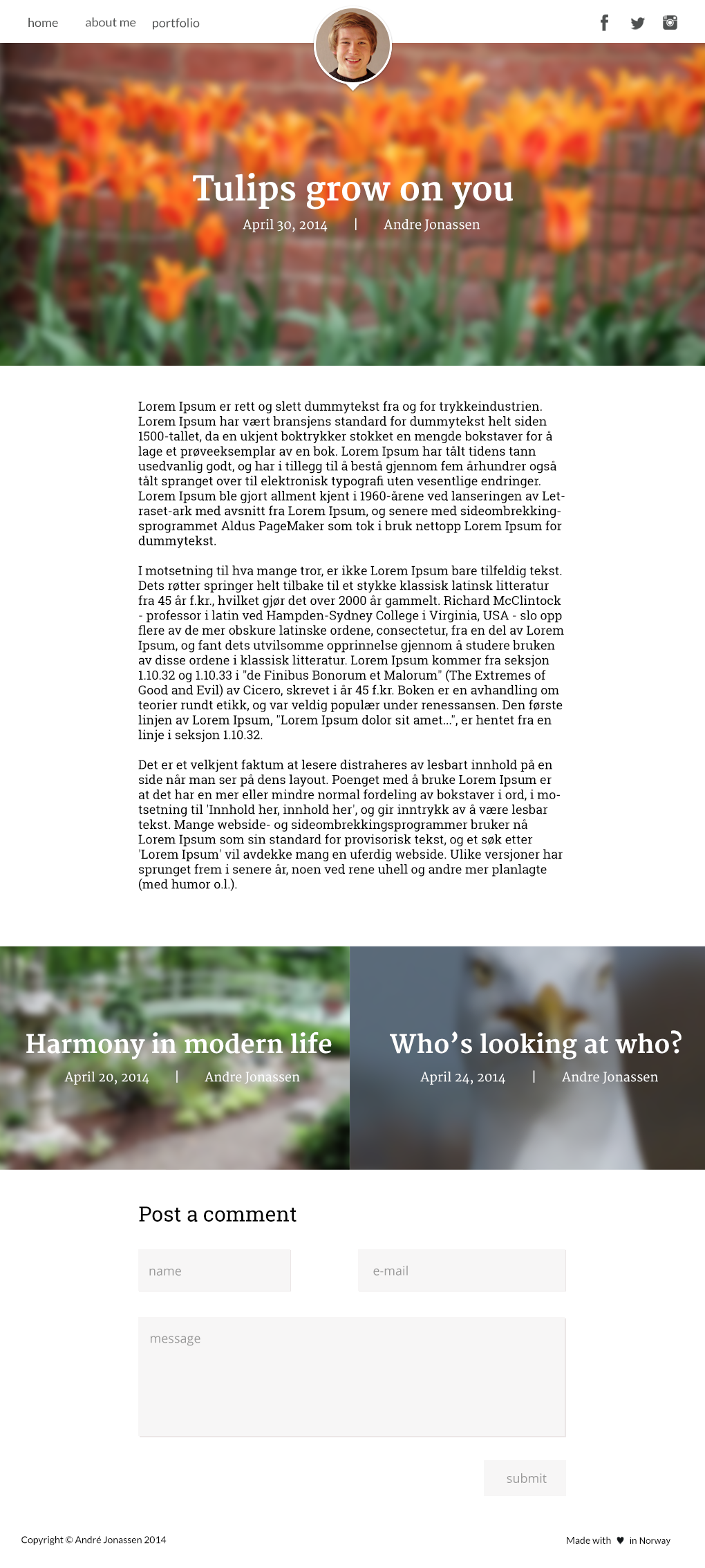
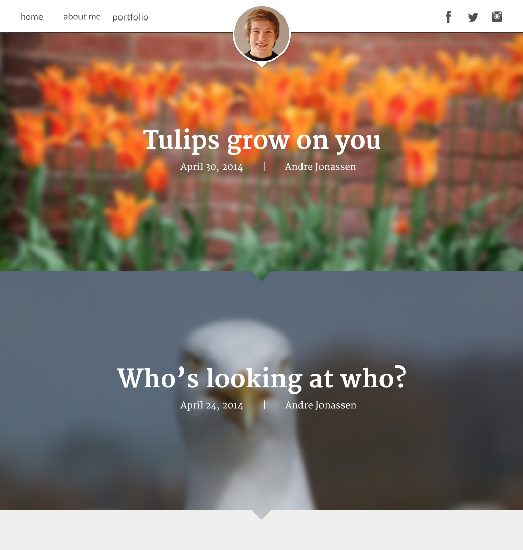
I'm pretty bored, so I started designing the index page of a blog. Quite simple, trying to focus on getting the most out of pictures and using the power of colors through images. Right now I'm too lazy to keep working on it, but when I do continue I'd love to have some input. What should I improve of what I have, and what should I focus on adding next (besides the obvious).

iUS8ErDJPIS0.png
 

Sysode

Front-End Developer
Dec 11, 2012
1,673
848
Overall, nice. I won't bother rating it and stuff, I don't believe in all that, even the best of designs can have improvements..

Anyway, I really like the user of the blurred background, it adds some "life" to the page and thus allowing you to use some simple and plain colours.
To improve though, imo:
  • In between each post, I feel some shadow is needed (preferably on top the post below) just so it doesn't so plain. I'm not talking about a lot, just a light shadow - play around and see which fits best
  • Try adding some tags (most blogs use tags in posts) - I'd maybe make these center aligned, underneath the Author and Date but make the text smaller
  • Have you designed a hover effect for the navigation? If so, mind showing us? I think without anything for hover/focus, it'd be a tad too plain
Other than that, nice work man :)
 

Andeh

the best cis-boy
Jun 1, 2010
892
124
Looks nice if you are going to code this I suggest using the parallax feature. @Sysode
Parallax scrolling is beast, and something I'll most definitely think about when/if I code it.

Overall, nice. I won't bother rating it and stuff, I don't believe in all that, even the best of designs can have improvements..

Anyway, I really like the user of the blurred background, it adds some "life" to the page and thus allowing you to use some simple and plain colours.
To improve though, imo:
  • In between each post, I feel some shadow is needed (preferably on top the post below) just so it doesn't so plain. I'm not talking about a lot, just a light shadow - play around and see which fits best
  • Try adding some tags (most blogs use tags in posts) - I'd maybe make these center aligned, underneath the Author and Date but make the text smaller
  • Have you designed a hover effect for the navigation? If so, mind showing us? I think without anything for hover/focus, it'd be a tad too plain
Other than that, nice work man :)
I agree on the shadow, and have been thinking about it. Tags can also be interesting to add, and something I'll take into consideration. As of right now I still haven't designed a hover effect for the navigation, but this will of course be added. If you have any suggestions for how that effect should be, I'd be more than happy to hear!

Thanks for all of the input!
 

Sysode

Front-End Developer
Dec 11, 2012
1,673
848
Parallax scrolling is beast, and something I'll most definitely think about when/if I code it.


I agree on the shadow, and have been thinking about it. Tags can also be interesting to add, and something I'll take into consideration. As of right now I still haven't designed a hover effect for the navigation, but this will of course be added. If you have any suggestions for how that effect should be, I'd be more than happy to hear!

Thanks for all of the input!
I think a simple colour change on hover, animated (easily done in CSS) would be decent enough. However, you could try and be a bit more unique and do maybe a border-top on hover (with padding obviously). I saw you mention something about it being able to changable via a colour changer, maybe the border - if added - could inherit this colour to keep the consistency flowing. Just a few ideas, have a play around go with your opinion and keep us updated.
 

Andeh

the best cis-boy
Jun 1, 2010
892
124
Haven't included the suggestions mentioned in this thread yet (I'm too lazy atm). The load more button is rubbish, I am aware. Changing that later.

q0PPH8MmSPS0.png


O5n7gScYRPS0.png
 

lepos

thinking about you. yes you
Dec 11, 2011
2,022
685
I think it looks pretty decent.

It fits the theme "blog" perfectly. Looks like something you'd see a popular personal blogger using (or someone tumblr famous haha). I want to see updates!
 

Chlorate

New Member
May 5, 2014
7
2
The latest update is looking pretty sweet. ^ And yeah it seems like it could be used by a well-established blog because it's very neat and simple. Well done
 

Users who are viewing this thread

Top