Show DevBest Rate my two similar layouts!

Snappy

^^^^UpHosting^^^^
Aug 29, 2013
521
43
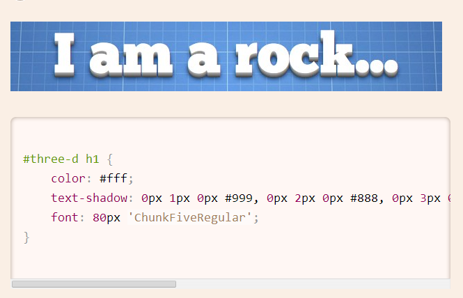
Ok title says it all.
Try to be constructive with your criticism please!
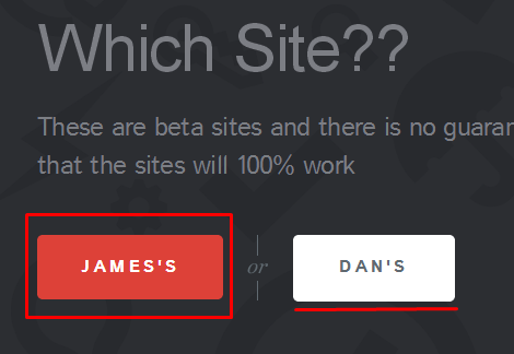
Links

Updated my style completely its barely done for now will notify on future updates!(not completely finished! e.g. the containers)

Hope people like them as I may release one of them!
 
Last edited:

Deion

Posting Freak
Jul 3, 2010
1,273
300
Both looks real unprofessional and it looks like you were aiming for something of high quality.

Overall I'd have to say that it's missing a lot of stuff that could dramaticly affect how it would look. The logo throughs off the entire top on both layouts. The containers look hideous in my opinion, try adding an image to it, push it down, and use a better choice of font and a better buy now button. The new york background is extended further than it should be. All of the text near the bottom could be positioned better with the help of addition things such as images and layed out borders. Again this is just my personal view of how things should go, I don't know what you're aiming for.

I'll rip it and attempt to play around with it if you don't mind .
 

Snappy

^^^^UpHosting^^^^
Aug 29, 2013
521
43
Both looks real unprofessional and it looks like you were aiming for something of high quality.

Overall I'd have to say that it's missing a lot of stuff that could dramaticly affect how it would look. The logo throughs off the entire top on both layouts. The containers look hideous in my opinion, try adding an image to it, push it down, and use a better choice of font and a better buy now button. The new york background is extended further than it should be. All of the text near the bottom could be positioned better with the help of addition things such as images and layed out borders. Again this is just my personal view of how things should go, I don't know what you're aiming for.

I'll rip it and attempt to play around with it if you don't mind .
Thanks for feedback you can rip it I don't mind! I have to agree with you on the font, I can't seem to find a nice font anywhere! In your opinion which one is better? new.udesigns.pw or udesigns.pw ? I prefer new.udesigns as I just did a nice little update I might actually make the logos as images instead of fancy css! @Deion
 
Last edited:

Sysode

Front-End Developer
Dec 11, 2012
1,673
848
Like @Deion said, it's like you've attempted to create something more advanced than you are capable of creating - it's fine, worth a try.

First thing I noticed is that you seemed to have found some tutorial on how to create 3D text using CSS - this is fine but it seriously does not suit your kind of design.
Also, there are some other things that need looking into:
  • The top-bar is the entire page width yet it only features a small logo in the middle? Either avoid going to with a top bar or add some content (navigation maybe) to it;
  • The header image doesn't reach full width. You declared a width of what it must reach (1350px) which means it'll look decent on a screen resolution with a width of 1350.. Any smaller will cause scrolling by default and any larger (like mine) just looks bad.
  • Consistency is key when designing, or so I think. You've used various hover-styles and padding for each section and it just makes your site look messy and not thought of. Try and stick to the same padding on each container and adding the same hover effects on <div>'s
Also, to point out now as it's a good habit to get into, you're coding style seems a little outdated.. By this I mean:
  • Your code isn't valid at all. For example, if you take your image which you have used, you haven't included an alt tag. It should be like so
    HTML:
    <img src="../path/image.jpg" alt="Your image alt" />
  • When using selectors for CSS, I notice that you use ID's (<div id="">) which is fine for smaller sites, but it's quicker and more efficient to use classes (<div class="">) <- May be useful to get into the habit of that now;
  • Also, this is just a personal preference but you don't indent your code at all? Maybe look into completing that as well.
There are room for a few improvements, work on them and then maybe share your progress soon and gather some more feedback. Best of luck, hope this helps.
 

Snappy

^^^^UpHosting^^^^
Aug 29, 2013
521
43
Like @Deion said, it's like you've attempted to create something more advanced than you are capable of creating - it's fine, worth a try.

First thing I noticed is that you seemed to have found some tutorial on how to create 3D text using CSS - this is fine but it seriously does not suit your kind of design.
Also, there are some other things that need looking into:
  • The top-bar is the entire page width yet it only features a small logo in the middle? Either avoid going to with a top bar or add some content (navigation maybe) to it;
  • The header image doesn't reach full width. You declared a width of what it must reach (1350px) which means it'll look decent on a screen resolution with a width of 1350.. Any smaller will cause scrolling by default and any larger (like mine) just looks bad.
  • Consistency is key when designing, or so I think. You've used various hover-styles and padding for each section and it just makes your site look messy and not thought of. Try and stick to the same padding on each container and adding the same hover effects on <div>'s
Also, to point out now as it's a good habit to get into, you're coding style seems a little outdated.. By this I mean:
  • Your code isn't valid at all. For example, if you take your image which you have used, you haven't included an alt tag. It should be like so
    HTML:
    <img src="../path/image.jpg" alt="Your image alt" />
  • When using selectors for CSS, I notice that you use ID's (<div id="">) which is fine for smaller sites, but it's quicker and more efficient to use classes (<div class="">) <- May be useful to get into the habit of that now;
  • Also, this is just a personal preference but you don't indent your code at all? Maybe look into completing that as well.
There are room for a few improvements, work on them and then maybe share your progress soon and gather some more feedback. Best of luck, hope this helps.
Thanks for this feedback
a44bc6b40e14b9f53f869a47e57f4d62.png
lol that's the tutorial and on the udesigns.pw site I use div id whereas on the second site I don't because someone already told me about id and classes and the first site hasn't been updated in a while the reason for the variation of opacity hover on the first site is because I was seeing which hover I preferred. I always forget to add alt tags :S. I will take this feedback on board and try to change! thanks mate!
 

Pro

Insane in the midbrain.
Oct 14, 2010
194
37
Don't like it all. Neither the color usage.

Verstuurd van mijn GT-I9070 met Tapatalk
 

Kontrol

Graphics Artist - Kontrol!
Feb 23, 2014
217
28
In my opinion, they both are horrible.
The new one is better than the old one, if you compare the two.
Although both of them could use some major edits towards more features and such.

Good luck!


-Kontrol
 

Stallone

[◣_◢]
Feb 4, 2012
419
128
They're both ugly, no offence.

Maybe try some padding to your work.
For example on the second site you could add:

Code:
.Container {
background-color: #17A98C;
width: 500px;
height: 350px;
margin-left: 445px;
border-radius: 10px;
margin-top: 100px;
margin-bottom: 500px;
box-shadow: 0px 0px 30px #000;
padding: 10px;
}
 

Jian

Resident Weeb
Contributor
Sep 2, 2011
687
437
I'll be strict with this. As I'm on mobile, I can only rate from a mobile point of view.

They're both horrible. You need to do better if you're to start a designing company. Or else no one will want to do business with you.

I'll rate it via my desktop once I reach home.
 

Doge

Active Member
Jan 12, 2012
174
40
I'm sure is ripped from Themeforest.

If you are web designers try to make your website as beautiful as possible without downloading ready made templates.
 

Sysode

Front-End Developer
Dec 11, 2012
1,673
848
I'm sure is ripped from Themeforest.

If you are web designers try to make your website as beautiful as possible without downloading ready made templates.
Well pointed out.

Fucking scumbag, once a scammer, always a scammer. Is this what you were planning on doing all along? Charging people for you to use SOMEONE ELSES design? Pathetic. Why even attempt this?
 

Doge

Active Member
Jan 12, 2012
174
40
Well pointed out.

Fucking scumbag, once a scammer, always a scammer. Is this what you were planning on doing all along? Charging people for you to use SOMEONE ELSES design? Pathetic. Why even attempt this?

Children be stealing peoples designs and attempting to sell them on as their own.
 

Snappy

^^^^UpHosting^^^^
Aug 29, 2013
521
43
Well pointed out.

Fucking scumbag, once a scammer, always a scammer. Is this what you were planning on doing all along? Charging people for you to use SOMEONE ELSES design? Pathetic. Why even attempt this?
Look at this bit
1ihbGGy.png
James's one must of been ripped from themeforest not my one as I have been in Egypt for 2 weeks with no wi-fi I will ask him about why he has ripped it. Whereas my one is not even good but not ripped.
 
Last edited:

Users who are viewing this thread

Top