[PSD] Google "2.0" Mockup

KeironParkes

Member
Oct 19, 2013
235
39
I was bored one night and I saw the idea for his surface on a foreign website.
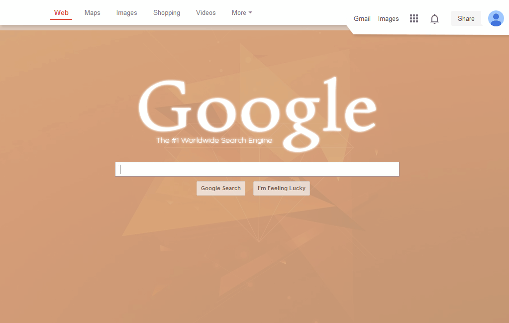
This is my attempt at a more modern Google layout.

VFbl1C7.gif


Sysode

Front-End Developer
Dec 11, 2012
1,673
848
The logo looks worse and as does the background (color wise). It also looks like you print screened the top right of the design from the actual Google homepage? They shades of white just look mismatched to me.

I see what you're getting at, its not bad. Redesigning something that is already ultra simple can be difficult - maybe go for something with a bit more content next time (ie - wikipedia homepage etc)

Keep up the work mayn! :)
 

Benden

maging ang maganda mamatay
Jun 4, 2010
2,281
1,480
You picked an ugly colour imo and the Google logo looks a bit more blurry, but I like what you've done with it!
 

KeironParkes

Member
Oct 19, 2013
235
39
The logo looks worse and as does the background (color wise). It also looks like you print screened the top right of the design from the actual Google homepage? They shades of white just look mismatched to me.

I see what you're getting at, its not bad. Redesigning something that is already ultra simple can be difficult - maybe go for something with a bit more content next time (ie - wikipedia homepage etc)

Keep up the work mayn! :)
The logo and the background are just placeholders. As I said, this was like 5AM :p
 

Sysode

Front-End Developer
Dec 11, 2012
1,673
848
The logo and the background are just placeholders. As I said, this was like 5AM :p
Well you didn't say that + when designing you can't use the excuse that it is a placeholder... The whole point is to use everything so it looks, hence why it is a design :p
 

Crup

weeeeee
Jul 25, 2010
545
310
If this was google's homepage, I wouldn't notice a difference. Seems like something google will do. The bars looks nice but the logo is a bit blurry.

It looks better then google's current homepage.
 

KeironParkes

Member
Oct 19, 2013
235
39
Sorry haha, its not meaning to sound as blunt as it is, not sure how to word it ;p

Either way, it's feedback. Just take it on board if you think it'd help, if not then just let it slip.
Haha, I will definetly take it all onboard bro, especially from someone experienced in the field.

If this was google's homepage, I wouldn't notice a difference. Seems like something google will do. The bars looks nice but the logo is a bit blurry.

It looks better then google's current homepage.
The logo has an outer glow, thank you for the feedback!
 
Feb 1, 2014
165
137
Looks the same to me just with a different logo and background.

Anyway feedback,

Could change the logo size and ditch the glow, now in days people tend to like flat and basic logos now.
Although I see you have the Google Dashboard-style background in there which is nice.

The whole hotlink area/navigation at the top could do with a revamp. Not so flat design but a metro styled outlook would be cool.
Again, a new font that would do the google hompage justice would be 'Segoe UI' or numberous other smooth fonts.
 

Markshall

Русский Стандарт
Contributor
Dec 18, 2010
2,637
2,389
I think it's terrible to be perfectly honest. The background is ugly, the logo is too blurry/glowey and that's basically all you've changed apart from the extra addition to the bar where the user information is displayed

Also, the '#1 worldwide search engine' text wouldn't suit google. They are most likely the #1 search engine in the world but they wouldn't put that on the site. They like to keep it simple and not fill it with self proclaimed titles.
 
Feb 1, 2014
165
137
What Markshall said basically,

I done this in about 8 minutes just to give you some ideas on flat design and the correct fonts to use.
Nothing big, btw I know that the font colors are too light for the background.
ePs5dBM.png
 

Users who are viewing this thread

Top