You are using an out of date browser. It may not display this or other websites correctly.
You should upgrade or use an alternative browser.
You should upgrade or use an alternative browser.
Need some thoughts
- Thread starter griimnak
- Start date

Ecko
23:37 [autobots] -!- eckostylez [[email protected]]
- Nov 25, 2012
- 1,396
- 960
Looks like something a 11 year old would make when they first learn about HTML
griimnak
You're a slave to the money then you die
- Jul 20, 2013
- 956
- 797
- Thread starter
- #6
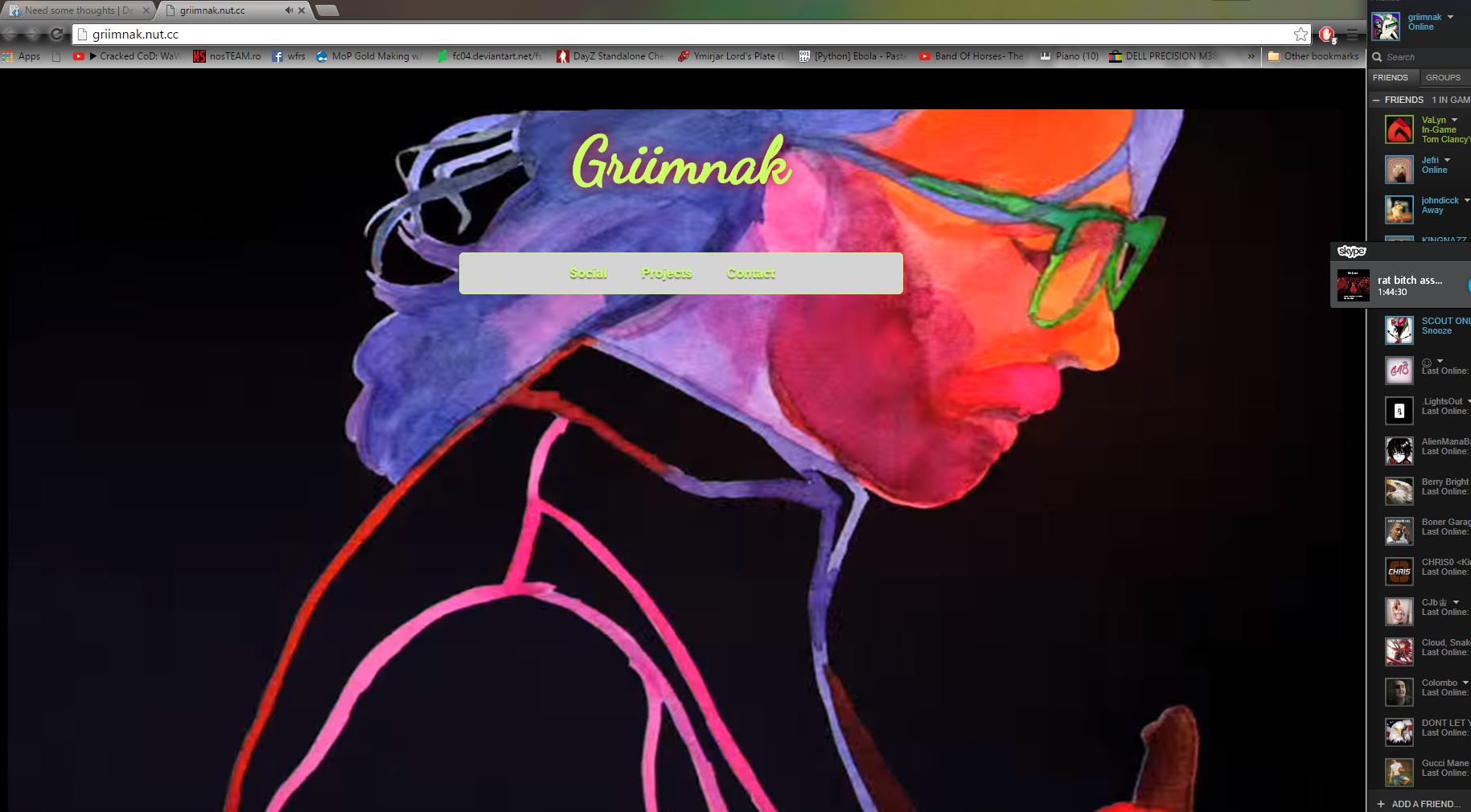
ok i enjoy the nut tickling but i've said this before, i'm a horrendous designer.Looks like something a 11 year old would make when they first learn about HTML
So, enough with how bad it looks and just give me suggestions please.
style of navi bar, fixed or static. colors, fluid or 2 collumn etc etc you know what i mean
Rain
c
- Mar 13, 2015
- 558
- 243
Make it more flat-ui style. Take a look on different websites and see how their designs are done. Also, font can make a huge difference.ok i enjoy the nut tickling but i've said this before, i'm a horrendous designer.
So, enough with how bad it looks and just give me suggestions please.
style of navi bar, fixed or static. colors, fluid or 2 collumn etc etc you know what i mean
Try using softer colours/different colours - The colour scheme is a massive part of design. Note that blue is the most favored colour, with green right behind. Make use of that
")
Prehaps some out unique features??
griimnak
You're a slave to the money then you die
- Jul 20, 2013
- 956
- 797
- Thread starter
- #8
Thanks for the feedback man, i'm prolly gonna ditch the youtube background.. or maybe make it in more of a blurred canvas and have an overlay of content idkMake it more flat-ui style. Take a look on different websites and see how their designs are done. Also, font can make a huge difference.
Try using softer colours/different colours - The colour scheme is a massive part of design. Note that blue is the most favored colour, with green right behind. Make use of that
Prehaps some out unique features??
griimnak
You're a slave to the money then you die
- Jul 20, 2013
- 956
- 797
- Thread starter
- #10
Thanks i was actualy gonna ask if anyone remembered the old one.Prefer the old one to the newer version
I think the problem is lack of content and the simplicity, this was made under 10 minutes too lol

I plan on gathering thoughts to perhaps make a decent scratch design for once in my life
Rain
c
- Mar 13, 2015
- 558
- 243
Save the youtube video to an mp4 or avi or w.e, and blur it. I like the youtube bg idea, It's slick.. But blurring the video would make the content more readableThanks for the feedback man, i'm prolly gonna ditch the youtube background.. or maybe make it in more of a blurred canvas and have an overlay of content idk
I like the jquery on the new one too, keep that

brsy
nah mang
- May 12, 2011
- 1,530
- 272
If you're trying to learn to design, start off by replicating what you like on
Although, I do like the concept, because it seems to give your personal touch to it, which is great, but the execution just seems to be off. Seems very 2000ish.
You must be registered for see links
This will help you learn some of the aesthetics of design, along with teaching you to properly utilize CSS. As for your template, it's just bad. There isn't anything you could improve on it honestly. You just need to start over.Although, I do like the concept, because it seems to give your personal touch to it, which is great, but the execution just seems to be off. Seems very 2000ish.
griimnak
You're a slave to the money then you die
- Jul 20, 2013
- 956
- 797
- Thread starter
- #15
I agree completely dude. I'll check out dribble, thanks for the guidenceIf you're trying to learn to design, start off by replicating what you like onYou must be registered for see linksThis will help you learn some of the aesthetics of design, along with teaching you to properly utilize CSS. As for your template, it's just bad. There isn't anything you could improve on it honestly. You just need to start over.
Although, I do like the concept, because it seems to give your personal touch to it, which is great, but the execution just seems to be off. Seems very 2000ish.

- Dec 18, 2010
- 2,637
- 2,389
I agree with this, I do it. Although I don't do it to learn design, I do it out of boredom and to sharpen up on coding since I don't do it as much as I used to, so I don't want to forget what I already know.If you're trying to learn to design, start off by replicating what you like onYou must be registered for see linksThis will help you learn some of the aesthetics of design, along with teaching you to properly utilize CSS. As for your template, it's just bad. There isn't anything you could improve on it honestly. You just need to start over.
Although, I do like the concept, because it seems to give your personal touch to it, which is great, but the execution just seems to be off. Seems very 2000ish.
If you're interested, here's a handful of Dribbble designs I've coded, full credits to the original designer can be found in the HTML source code.
You must be registered for see links
griimnak
You're a slave to the money then you die
- Jul 20, 2013
- 956
- 797
- Thread starter
- #19
Yeah i just scrapped the old one but i'm gonna keep working on what i have now, maybe if i puff enough ganja creativity will spark in my cancer infected mindSo many things are wrong with it, generally I think it looks like crap and the source made me cringe. Honestly, you should scrap the whole thing and start over.
Users who are viewing this thread
Total: 2 (members: 0, guests: 2)