bodge
ayy lmao
- Oct 31, 2011
- 406
- 54
Hello Devbest, it is me the best user in all existence here to parade my crap work into your monitors!!
IlluminaCMS made by me for my hotel, Vault Hotel (which everyone hates") )
)
Index:

(the clouds move, I saw that on a another hotel and thought I'd pinch the idea, turns out other hotels are doing it)
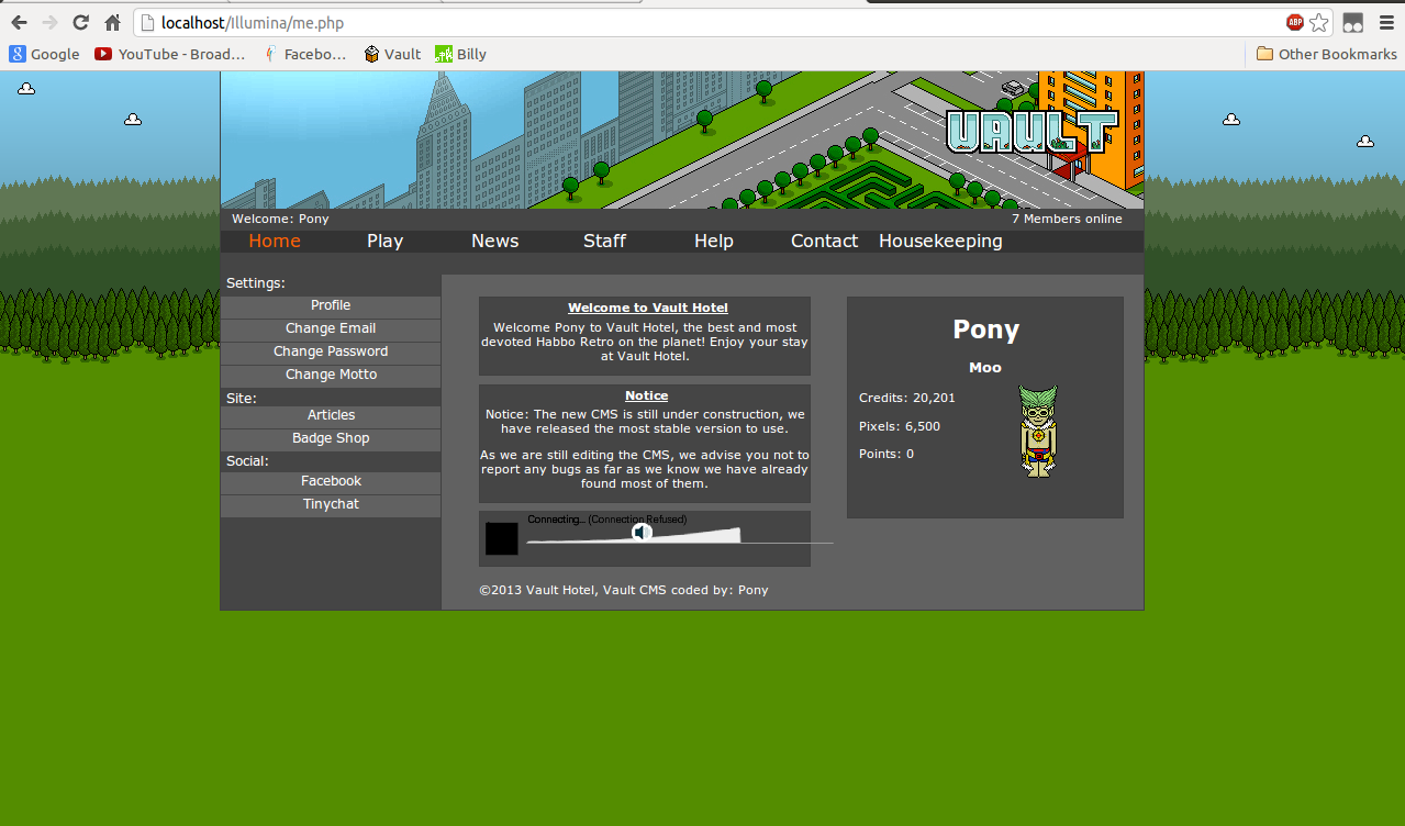
Me:
(I am working on a new edit a better one") )
)
Thanks for viewing, I'll release this when my new edit is out so I can quickly abandon this one
IlluminaCMS made by me for my hotel, Vault Hotel (which everyone hates
)Index:
(the clouds move, I saw that on a another hotel and thought I'd pinch the idea, turns out other hotels are doing it)
Me:
(I am working on a new edit a better one
)Thanks for viewing, I'll release this when my new edit is out so I can quickly abandon this one
You must be registered for see links
(fail at advertising)