LeZack
Don
- Jul 22, 2015
- 64
- 16
Hello, Devbest
We currently working on own design skin for my retro and i would love to see some opinions on what to currently change and ideas on what to add or edit.
As most of people saying its not for habbo style, Well i do agree with you reason is because everyone is using the same style thats released and i want one on my own style.
Screenshots are below:
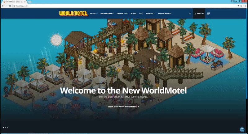
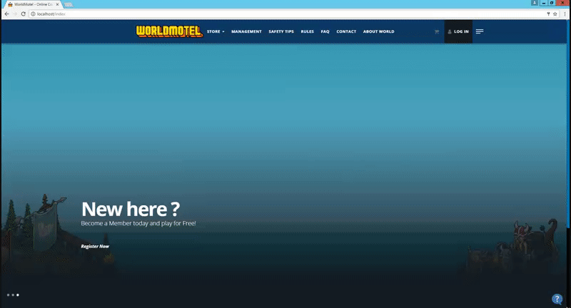
Index:We currently working on own design skin for my retro and i would love to see some opinions on what to currently change and ideas on what to add or edit.
As most of people saying its not for habbo style, Well i do agree with you reason is because everyone is using the same style thats released and i want one on my own style.
Screenshots are below:
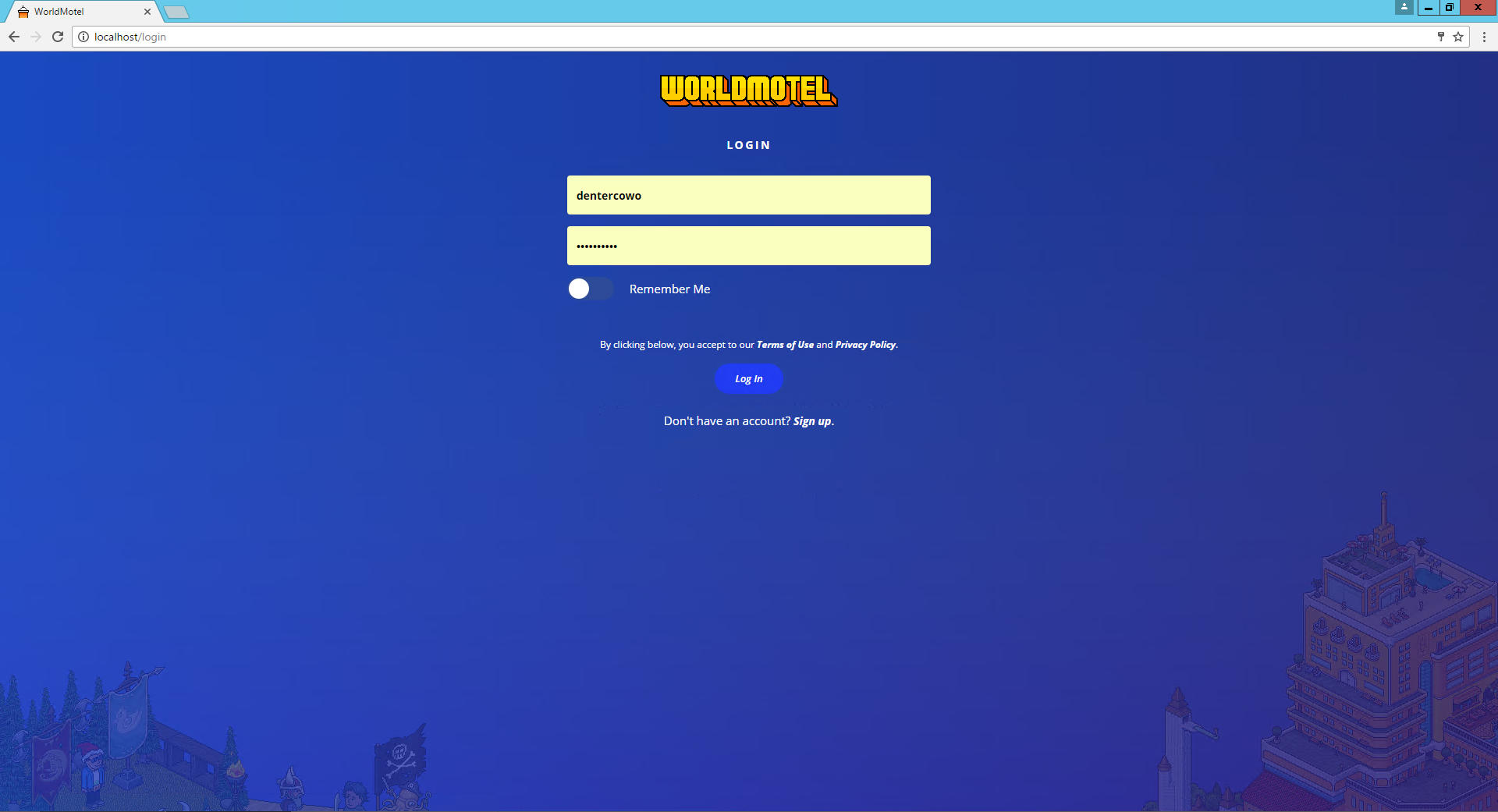
Login 1:
Login 2:
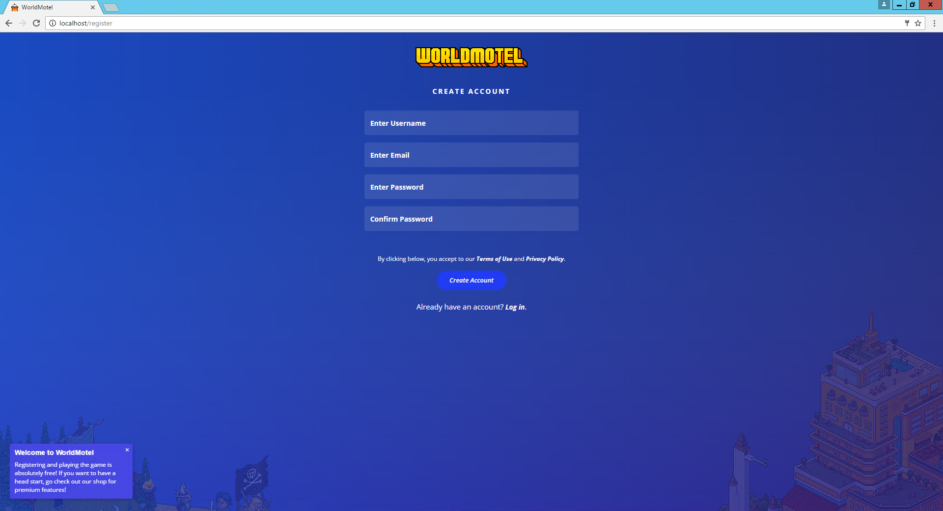
Register:
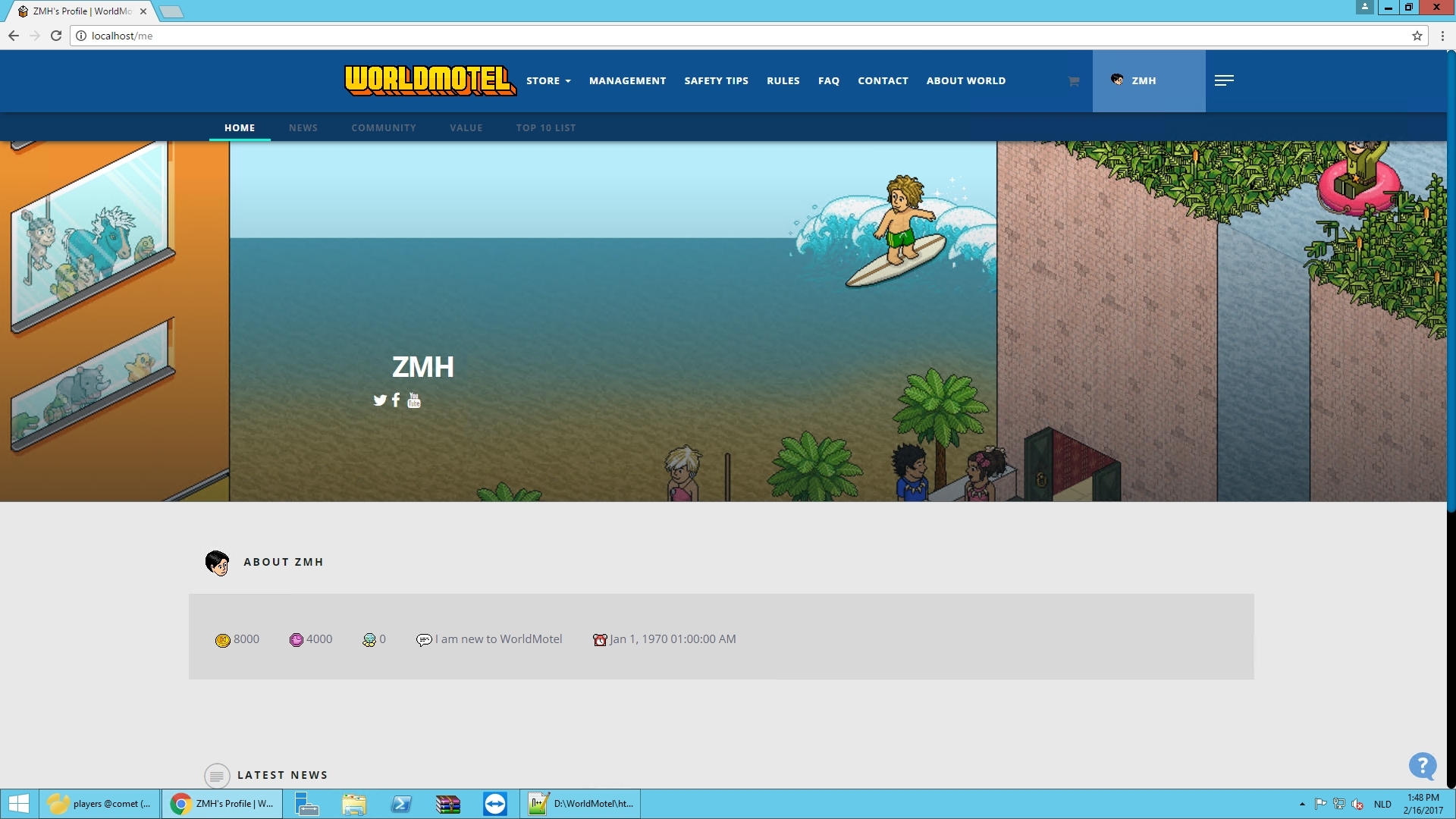
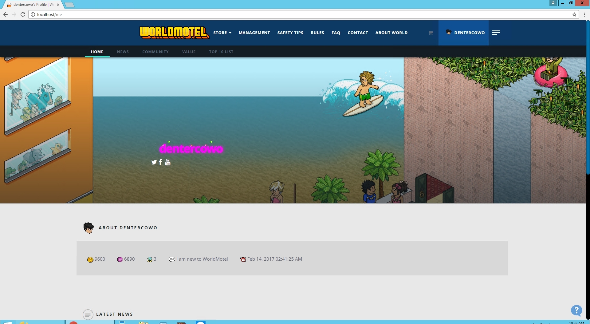
Me Page (NOT FINISHED)
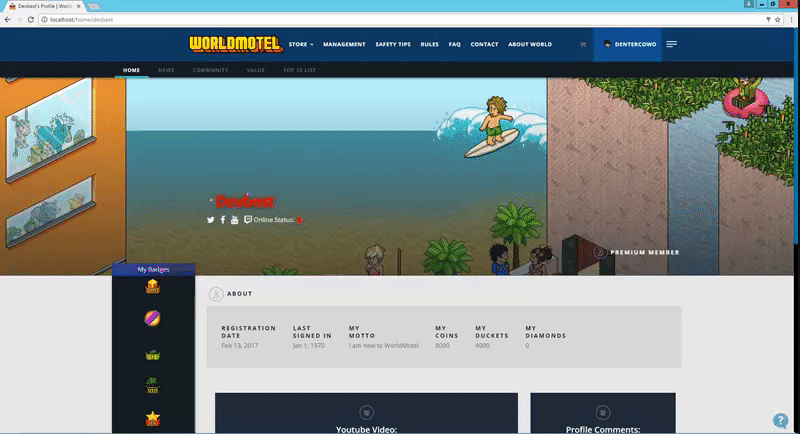
Public Profile Page (not Finished Yet):
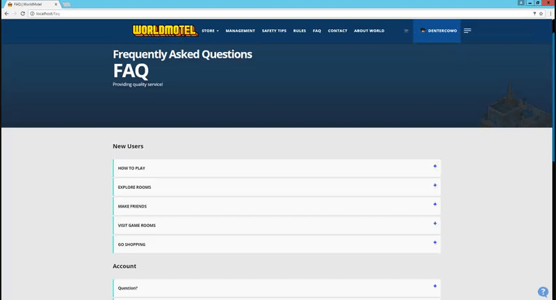
FAQ:
More will be released in a link so you guys actually can see every single page this thread will stay as we wanna improve our skin with great features for our user's.
This thread will get updated when im complety finished.
Thank you for your time for reading this and leaving feedback.
We wish everyone a beautiful day!
Im working on this design with @SpreedBlood everything that is done is with my buddy !
This thread will get updated when im complety finished.
Thank you for your time for reading this and leaving feedback.
We wish everyone a beautiful day!
Im working on this design with @SpreedBlood everything that is done is with my buddy !
Last edited:


")