Simple Coming Soon template [HTML, CSS, JS]

Damon

Member
Aug 13, 2012
364
114
g2j7YLI.png

Simple Coming Soon Template
I decided to try something new for myself and try a coming soon page.

This is a simple coming soon template that you can be used for your website that is being developed/created. The template can also be easily changed to something similar like "We'll be back up soon" and be used for a maintenance page. Simple and easy to change to your preferred opening date so your website viewers know when exactly you will be up.

Features:
  • Images - [Social icons, background]
  • Easy to edit coding [Html & CSS]
  • LIVE countdown script to let your viewers know roughly when you will be open
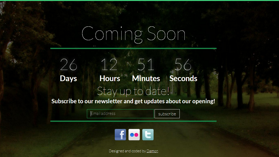
Screenshot(s):
vemw.png


Last edited:

Sysode

Front-End Developer
Dec 11, 2012
1,673
848
Overall: fairly nice, nice font (I use it a lot myself, especially with that weight for titles).

However, you've used it everywhere. I normally only tend to use the weight 100 for titles as it's more effective. Maybe just play around with different font weights/font family's for the body text. Also, not a big fan of the green shadow in input hover/focus, it just feels a little odd. Finally, the submit button isn't the same the size as the input field (height wise) is this supposed to happen?

On the whole though, it's nice, clean and minimal - nice work bro.
 

Damon

Member
Aug 13, 2012
364
114
Overall: fairly nice, nice font (I use it a lot myself, especially with that weight for titles).

However, you've used it everywhere. I normally only tend to use the weight 100 for titles as it's more effective. Maybe just play around with different font weights/font family's for the body text. Also, not a big fan of the green shadow in input hover/focus, it just feels a little odd. Finally, the submit button isn't the same the size as the input field (height wise) is this supposed to happen?

On the whole though, it's nice, clean and minimal - nice work bro.
Once I uploaded I noticed the input and submit styling myself. I'll go and fix it right now :)
And yes, I agree with you about the font.
Thanks though :)

Edit: Fixed up the button, made it look better. I also took your suggestion about the fonts and changed "Subscribe to our newsletter and get updates about our opening!" into a different font weight, which looks a bit better to me.
 
Last edited:

Shatter

Selling Dedicated Servers
Jan 8, 2014
537
145
Apart from a few negative comments above, I think it's absolutely wonderful. Great release! Cannot wait to see more.
 

Damon

Member
Aug 13, 2012
364
114
Fair enough. Are you planning on releasing more website templates soon?
If you look at my portfolio or downloads by going to , i've done a few things in the past. So yes, of course i'll be working on more templates and releasing them.
 

Markshall

Русский Стандарт
Contributor
Dec 18, 2010
2,638
2,393
Everything is far too close together, and with the fonts varying in weights it's hard to focus on one thing at a time. Space things out, other than that, it's decent.
 

Damon

Member
Aug 13, 2012
364
114
How do you edit the times? :$
Just find the line: <span id="countdown1">2014-03-1 00:00:00 GMT+00:00</span><Br>
and change the date, time so for example

Christmas:
<span id="countdown1">2014-12-25 00:00:00 GMT+00:00</span><Br>
 

Kontrol

Graphics Artist - Kontrol!
Feb 23, 2014
217
28
Just find the line: <span id="countdown1">2014-03-1 00:00:00 GMT+00:00</span><Br>
and change the date, time so for example

Christmas:
<span id="countdown1">2014-12-25 00:00:00 GMT+00:00</span><Br>

I did earlier and it did nothing, I'll try again though!

EDIT;
Got it thanks, I'll use this to count down when my website/portfolio will open!
 

Users who are viewing this thread

Top