I'm viewing this on a mobile device, it's not responsive is it? The notice doesn't actually disappear when attempting to dismiss either.
I'm not 100% sure of what the sites purpose is when visiting, maybe make that a little clearer as it'll increase sign ups - being hit with a register page straight up is a little off-putting in terms of UX (as is "go to part 2 of sign up") maybe reconsider this?
All in all though I like the color pallet you've chosen it looks clean and modern. With a little work it'll look neat - keep us updated!
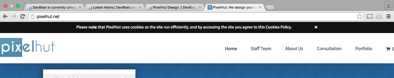
"We are a web development agency that designs what YOU want!" seems slightly pointless to me. Surely a personal web development agency designs what the client wants anyway? Maybe make your marketing a bit more clever. Also, you should make the PixelHut logo higher resolution for higher resolution computers. I'm using a Retina Macbook and it's slightly blurry. Furthermore, you should make the entire navigation section clickable rather than just the text on it, if that makes sense. Apart from that, the design is pretty good, well done
On the navigation if you click the text e.g. Staff Team it would take you too the staff page because it's a hyperlink but if you click say a bit below the staff team text but still in the darker button area it won't take you anywhere -
On the navigation if you click the text e.g. Staff Team it would take you too the staff page because it's a hyperlink but if you click say a bit below the staff team text but still in the darker button area it won't take you anywhere -


")