Show DevBest New r/Eminem layout

Markshall

Русский Стандарт
Contributor
Dec 18, 2010
2,637
2,389
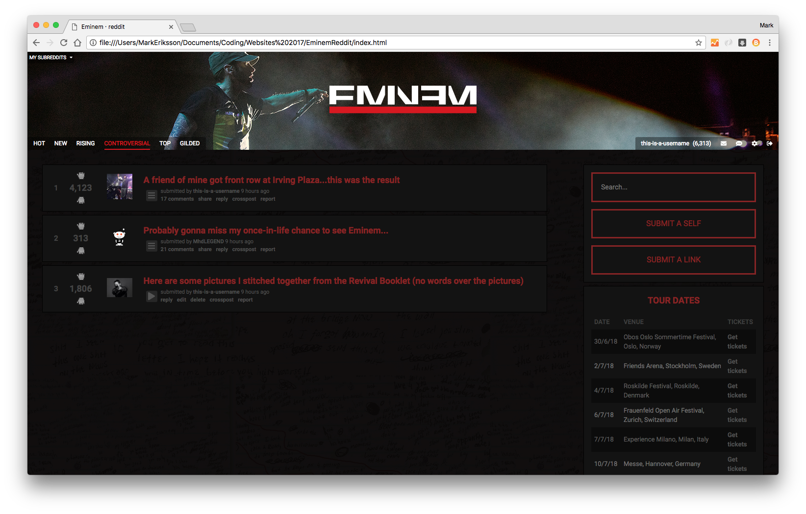
Most subreddits are ugly, but r/Eminem is particularly ugly so I decided to go away and design my own version and code it up to see how it went. I don't consider myself a designer but I don't think it went so bad.

I tried to keep the design simple and also base it off Eminem's website colours (red/grey/black).

The design features an SVG redesign of .

r/Eminem currently uses a middle finger for the cursor when you hover over links, I like it so decided to keep it, but I also decided to use it for the karma voting buttons but edited them so the middle finger only appears when you hover over them... I also decided not to use the hover-cursor on top of the karma buttons so it wasn't overloaded with middle fingers lol


Or here's a screenshot:
EwXFKKDgZ1k3.png


Let me know what you think/what you'd change etc.

Cheers,
Mark
 

Weasel

👄 I'd intercept me
Nov 25, 2011
4,132
2,456
Honestly this looks great compared to the version they currently have. Did you submit it to the subreddit MODs?
 

Markshall

Русский Стандарт
Contributor
Dec 18, 2010
2,637
2,389
Honestly this looks great compared to the version they currently have. Did you submit it to the subreddit MODs?
Kind of, yeah. I've sent it to one moderator on the new chat feature Reddit installed. But I only sent it about 30 mins ago or something so no reply as yet
 

Wight

New Member
Feb 5, 2018
12
2
I agree, to be honest mate. Maybe a lighter version could be the better option, as I find it a little hard to concentrate on the image itself. Good luck and can't wait to see your work in future! +1
 

Markshall

Русский Стандарт
Contributor
Dec 18, 2010
2,637
2,389
I agree, to be honest mate. Maybe a lighter version could be the better option, as I find it a little hard to concentrate on the image itself. Good luck and can't wait to see your work in future! +1
Perhaps it’s just a matter of taste then. I’m a fan of dark backgrounds, I tend to like dark websites, use night-theme in reddit/twitter apps and code on a dark theme. I’ll hopefully get round to coding a lighter version and update it on here

Either way nice one
 

Khalil

IDK
Dec 6, 2011
1,642
786
Honestly, that's some pretty fucking good shit, Mark.

It looks great, the only part that may have "ticked" me so to say was the subreddits dropdown menu, I'm a fan of just having my subs at the top for easy and immediate access, having to put effort into accessing them (regardless of how relatively easy you've made it, kudos on that one) would just put me off a bit or even somewhat take from the general experience of it all. Also, having the dropdown cover the entirety of the page kind of leaves you with a lot of unused space that looks a bit weird when just left blank in that fashion, reckon you could tweak that or find some other use for it?

I think you could still improve on those two little fronts; aside from them, it's pretty impressive.
 
Last edited:

Markshall

Русский Стандарт
Contributor
Dec 18, 2010
2,637
2,389
Honestly, that's some pretty fucking good shit, Mark.

It looks great, the only part that may have "ticked" me so to say was the subreddits dropdown menu, I'm a fan of just having my subs at the top for easy and immediate access, having to put effort into accessing them (regardless of how relatively easy you've made it, kudos on that one) would just put me off a bit or even somewhat take from the general experience of it all. Also, having the dropdown cover the entirety of the page kind of leaves you with a lot of unused space that looks a bit weird when just left blank in that fashion, reckon you could tweak that or find some other use for it?

I think you could still improve on those two little fronts; aside from them, it's pretty impressive.
Thanks man, not often you're one to compliment lol so I'll take it

But in all seriousness, I can see what you mean. If you're just an average redditor and don't have many subs, that area is going to look very, very empty. My intention was to have loads of different subs in there, but I couldn't be bothered to go picking out different ones to use them as placeholder subs for the project. I didn't want 50 * r/Eminem if you get me, I wanted a variety to make it look more 'organic'.

Anyway, I've always hated the horizontal-sub bar so thought I'd change it up a little, but after reading what you've said, it makes sense.

Also, the reason it covers the full screen is because I wanted it to, as it was meant to display a full screen of subs, but as we've both mentioned, many people may only have a few. I wanted it like those websites where you click the menu button and it covers the screen and the navigation appears. Not sure if you've seen them about.

But anyway, thanks again for the feedback and honesty:up:

EDIT: here's an example of what I mean with the full-page nav:


@Wess, just got word back from one of the moderators. He said he prefers the one I've done to another one that got posted a couple days earlier. He also said that they're currently developing a dark theme for the one they have now and that in the near future, they're planning a complete redesign, not sure if that means they want to use mine or what, but yeah. Also, he's asked if they can use the logo I redesigned too
 
Last edited:

Mystical

Member
Feb 13, 2018
63
16
Looks amazing, some feedback would be possibly adding a way to switch between a dark & light version, but keep the dark version as default as it looks amazing.
 

griimnak

You're a slave to the money then you die
Jul 20, 2013
955
794
I can't comment on the functionality because i barely use reddit, but it looks great and definitely carries over the style from em's website.
Great work man, your aesthetic taste has proven to still be viable (haven't seen you do a dribble in a while besides that "new app startup" one, so this was refreshing)
 

AssLikeThat

Posting Freak
Jan 27, 2013
765
154
Looks good mate! I like how you've followed the colour scheme of his website, makes sense to be honest. Hope it gets used haha
 

TesoMayn

Boredom, it vexes me.
Oct 30, 2011
1,482
1,482
I think it looks great, good job Mark!

Just wondering though, why did you save that locally instead of just making a private subreddit to do it on? :p

I'd love for you to do that, so we can check it out live!
 

Markshall

Русский Стандарт
Contributor
Dec 18, 2010
2,637
2,389
Looks amazing, some feedback would be possibly adding a way to switch between a dark & light version, but keep the dark version as default as it looks amazing.
Thanks, I did debate doing a lighter version. Still thinking about doing it haha

I can't comment on the functionality because i barely use reddit, but it looks great and definitely carries over the style from em's website.
Great work man, your aesthetic taste has proven to still be viable (haven't seen you do a dribble in a while besides that "new app startup" one, so this was refreshing)
Thanks man, I dunno if you saw, but I did this recently
Or is that the one you saw?

Looks good mate! I like how you've followed the colour scheme of his website, makes sense to be honest. Hope it gets used haha
Thanks man. They seem to like it!

I think it looks great, good job Mark!

Just wondering though, why did you save that locally instead of just making a private subreddit to do it on? :p

I'd love for you to do that, so we can check it out live!
Oh I didn’t even know I could do that lmao! Thanks though :D
 

Users who are viewing this thread

Top