My Loading Screen

Owen

Mar 20, 2013
1,208
614
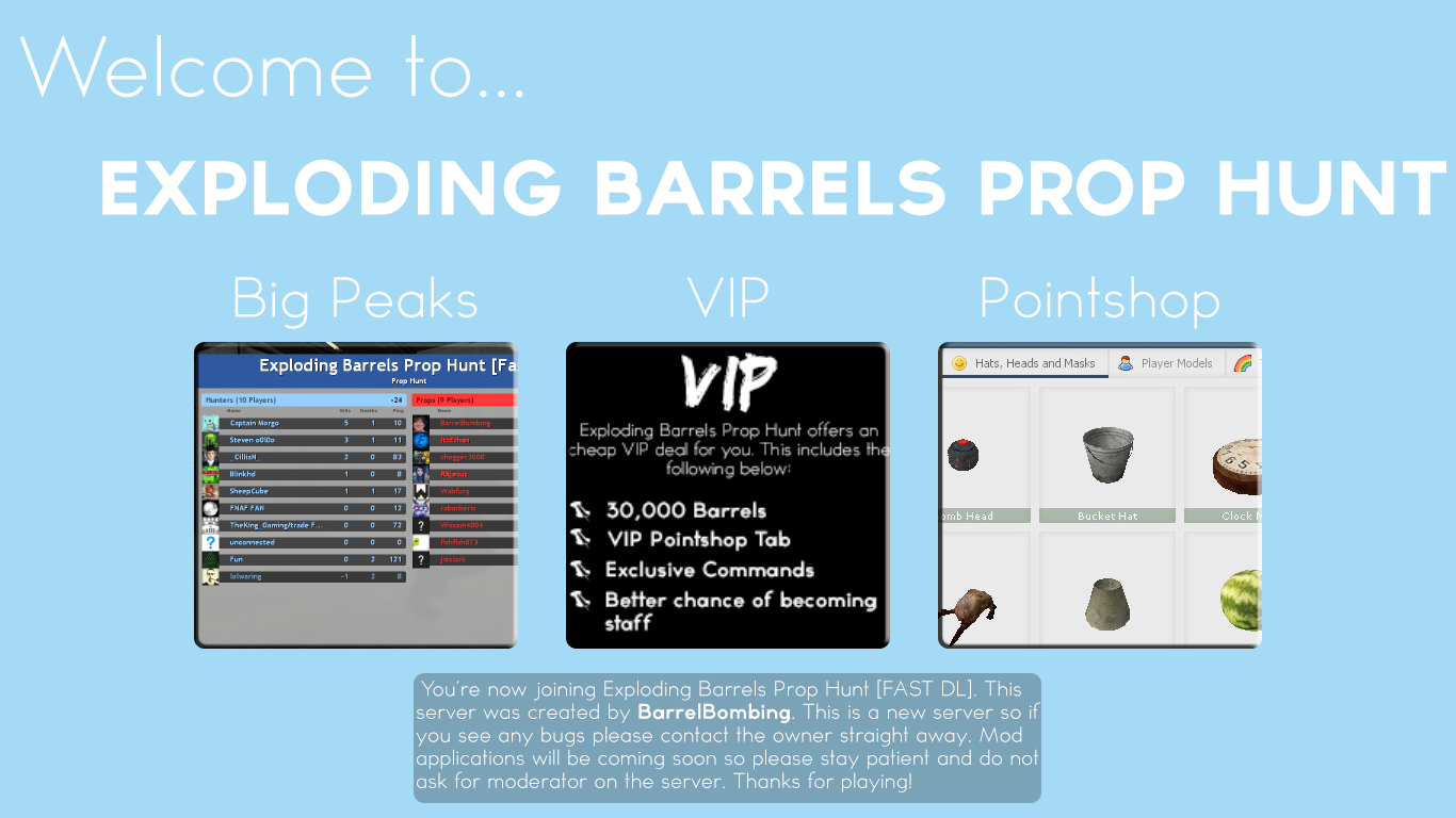
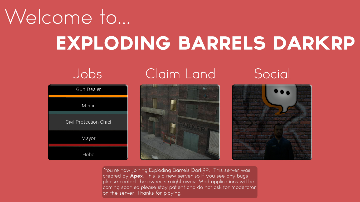
This is my Garrys Mod server loading screen for my prop hunt and darkrp server. There exactly the same but yeah just wanted to share the design to see if any of yous liked it because im thinking of changing it to make it better so please give feedback. I want to make it better than ever so your feedback really does count, thanks. I tried to make it look more sleek in these images because I didn't want to add too much images but just a little bit to make it look simple to look at.

Prop Hunt Screen
pLT8BQb.jpg
DarkRP Screen
IXUHu3c.jpg
 

r0ck

Megatron
Jul 18, 2015
167
56
Yeah, looks alright and all but there's always room for improvements. I wouldn't know what to add to this.
 

Ethereal

Neurotic Male
May 18, 2013
494
330
Really not that bad, apart from the: bad potato font, potato aliasing on the objects (pointshop) and a potatoily worded sentence (offers an cheap VIP).

1311sad-potato.jpg
 
Last edited:

Owen

Mar 20, 2013
1,208
614
Really not that bad, apart from the: bad potato font, potato aliasing on the objects (pointshop), potato font, and a potatoily worded sentence (offers an cheap VIP).

1311sad-potato.jpg
I don't get what your on about with your opinion to be quite honest, the font looks alright and relating everything to a potato doesn't really make sense because the design isn't a potato xD
 

Ethereal

Neurotic Male
May 18, 2013
494
330
I don't get what your on about with your opinion to be quite honest, the font looks alright and relating everything to a potato doesn't really make sense because the design isn't a potato xD

Dw, man. I gave you 9 potatoes out of 10, that's just 2 shy of 1 broccoli .
 

Xylo

邪悪
Jul 21, 2015
560
142
I don't know why, but I dislike the VIP page for the Prop Hunt. The font doesn't satisfy me, otherwise nice. Give you about 7/10 oppais.
 

Owen

Mar 20, 2013
1,208
614
Update on my loading screen:
I've decided to change some stuff from the opinions on DevBest, if you have more suggests fire ahead!
E2GzL27.jpg
 

Sysode

Front-End Developer
Dec 11, 2012
1,673
848
Update on my loading screen:
I've decided to change some stuff from the opinions on DevBest, if you have more suggests fire ahead!
E2GzL27.jpg
I'd allow more space for your text and pad it out a little more - failing that, reduce text.. No one likes to read too much.
 

Zymf

 
Aug 19, 2012
868
166
  • font
  • text box
  • random effect on images
  • alignment
i don't like them truthfully but good attempt
 

Users who are viewing this thread

Top