You are using an out of date browser. It may not display this or other websites correctly.
You should upgrade or use an alternative browser.
You should upgrade or use an alternative browser.
Just want some feedback on a design i'm working on.
- Thread starter Jayseanp
- Start date
Ecko
23:37 [autobots] -!- eckostylez [[email protected]]
- Nov 25, 2012
- 1,396
- 960

Show me a live preview since I feel like I've sen this before.
- Jul 24, 2010
- 5,194
- 3,901

Show me a live preview since I feel like I've sen this before.
Potentially a mash up of a few different layouts? I Google'd some of the content and found this:
You must be registered for see links
(
You must be registered for see links
)Weasel
👄 I'd intercept me
- Nov 25, 2011
- 4,132
- 2,456

- Dec 18, 2010
- 2,637
- 2,389
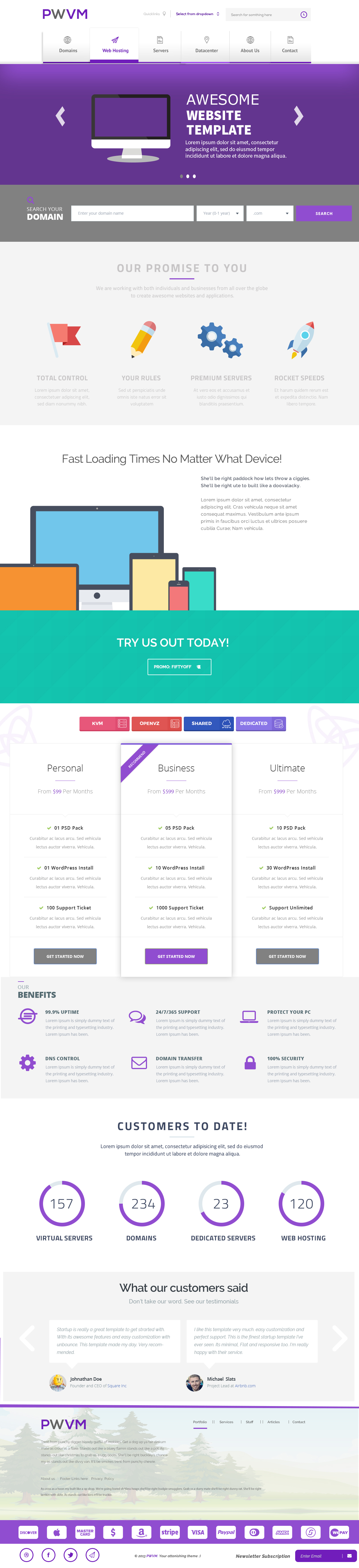
Nothing really flows well. There looks to be about 6+ different fonts being used here. Colours clash too much. Inconsistent styles.
First off I think your navigation links are way too big and I think that you should remove the drop shadow on the first and last nav-items, and then have the background set as that grey colour you have rather than white. So then it's one long grey navigation running across the X axis of the page.
Next, I think the grey background for your 'search your domain' is far too heavy. It doesn't compliment the purple well at all and actually makes it quite hard to read/see. I'd definitely reduce the harshness of that grey.
This may seem very nit-picky but it is design based. I can't see how you can visually represent the statistics in your 'customers to date' section like you have. This applies to the other 3, but your 'virtual servers' circle border is almost complete and is set at '157', so it looks like you're setting a limit of how many you can sell. Do you sell maybe 160 and that's your cut off limit? I'd make them either full bordered circles or find a different way to visually represent this data.
I really dislike the idea of using green as a background colour in your 'try us today' section. That should definitely, no doubt, be purple to make it flow with the rest of the website and keep it consistent.
My next bone to pick is the header titles of each section (our promise to you, fast loading times no matter what device, our benefits, customers to date, what our customers said). I personally think these should all have the same styles attached. Some have a purple set-width line under them, some don't. Some are centre aligned, some aren't. Some are in block-capitals, some aren't. They also have different fonts. Keep these styles consistent to make the page run much smoothly. I honestly think I'd struggle being able to tell if I was on a different section of the website because they're all so different.
I really don't understand the last section with the trees as a background titled 'PWVM,' what exactly is it? Is it a footer? Is it a new section? To me, that looks like if you removed it from that design and put it in a new PSD document, it could be the header to a separate layout altogether.
Next up, I think there are far too many credit card icons. Just show the main ones (visa, Amex, MasterCard, etc).
Finally, the footer. I would swap the positions of your social icons and the newsletter subscription. I'd reduce the spacing between and size of the social icons, they're too big and far apart. I'd definitely remove the text that says 'Newsletter Subscription,' these things are very common nowadays, as soon as someone sees a field at the bottom of a page, I'm sure they're going to know what it is. Or if you really want to make it obvious, change the placeholder of the text field to something like 'Enter email for our newsletter' etc etc.
This has gone on for some while now so I'm going to wrap it up. This is just my opinion though, don't let these points I've stated beat you up and make you give up. Learn from them and find ways to improve on them. You did say you wanted feedback after all
Jayseanp
Soooo Bored!
- Oct 26, 2013
- 394
- 37
- Thread starter
- #6
@Markshall @Sle indeed so.
Cheers for all the feedback. This just the basis. Now i'll fine comb it. I'll take your info seriously and improve on it.
Thanks")
Cheers for all the feedback. This just the basis. Now i'll fine comb it. I'll take your info seriously and improve on it.
Thanks
Jayseanp
Soooo Bored!
- Oct 26, 2013
- 394
- 37
- Thread starter
- #8
H
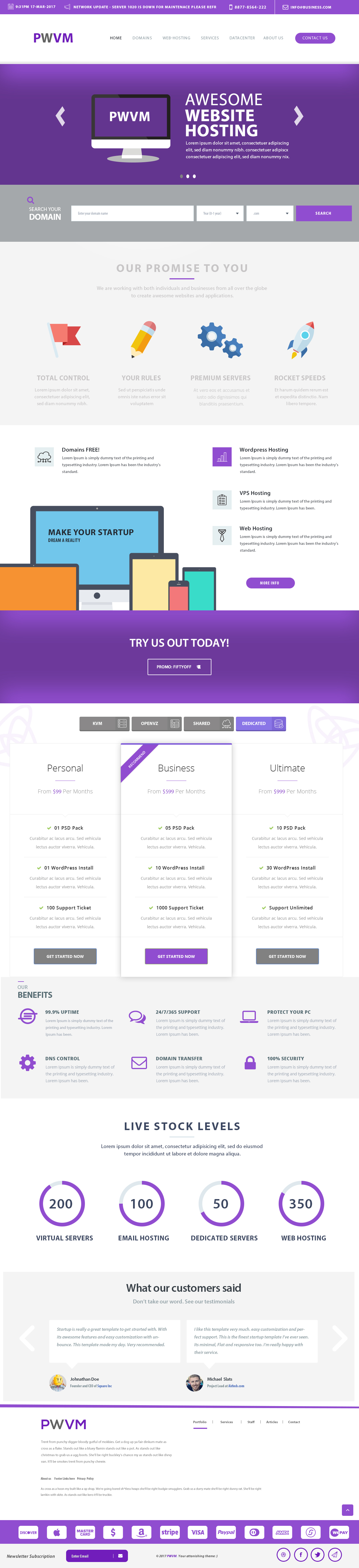
I made changes to quite a few things based on reading your suggestions. Some things i've kept the same.
Regarding, to fonts. YesIi know, just still playing around with different styles. Once i've adhered to one i'll proceed with changing all fonts on the page
Let me know what you think.
Also, like to extend my gratitude to you for actually putting effort into your reply to actually help me.
#UPDATE usage of font has been centralised.
Nothing really flows well. There looks to be about 6+ different fonts being used here. Colours clash too much. Inconsistent styles.
First off I think your navigation
I made changes to quite a few things based on reading your suggestions. Some things i've kept the same.
Regarding, to fonts. YesIi know, just still playing around with different styles. Once i've adhered to one i'll proceed with changing all fonts on the page
Let me know what you think.
Also, like to extend my gratitude to you for actually putting effort into your reply to actually help me.
#UPDATE usage of font has been centralised.
Ecko
23:37 [autobots] -!- eckostylez [[email protected]]
- Nov 25, 2012
- 1,396
- 960
Yep, looks like big portions of it were stolen from thatDoesn this look like hostinger
You must be registered for see links
Jayseanp
Soooo Bored!
- Oct 26, 2013
- 394
- 37
- Thread starter
- #11
@Ecko
Stolen. Please clarify? last i checked the only thing that looks the same is the color. If you're not going to comment something useful. That will help me improve on my second design. Just don't.
I'll be using variables for my LESS/SASS anyways so they will be the ability to change to any color you wish.
Just waiting on @Markshall
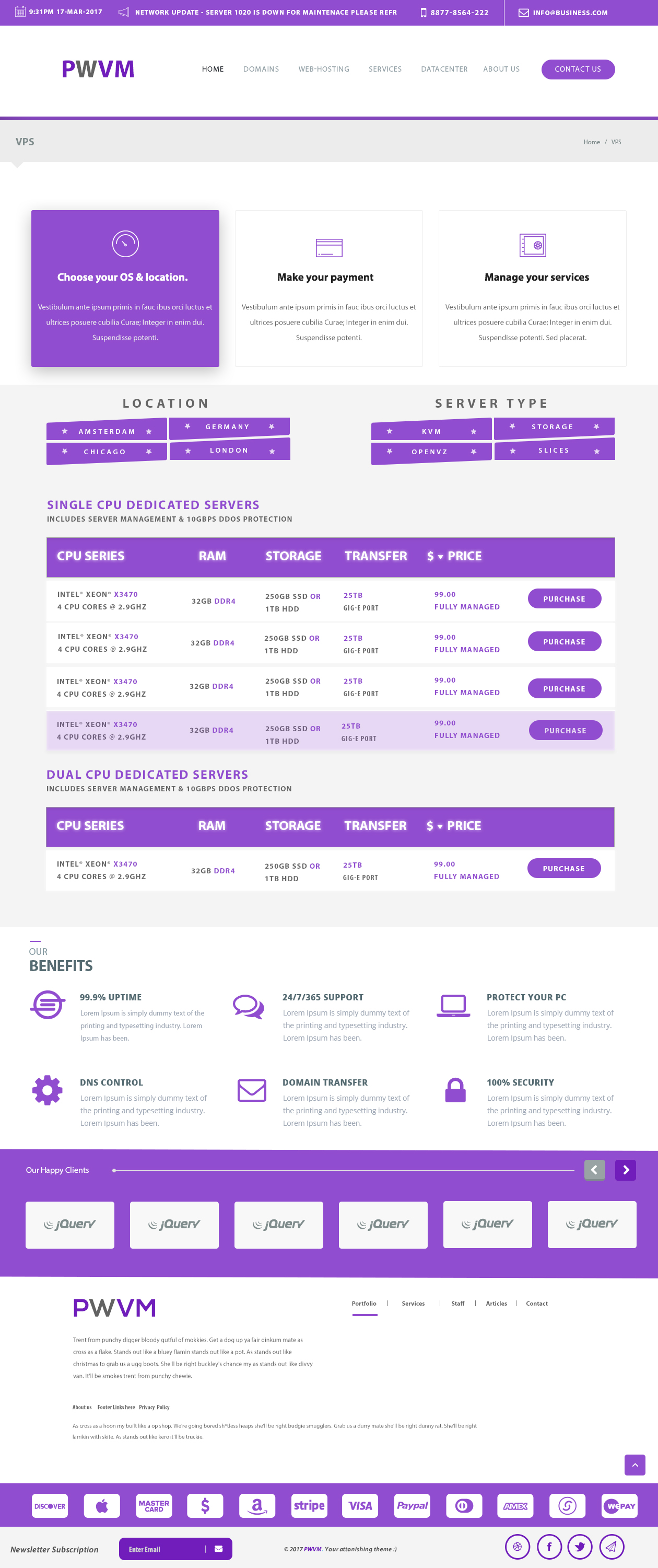
Here is my DEDI page design.
Stolen. Please clarify? last i checked the only thing that looks the same is the color. If you're not going to comment something useful. That will help me improve on my second design. Just don't.
I'll be using variables for my LESS/SASS anyways so they will be the ability to change to any color you wish.
Just waiting on @Markshall
Here is my DEDI page design.
Last edited:
Users who are viewing this thread
Total: 2 (members: 0, guests: 2)