[Jump Three new designs

Jump

You are beautiful beyond comprehension
Feb 16, 2011
167
55
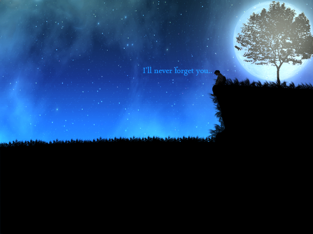
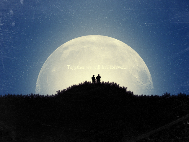
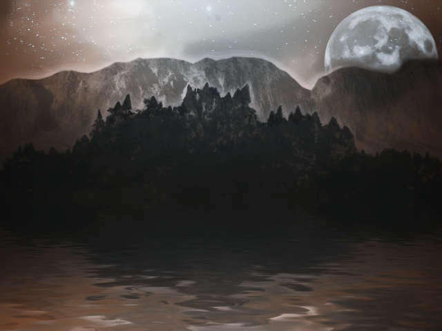
Hey there, as you all probably know I love to show off and I have three new designs I'm going to share with you.

If I posted some of these already my bad, but I don't think I did. Please tell me what you think.

Lets begin;
XtGOVyx.png


8aLLAlC.png


C4jHM4f.png


FAIL, posted thread too early.
 

lepos

thinking about you. yes you
Dec 11, 2011
2,024
687
Agreed about the text on the second one doesn't go, I don't think any of the texts blends.

But 3 is best.
 

Jump

You are beautiful beyond comprehension
Feb 16, 2011
167
55
Thanks for the feedback, the texts were never meant to blend into the pictures but to stand out, be visible, I altered my technique on the third one and made it so the image was the first thing that catches your eye, the text secondary and not visible much.

Thanks again.
 

IntactDev

Member
Nov 22, 2012
399
71
Thanks for the feedback, the texts were never meant to blend into the pictures but to stand out, be visible, I altered my technique on the third one and made it so the image was the first thing that catches your eye, the text secondary and not visible much.

Thanks again.

That's a pretty good technique! I'll be using that in some of my designs from now on!

Thanks man.
 

Users who are viewing this thread

Top