Home page feedback

Status
Not open for further replies.

xAlex

New Member
Oct 30, 2011
23
1
Its been about 3 years since i last done any design work so i thought i would have a little ago again just at a home page see what you guys think

Ignore the logo i needed a round logo so i picked first one i saw shhh! :p

QVaPrcw.jpg


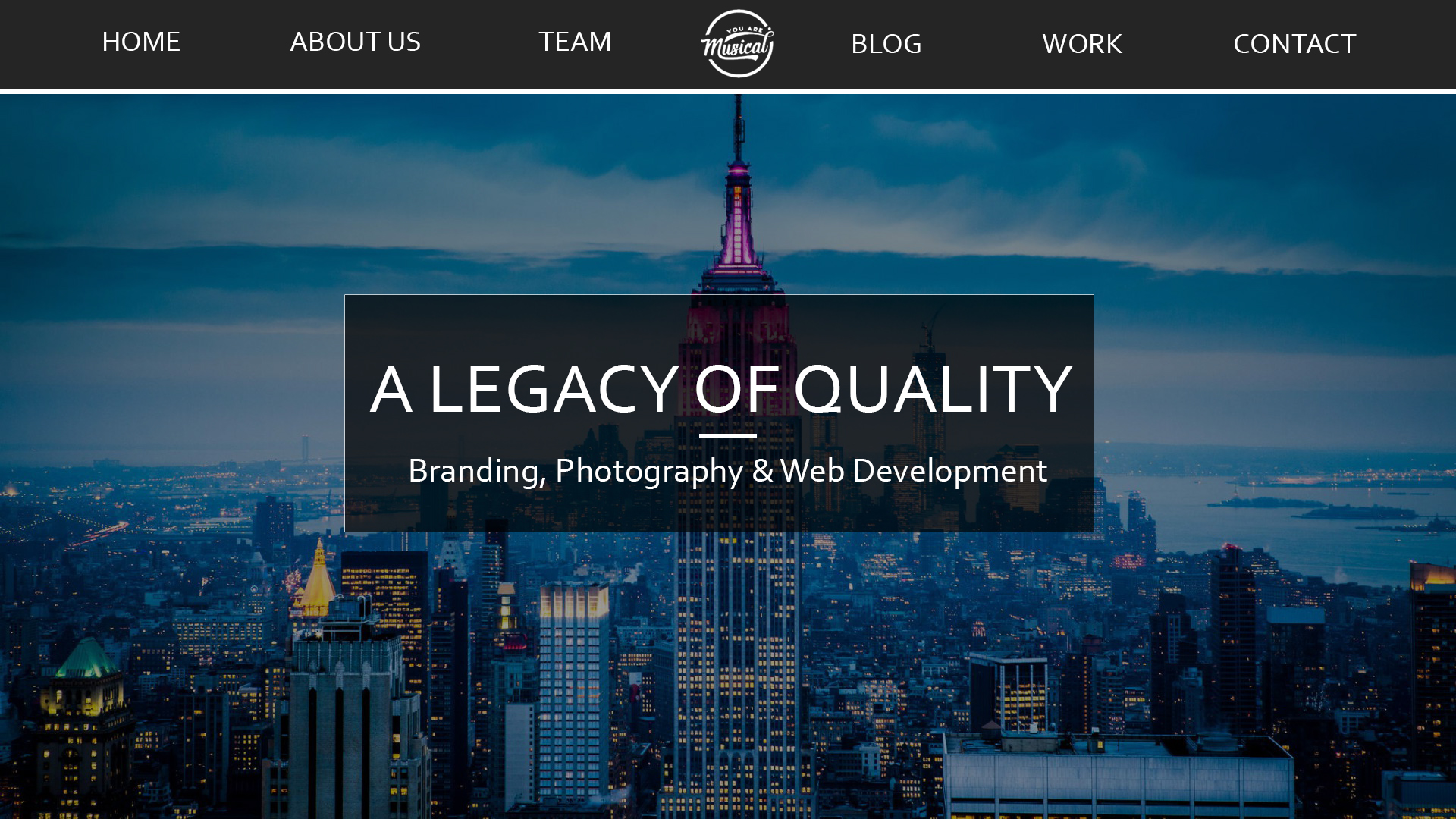
Thanks for the feedback guys i might even start coding again!
 

Lame

Member
Nov 6, 2014
303
78
Header is nice. The rest looks like a generic modern website. Skyline, main container with a heading and subheading. Also, that 1px wide border kinda hurts my eyes. The anti-aliasing on the heading and sub-heading is pretty dookiebutt. All in all, 4/10. :)
 

xAlex

New Member
Oct 30, 2011
23
1
Header is nice. The rest looks like a generic modern website. Skyline, main container with a heading and subheading. Also, that 1px wide border kinda hurts my eyes. The anti-aliasing on the heading and sub-heading is pretty dookiebutt. All in all, 4/10. :)
Cheers man yeah its easy work I just needed to get back into it start of easy im working on a new one now :)
 

Markshall

Русский Стандарт
Contributor
Dec 18, 2010
2,637
2,389
Your navigation links are too big. Reduce the size.
Your slogan 'Branding, Photography...' needs to be reduced in size as well
Remove the border on your header.
 

Virgin

i am a virgin
Apr 6, 2016
141
28
I think this is actually quite nice, although I would reduce the navigation links sizes and then you should be good to go.
 
Status
Not open for further replies.

Users who are viewing this thread

Top