It looks really bad, tbh. The font is not habbo-based at all. At least if you're going to move away from Habbo themed graphics make them attractive.
2/10 and the 2 is for effort.
Like I already told you on your advertisement thread, your banner is super plain, so boring to look at, doesn't make me want to join it at all. Try to be more creative.
For a first try this is decent.. But your banner doesn't really relate to any theme what so ever to do with Habbo which I suggest changing if you decide to use this, Also the description along the banner isn't really appealing to drag any type of audience to your retro. Other than this good attempt and good use of the Coding to create the php banner
This is not what I would consider a great graphics piece. The effort put into this looks minimal to none. I would suggest using a pre-made template or working on the actual template before even working on adding the PHP script.
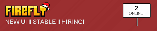
Yet there again the ont does not look like it would match with habbo and the firefly logo is way to big and is way to dark change the bg or take off some of the siding on the logo use habbofont.com if your making a logo. Don't use the basic photoshop or paint.net font use a custom font or actually make it php?
Starting to slowly make improvements by you taking onboard the feedback which is given to you which is good.. However Possibly try re-sizing your logo and giving it a white outline of 1 I think it is not too sure you'd have to play around.. Another this is possibly try adding a box below to where your text could go (the description of the retro) You could also try making it relate to a certain theme for example christmas. Other than this you're making improvements which is good best of luck!
okay well ur logo is hideous you have a normal text under the logo and you have a downloaded background
so mate just go use my banner i just made no offense if you just try a little harder it could look nice
okay well ur logo is hideous you have a normal text under the logo and you have a downloaded background
so mate just go use my banner i just made no offense if you just try a little harder it could look nice
Woah. Thats Deep. Normal Font Can Still Look Good Ya Know. Something Tells Me You Like It But you want
to make yourself cool by pitying on peoples creations.
(Shame On You)
I owned firefly forever lol but we decided to close but this thread needs to be closed as firefly is closed and the thread is useless @Brad close thread pls
I owned firefly forever lol but we decided to close but this thread needs to be closed as firefly is closed and the thread is useless @Brad close thread pls