Nicco_Gamer
Member
- Jan 4, 2015
- 63
- 6
Which one do you prefer
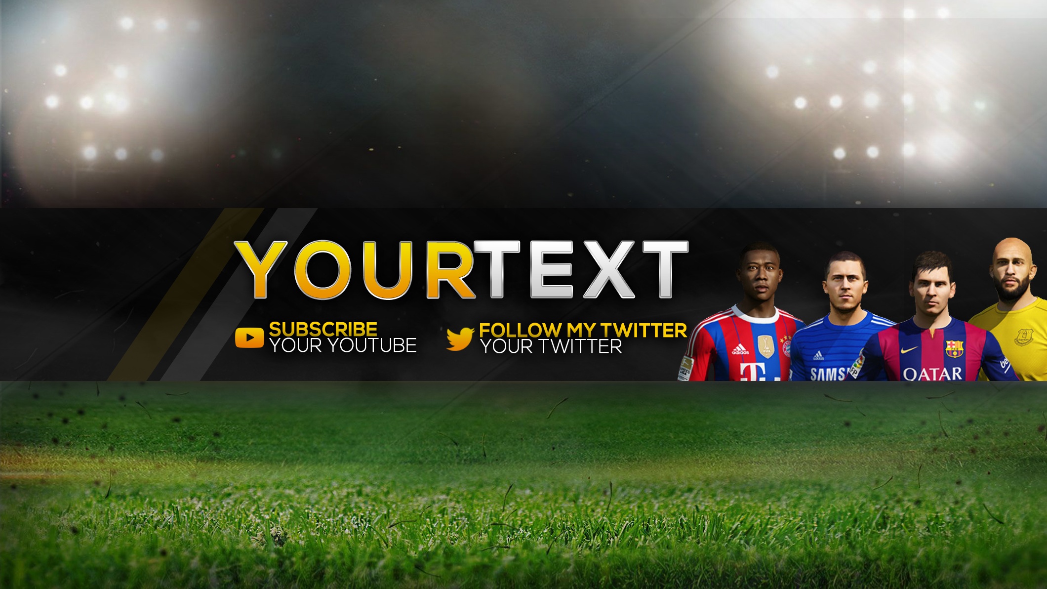
1.
1.
You must be registered for see images attach
or 2. ignore the name I'll edit it
You must be registered for see images attach
Thanks for the opinionI would use the second one, although the idea of the first one is better. The only thing wrong with the first one is that the players look a bit weird. Especially Ronaldo. Neymar doesn't look that bad.
")
Ye thanks for your opinion am not good at photoshop yet am just practicing am trying to improve.The second one hurts my eyes straight up. Sorry man but had to say it. nice flares but i don't think red and yellow match as much unless you try something with them like different types of shades. The first one I'm still not a fan because of the different use of colors, its good to try go with a color scheme because like you've got a various amount of colors including the players with the hard drop shadow. When you going to make a banner for a game then try use their color scheme because it looks more better and you will see this in my example below.
If I was you to try start off experimenting more try do a color scheme like black and white or a dark color and black. Also don't hesitate to steal from other youtubers banner like try do their ideas but don't exactly copy and paste it.
I'm really bad at editing. Could you edit this for me. The gold bit where it says "your" write "x" and the white "text" write "Rejection". Also please could you remove the twitter and put the youtube subscribe in the middle. Please could you do this. I signed up just to send this to you. Thanks, save as JPEG so I can make it my YouTube banner.The second one hurts my eyes straight up. Sorry man but had to say it. nice flares but i don't think red and yellow match as much unless you try something with them like different types of shades. The first one I'm still not a fan because of the different use of colors, its good to try go with a color scheme because like you've got a various amount of colors including the players with the hard drop shadow. When you going to make a banner for a game then try use their color scheme because it looks more better and you will see this in my example below.
If I was you to try start off experimenting more try do a color scheme like black and white or a dark color and black. Also don't hesitate to steal from other youtubers banner like try do their ideas but don't exactly copy and paste it.

I like, but I think if you're going to use shadows you should show a source of light.The second one hurts my eyes straight up. Sorry man but had to say it. nice flares but i don't think red and yellow match as much unless you try something with them like different types of shades. The first one I'm still not a fan because of the different use of colors, its good to try go with a color scheme because like you've got a various amount of colors including the players with the hard drop shadow. When you going to make a banner for a game then try use their color scheme because it looks more better and you will see this in my example below.
If I was you to try start off experimenting more try do a color scheme like black and white or a dark color and black. Also don't hesitate to steal from other youtubers banner like try do their ideas but don't exactly copy and paste it.


Good image. Shit grammar.The second one hurts my eyes straight up. Sorry man but had to say it. nice flares but i don't think red and yellow match as much unless you try something with them like different types of shades. The first one I'm still not a fan because of the different use of colors, its good to try go with a color scheme because like you've got a various amount of colors including the players with the hard drop shadow. When you going to make a banner for a game then try use their color scheme because it looks more better and you will see this in my example below.
If I was you to try start off experimenting more try do a color scheme like black and white or a dark color and black. Also don't hesitate to steal from other youtubers banner like try do their ideas but don't exactly copy and paste it.
Wots the font used on your banner?The second one hurts my eyes straight up. Sorry man but had to say it. nice flares but i don't think red and yellow match as much unless you try something with them like different types of shades. The first one I'm still not a fan because of the different use of colors, its good to try go with a color scheme because like you've got a various amount of colors including the players with the hard drop shadow. When you going to make a banner for a game then try use their color scheme because it looks more better and you will see this in my example below.
If I was you to try start off experimenting more try do a color scheme like black and white or a dark color and black. Also don't hesitate to steal from other youtubers banner like try do their ideas but don't exactly copy and paste it.
Its not mine but I'm sure you could find out if you saved the image and put it on a findfont generator.Wots the font used on your banner?