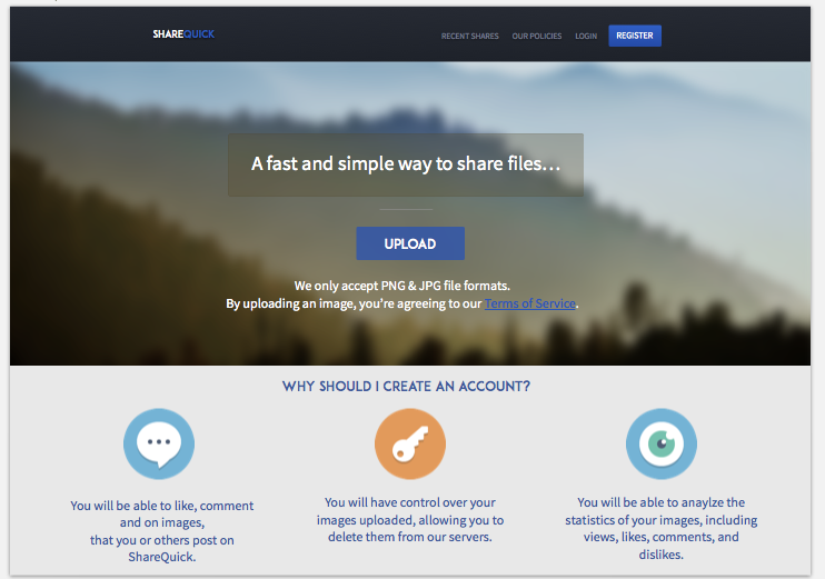
Here is a website that I'm designing for @Canadian. Anything that I could change on the home page before I start it? The website is an image upload website.
NOTE: The fonts look low resolution because the screenshot was zoomed out.
In the future don't state what the type of website is, let people figure it out - if they manage to realise it then you've done well!
Anyhow, there are a few things which I think could be improve. Such as:
The main body content - the font face could be better, seems a tad bland at the moment
The main body title ("Why should I create an account") - I'd suggest making it seem more like a title, increase the font size and padding maybe?
Apart from that, I really like the contrast of the navigation, are you planning on adding any effects on hover or active etc? Same as any effects for the buttons on site?
Overall, nice work man. Keep us updated on the overall progress!