Pinkman
Posting Freak
- Jul 27, 2016
- 814
- 193

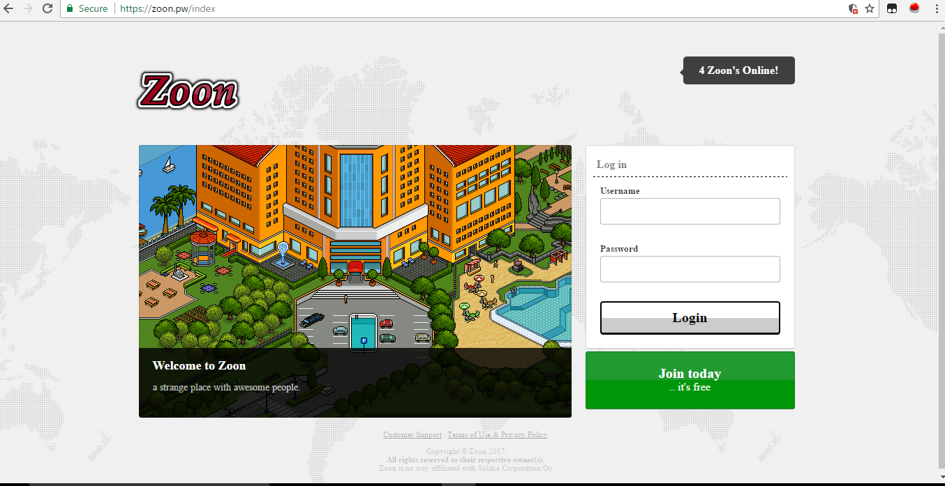
You must be registered for see links
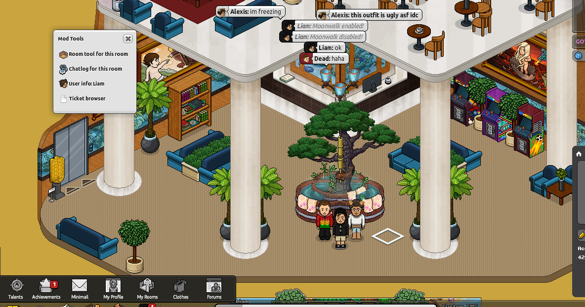
We have officially opened and on page 2 on Findretros. So far so good. We are also running on a 6GB VPS.
What makes Zoon different?:
Here at Zoon we have a strict eco system. What does this mean? Basically earning credits and duckets is not as easy as it is else where. Here you have to earn your wealth, rather than be "given" it. We feel this is the best way to keep users entertained while also growing their own wealth.
We also have a dedicated Staff team, which are here to help the users when is needed and also to help entertain users. This allows the Developers; me (Liam and God) to mainly focus on the development of the hotel, which allows new things to be coded and coded faster.
Features:
Here is a list of Features that make us unique.
- Clean and tidy RevCMS edit. (Fully functional with automatic store)
- Fast Food - In progress
- Hidewired Command.
- sh Command.
- Updated Catalogue (Latest furni)
- Updates clothes (Latest 2017 Clothes including custom ones)
- Buyroom/Sellroom Commands.
- DailyReward System for random Credits and Duckets on every daily login.
- Double Diamonds Weekends for special events.
- and much more!


Last edited:


